Imagine controlling the look and feel of an entire presentation from a single place, like the conductor of an orchestra ensuring every slide hits the perfect note. Thats the power of the PowerPoint Slide Master. With this feature, you’ve got the key to unlocking uniformity and flair across every part of your presentation.
Download our 141 Free Excel Templates and Spreadsheets!
Key Takeaways
- Use PowerPoint’s Slide Master to apply consistent design changes to every slide in your presentation by going to the VIEW tab and clicking on Slide Master.
- Customize the Slide Master to show or hide specific placeholders like titles, text, dates, slide numbers, or footers by checking or unchecking the relevant boxes on the SLIDE MASTER tab.
- Create different presentation looks or layouts by adding an additional Slide Master for specific sections that need a distinct design from the rest of the slides.
Why Master Slides Matter in Presentations
Master slides are the backbone of a well-designed presentation, providing the template for a cohesive look and feel that carries through every slide. When you invest time in crafting a master slide, you’re ensuring that each part of your presentation sings the same tune visually, enhancing the professionalism of your brand and the clarity of your message. This is especially crucial when projecting your company’s values and identity through well-thought-out design elements like logos, fonts, and color schemes, which become synonymous with the quality and character of your business.
Consistency brought by master slides not only gives your presentation a polished look but also serves as a communication aid, reinforcing your points and making your presentation more digestible for the audience. They also crave for less time investment in the long run—after you’ve perfected your master slide, the rest of the presentation flows seamlessly from there.
Table of Contents
Getting Started with Slide Master
Accessing the Master Slide View
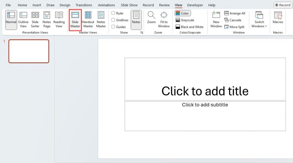
To start shaping your presentation’s backbone, you need to get into the Slide Master view. It’s quite simple: just click on the ‘View’ tab at the top of your screen and then select ‘Slide Master’. Alternatively, for a quick access shortcut, you can hold ‘Shift’ and click the ‘Normal view’ button on the status bar.
This will reveal the skeleton of your presentation’s design, laying out all the slide layouts and styles that you’ve been using, perhaps without even knowing it. It’s a bit like peeking behind the scenes of a stage play, where you’ll see the props and frameworks that make the magic happen in front of the audience.
Navigating the Slide Master Interface
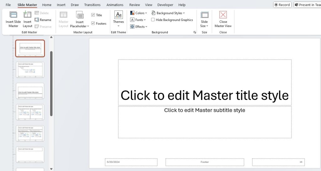
Once you’re in the Slide Master view, navigating the interface is intuitive. You’ll notice a different layout: on the left-hand side is a pane with thumbnail previews. At the very top is the master slide, which controls the default styles and layouts for your presentation. Below it are the individual layouts that derive from this master slide.
Understanding the hierarchy here is key. Changes made to the master slide will affect all layouts linked to it, while alterations to a specific layout will only apply to that layout. If you click on any of these thumbnails, the respective slide or layout will appear on the main window, ready for editing.
Remember, familiarity with the Slide Master interface is your pathway to a consistent and impactful presentation design, so take a moment to explore and get comfortable with it.
Customization Techniques
Editing and Stylizing Layouts for Consistency
Editing and stylizing layouts within Slide Master is like setting the stage for your presentation’s success. It ensures that every slide follows a consistent pattern, which is not only aesthetically pleasing but pivotal for maintaining an audience’s focus. To tailor a layout, first navigate to Slide Master view. Locate the layout that needs tweaking, remembering that any adjustments made here will cascade throughout all other slides using that specific layout.
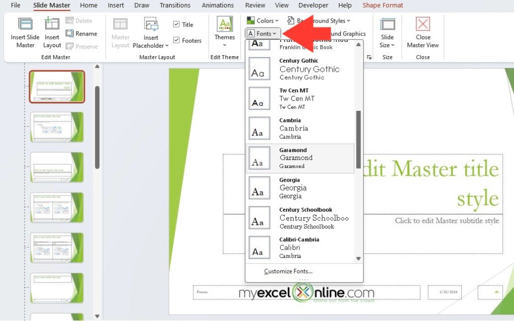
You might start by modifying the master slide—it’s a quick way to apply a global effect. However, for more precise control, select an individual layout. Want to bold your headings, switch font colors, or resize text boxes? This is your playground. Here, you can also weave in your brand colors and embed fonts meticulously chosen to represent your brand’s voice.
Don’t forget to be mindful of over-styling. A clean, professional look often trumps a flashy one in the business world. The key is finding the balance that embellishes your content rather than overshadowing it.
Adding and Modifying Placeholders for Versatility
Introducing placeholders to your slides is like adding pockets to a jacket—the right additions not only complement the design but also enhance functionality. When you want to infuse your slides with text, pictures, charts, or other media, placeholders are the designated spots where content can easily be slotted in.
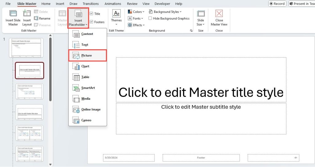
To add a new placeholder, click on the ‘Insert Placeholder’ option within the Slide Master tab and choose from various types – be it for text, pictures, charts, or even custom shapes. Click and drag on your chosen layout to place it. And if you’re looking to modify an existing placeholder, reshaping, moving, or resizing it is just a click and drag away.
The versatility of placeholders makes them a game-changer. Whether you’re refining an existing presentation or building one from scratch, they give you the flexibility to tailor your content display to your precise needs. Just be wary of clutter – too many placeholders can lead to an overcrowded and confusing slide.
Advanced Slide Master Strategies
Creating Unique Themes and Backgrounds
Creating unique themes and backgrounds is akin to setting the perfect stage for your performance. It’s about making a visual statement that captivates your audience from the get-go. With Slide Master, you have the tools at your fingertips to craft themes that resonate with your presentation’s purpose and your brand’s identity.
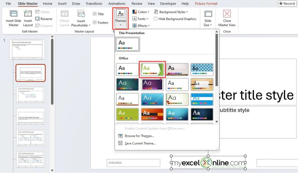
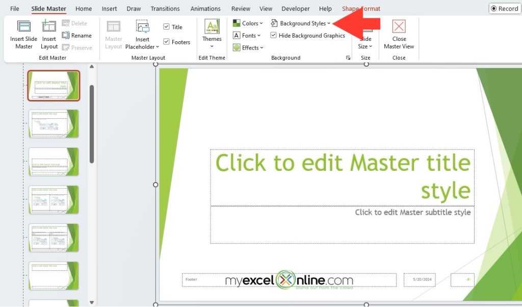
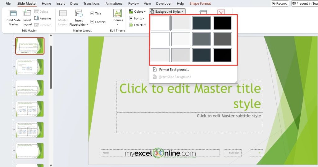
Start by exploring the ‘Themes’ gallery where a variety of professionally designed themes are ready to be employed. Each theme harmoniously blends color schemes, fonts, and effects, but you can go even further. Feel free to tweak these elements through the ‘Background Styles’ option or ‘Colors’ dropdown to marry functionality with creativity.
For a truly bespoke look, consider importing a custom background image or crafting one using PowerPoint’s shape and gradient features. This is your chance to break away from the stock design templates and present something that is unmistakably yours.
Just be mindful that a remarkable theme should empower your message, not distract from it. Achieve a balance between uniqueness and clarity, ensuring that your background doesn’t pull attention away from the content it’s meant to support.
Preserving Brand Identity Across Presentations
Maintaining a consistent brand identity across presentations is crucial in administering a coherent and reliable message about your organization. Think of your brand as a story told across various chapters—each presentation is a new chapter that should unmistakably belong to the same book.
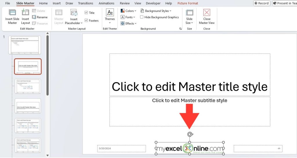
Using a Slide Master, you can embed your brand’s DNA directly into your slides. You might incorporate your company logo in the footer, use corporate colors across text and shapes, or apply the brand’s fonts to all text elements. These consistent elements act as visual anchors, reminding your audience of the brand behind the message.
But it’s not just the visuals that play a part. The tone of your slides—the language and the style of conveying your message—should also align with your brand’s voice. By standardizing these across presentations, you make sure that no matter where and no matter who is presenting, the brand identity remains strong and recognizable.
While personal touches can be valuable, ensuring that they don’t dilute the brand’s core visual identity is vital. Each slide is an opportunity to reinforce your brand’s essence to the audience.
Practical Tips and Tricks
Incorporating Multimedia Elements with Slide Master
Incorporating multimedia elements into your presentations ensures they are not only informative but engaging and memorable as well. Slide Master facilitates the seamless integration of these dynamic elements across your entire slide deck.
Videos, audio clips, animations, and images can enrich the storytelling aspect of your presentation, making complex information more digestible. In the Slide Master view, you can set up the placeholders for these multimedia components, ensuring that they follow a consistent placement and style.
When you add these elements within the Slide Master, they become part of the slide layouts, allowing for a uniform appearance. This means that, should you need to update or replace a video or image, you can do it once, and it will update across all relevant slides.
Always remember that multimedia should supplement your message, not overshadow it. Aim to use these elements to illustrate points, provide examples, or break up text-heavy slides, making sure they are integrated in a way that is logical and enhances the viewer’s experience.
Saving Time with Predefined Slide Configurations
Utilizing predefined slide configurations is like having a set of blueprints at your disposal; they streamline the creation of your presentation allowing you to focus more on content than on design. Slide Master is the secret ingredient to creating these time-saving configurations.
Instead of adjusting settings slide-by-slide, you can set up a repository of slide templates tailored for different content types—be it title slides, graphs and charts, images, or bullet lists. By selecting a layout that matches your current needs, you can instantly apply a set of design and formatting rules, bringing your ideas to the screen rapidly and cohesively.
The beauty is in the customization. With predefined configurations, you can set up everything from font sizes to text alignment to specific multimedia placeholder setups. This guarantees that every time you add a new slide, it automatically aligns with your presentation’s style and structure.
Just remember, the key is preparation. Spend the time to thoughtfully create and save your configurations in the Slide Master, and you’ll reap the rewards every time you build a new slide deck.
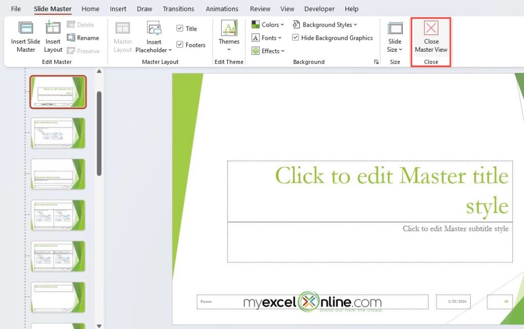
Once you have completed your edits, go to the Slide Master tab. Click on the Close Master View button, which is usually located on the far right of the Slide Master tab.
Common Pitfalls and How to Avoid Them
Overcoming Over-Complicated Designs
Taming over-complicated designs is essential for ensuring your presentation communicates your message effectively. When slides are too busy, they can distract and even confuse the audience. Your goal should be to find that sweet spot where design complements rather than complicates.
Harness the power of Slide Master to set restrictions for yourself and prevent design elements from becoming overwhelming. Use it to define and enforce a clean and simple layout across all your slides. Consider limiting the number of fonts and colors used, and align elements consistently.
Slides should serve as an aid to your narrative, not compete with your spoken words. If a slide feels too complex, it probably is. Use Slide Master to strip back to the essentials, focusing on key points that support your verbal message.
Remember, when you streamline the design, you’re not only helping your audience but also saving yourself time and effort during the presentation’s creation and delivery. Keep it simple, and your message will shine through.
Ensuring Smooth Transitions and Animations
When used thoughtfully, transitions and animations can add a professional polish to your presentation. They can guide attention and provide a visual cue that the narrative is moving forward. However, when overdone, they become tedious distractions. That’s where mastering Slide Master helps you maintain control.
By setting up transitions and animations within the Slide Master, you ensure they’re uniform across the entire presentation. Consider using subtle and consistent animations for regular slides and reserve more distinctive transitions for major topic shifts.
To ensure everything runs smoothly, make sure to preview your animations and transitions as you go. This prevents any last-minute surprises during the actual presentation. A smooth transition should be just that—smooth, not jarring or comically slow.
A reminder worth noting is moderation. The goal is to enhance the audience’s experience, not create a spectacle. A well-executed transition guides the audience; a poorly thought-out one can lose them.
Analyzing World-Renowned Presentation Blunders
Analyzing presentation blunders from the past provides invaluable lessons for any presenter. By examining instances where even seasoned professionals got it wrong, you can identify pitfalls to avoid in your own presentations.
World-renowned presentation mishaps often serve as a cautionary tale about the importance of preparation and attention to detail. This could be anything from Bill Gates’ infamous Windows 98 system crash during a live demonstration to a TED talk where the speaker lost track due to overwhelming slides.
Use these examples to check your own Slide Master templates for potential flaws, such as overly complex animations that could cause technical issues or cluttered designs that might confuse the audience. They also remind us to always have a contingency plan in case technology fails.
Keep these blunders in mind as a reminder that presentation success lies not only in what you present but in how you adapt and handle unexpected issues. Use them to fine-tune your approach and to remember that even when things go wrong, a calm and professional response can save the day.
FAQ on PowerPoint Slide Master
How Do I Access the Slide Master View?
To access the Slide Master view in PowerPoint, go to the ‘View’ tab and select ‘Slide Master. Alternatively, hold ‘Shift’ and click the ‘Normal view’ button on the status bar for quick access. This will switch you to the Slide Master view, where you can make changes to the slide templates.
Can I Apply a Custom Slide Master to Another Presentation?
Yes, you can apply a custom Slide Master to another presentation. Save the Slide Master as a template and then open the new presentation.
Upon applying the changes to the Slide Master, click on the ‘Close Master View’ button.
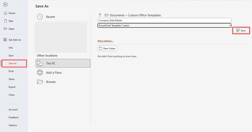
STEP 1: Click on File in the top-left corner > Select Save As. > Choose a location where you want to save your template > Select the Template Format.
STEP 2: In the Save as type dropdown menu, select PowerPoint Template (*.potx).
Enter a name for your template in the File name field.
STEP 3: Click Save.
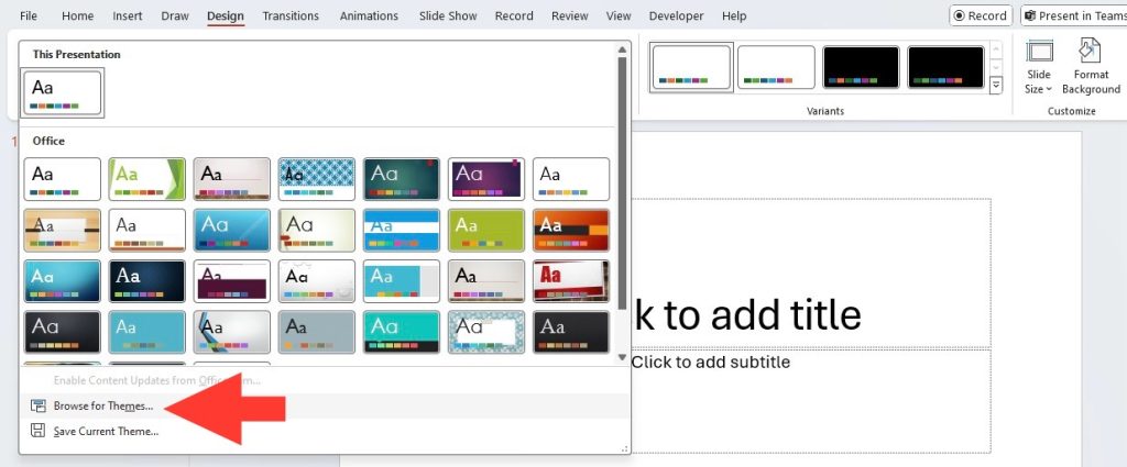
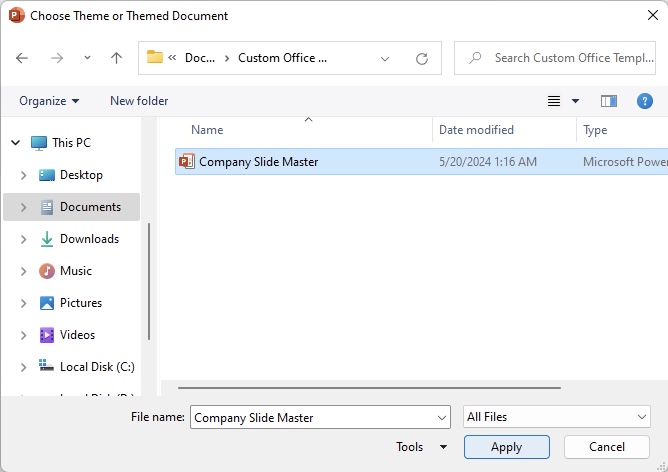
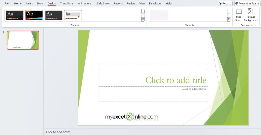
STEP 4: Go to the ‘Design’ tab, click on ‘Browse for Themes’, and select your saved template to apply the custom designs to the new presentation.
How do you exit slide master view in PowerPoint?
To exit the Slide Master view in PowerPoint, select the ‘Slide Master’ tab in the ribbon and look for the ‘Close Master View’ button. Clicking this button will take you back to the normal view of your presentation, where you can continue editing individual slides.
John Michaloudis is a former accountant and finance analyst at General Electric, a Microsoft MVP since 2020, an Amazon #1 bestselling author of 4 Microsoft Excel books and teacher of Microsoft Excel & Office over at his flagship MyExcelOnline Academy Online Course.

