Venn diagrams aren’t just circles on a screen; they’re a transformative tool for communicating complex data in a digestible format. Their ability to illustrate similarities and differences through overlapping shapes makes them perfect for comparative analyses presented in a visually engaging way. You’ll wonder how you ever got by without resorting to these simple, yet effective graphics in your slides.
Learn about Excel with our Free Microsoft Excel Online Course!
Key Takeaways
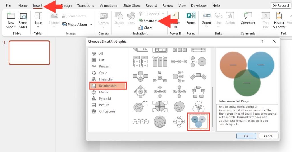
- Use the Insert tab and SmartArt graphics in PowerPoint to select and insert an appropriate Venn diagram template from the Relationship category, like the Basic Venn with 3 Overlapping Circles.
- Add and edit text within the Venn diagram by clicking on text placeholders, and customize the design by right-clicking on the diagram to format shapes, colors, and lines for a clear presentation.
- To maintain clarity and visual balance in your Venn diagram, limit the number of sets to two or three, use concise labels, and arrange the components for an aesthetically pleasing layout.
Essential Steps to Create Your Venn Diagram
Crafting a PowerPoint Venn Diagram is a breeze when you know the steps. To begin, head over to the ‘Insert’ tab > ‘SmartArt’ option nestled within the ‘Illustrations’ group. A window called ‘Choose a SmartArt Graphic’ will pop up. Now, select ‘Relationship’ to view different Venn diagram layouts. Pick one that fits your data story, like ‘Basic Venn’ for simplicity’s sake.
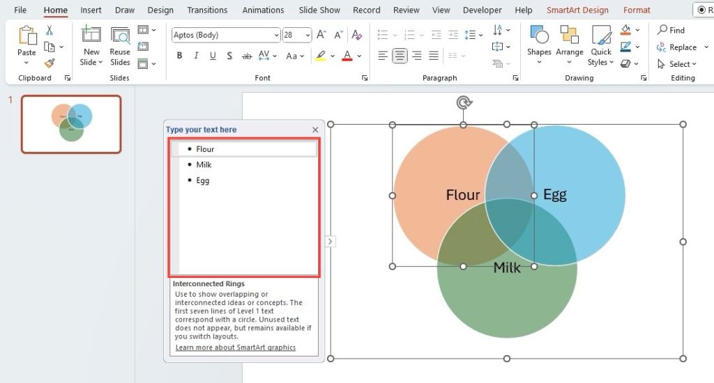
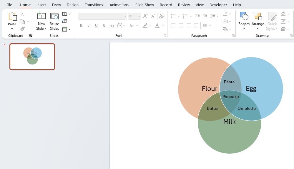
Once you’ve made your choice, hit ‘OK’ and see your Venn diagram spring up in your document. The next task is to personalize the text. You can either use the ‘Text Pane’ for guided input or dive straight into the diagram for hands-on editing. It’s about making the Venn diagram truly your own.
Table of Contents
Design Tactics for Maximum Impact
Choosing the Right Template for Your Venn Diagram
The critical starting point in ensuring your Venn diagram makes a splash is selecting the right template. Consider your audience and the subject matter to match the style with your content. PoweredTemplate boasts a vast selection, offering both contemporary and classic designs compatible with PowerPoint and Google Slides. Look for color-coded circles and clear demarcations for overlap to provide instant comprehensibility.
For light or dark backgrounds, pick a template that complements the visual theme of your presentation. Whether impressing clients with sharp, professional designs or engaging students with colorful, playful patterns, there’s a template ready to serve as the canvas for your data storytelling.
Customization Tips to Add a Personal Touch
Customizing your Venn diagram gives it that special touch, making your presentation not just informative but also engaging. Start by coloring each circle to reflect different categories or topics — this visual distinction helps your audience track the details more smoothly. Just right-click on any circle, select “Format Shape,” and choose a fill color or gradient.
But why stop there? Get creative with borders and effects to make elements pop. A little shadow here, a soft edge there, can make your diagram more than just informative—it becomes an eye-catching piece of your presentation puzzle.
Moreover, don’t forget to tinker with the text. PowerPoint lets you play around with font styles, sizes, and colors, ensuring your Venn diagram is not only insightful but also a delight to read. A neat trick is to contrast text color with the background for readability.
Advanced Features for Professional Diagrams
Integrating SmartArt for Dynamic Presentations
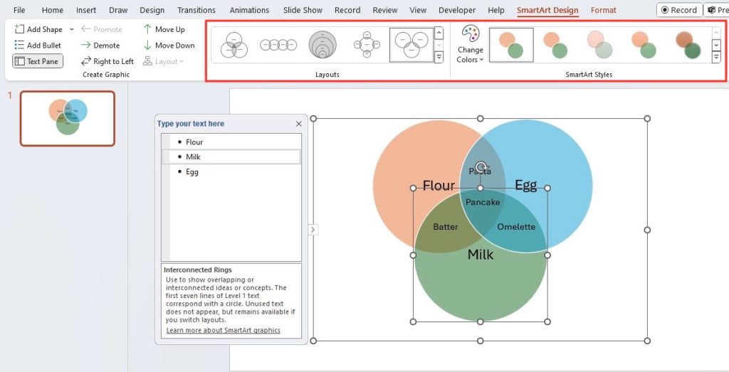
Integrating SmartArt in PowerPoint takes your Venn diagrams from static to dynamic. With a click on ‘SmartArt’ under the ‘Insert’ tab, you unlock a suite of design options that breathe life into your presentation. Beyond basic circles, SmartArt offers a range of customizable graphics that emphasize key points and data relationships in your diagram.
Tweak the colors, adjust the size, or experiment with shape styles to make your Venn diagram align with the presentation’s theme. The flexibility of SmartArt means you can visualize complex data without compromising on sophistication or visual appeal. Remember, the goal is to make data not just presentable, but memorable.
Adding Animations to Bring Your Venn Diagrams to Life
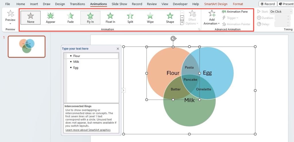
Transforming your Venn diagrams with animations in PowerPoint isn’t just about adding pizzazz; it’s about guiding your audience through your narrative thoughtfully. To weave this kind of magic, pick the element you need to animate—say, a circle or label within your Venn diagram—then pop over to the ‘Animations’ tab. Here awaits an array of animation choices, like ‘Fade’, ‘Wipe’, or ‘Fly In’.
For a touch of finesse, consider custom animations to control the sequence elements reveal themselves. It’s about accentuating the right part at the right time, ensuring your audience can follow along without a hiccup. Just take care to balance differently animated elements, so your presentation remains smooth and professional.
Overcoming Common Challenges
Ensuring Clarity with Overlapping Elements
One of the trickiest parts of a Venn diagram is maintaining clarity when elements overlap. To avoid confusion, aim for distinct color tones that blend well yet stand out when they overlap. Use different colors to distinguish between different sets and overlapping areas.
Adjust the text size and font within overlapping sections for optimal readability, ensuring your audience can discern the shared qualities of the sets you are comparing. Incorporate lines or arrows to highlight specific relationships if your Venn diagram includes a sequence or process, which further clarifies the connections.
Adding subtle shading or a different pattern to the overlapping area also helps to differentiate it from non-overlapping sections, crucial in crowded diagrams where several sets intersect.
Balancing Information Density and Readability
Striking the right balance between detail and digestibility can be challenging, but it’s essential for effective Venn diagrams. Avoid squeezing in too much text; keep it concise and to the point. Each segment should convey a single idea clearly and succinctly. If you need to present more complex data, consider using a legend to keep the diagram uncluttered while offering a more in-depth explanation on the side.
For enhanced readability, prioritize information by size and boldness, drawing attention to the most critical data first. This hierarchical approach leads viewers through the diagram in the intended order, allowing them to absorb the full scope of the information without getting lost in the minutiae.
Tips for Effective Presentation of Venn Diagrams
Strategic Use of Colors and Typography
When designing your Venn diagram, color and typography are not mere embellishments; they’re essential elements for enhancing comprehension. Choose colors that are harmonious, yet provide enough contrast to delineate different categories and ensure legibility. It’s also sensible to use distinct colors for overlapping sections to visualize connections effectively.
Typography is your silent ally in clarity. Select clear, simple fonts and maintain a consistent hierarchy in text size to guide the viewer’s attention. For emphasis, you may opt for bold or italic styles, but always with moderation to keep the overall look clean. Good typography not just conveys information, it captivates your audience.
FAQs about Venn Diagrams in PowerPoint
How can I make sure my Venn diagram is easy to understand?
To ensure your Venn diagram is a breeze to comprehend, keep it simple and straightforward. Start with a clear title and labels to guide your audience right from the get-go. Use contrasting colors for distinct sets, and distinct shading or patterns for overlap areas to avoid visual confusion. Limit the text to key information and utilize a balanced font size for readability. Remember, less is often more when it comes to conveying complex data with clarity.
Can I animate individual parts of my Venn diagram in PowerPoint?
Absolutely! In PowerPoint, you can animate each element of your Venn diagram individually. Select any part of the diagram you wish to animate, navigate to the ‘Animations’ tab, and choose your desired effect. This feature lets you introduce each segment sequentially, fostering a more interactive experience as you walk your audience through the details.
How to make a Venn diagram in PowerPoint without SmartArt?
Going classic without SmartArt is no hassle. Simply head to the ‘Insert’ tab and grab ‘Shapes’ to draw your circles. Overlap them as needed for your Venn diagram. Then, use the ‘Format’ tab to tailor the fill and outline, ensuring visibility on overlaps. Don’t forget to insert text boxes for labels. It’s a more manual approach but offers full control over the creative process.
John Michaloudis is a former accountant and finance analyst at General Electric, a Microsoft MVP since 2020, an Amazon #1 bestselling author of 4 Microsoft Excel books and teacher of Microsoft Excel & Office over at his flagship MyExcelOnline Academy Online Course.

