Pinterest Pixel

Semi Log Graph in Excel – How to Create Precise Charts Fast

John Michaloudis
Creating semi log graphs in Microsoft Excel is a valuable skill for visualizing data that spans several orders of magnitude.
These graphs are particularly useful for identifying exponential relationships and simplifying complex data analysis.

By plotting data on a logarithmic scale for one axis, semi log graphs make it easier to interpret trends and patterns that might be less apparent on a standard linear scale.

This article will guide you through the steps to create a semi log graph in Excel, enhancing your data visualization capabilities.

Creating semi log graphs in Microsoft Excel is a valuable skill for visualizing data that spans several orders of magnitude. These graphs are particularly useful for identifying exponential relationships and simplifying complex data analysis. By plotting data on a logarithmic scale for one axis, semi log graphs make it easier to interpret trends and patterns that might be less apparent on a standard linear scale. This article will guide you through the steps to create a semi log graph in Excel, enhancing your data visualization capabilities.

Key Takeaways:

  • Visualizing Exponential Relationships: Semi log graphs are ideal for displaying data that spans several orders of magnitude and identifying exponential trends.
  • Simplified Data Analysis: By using a logarithmic scale on one axis, semi log graphs make complex data easier to interpret compared to linear scales.
  • Excel’s Graphing Capabilities: Excel is a powerful tool for creating semi log graphs, thanks to its intuitive interface and robust graphing features.
  • Step-by-Step Creation: The process involves correctly inputting data, transforming it into a scatterplot, and then customizing the y-axis to a logarithmic scale.
  • Enhanced Presentation: Adding titles, legends, and gridlines enhances the readability and aesthetics of semi log graphs, making them more informative and visually appealing.


Introduction to Semi Log Graphs and Excel

The Basics of Semi-Log Charts

Are you ready to dive into the world of semi-log graphs? These specialized charts are your go-to when you have data with a wide range of values but significantly less variability on one axis. Essentially, they’re a game-changer for anyone dealing with data that would simply look chaotic on a regular, linear graph.

With one axis on a logarithmic scale, usually the y-axis, and the other on a linear one, these charts can elegantly reveal hidden patterns and trends in complex data.

Why Excel is Ideal for Semi-Log Graph Creation

Excel might just be the trusty sidekick you never knew you needed for creating eye-opening semi-log graphs. Its intuitive interface, coupled with powerful graphing capabilities, empowers you to visualize data relationships that might be tough to decipher in a table format. Excel shines because it’s designed for manipulating numbers, and its graphing engine effortlessly handles logarithmic scaling, saving you a ton of manual calculations. Moreover, it’s likely already part of your software toolkit, so you won’t need to venture into unfamiliar territory or invest in specialized graphing software.

Imagine being able to tweak and tailor every aspect of your chart without breaking a sweat—Excel delivers just that. Add to that the convenience of widely available support resources, and you’re all set for a smooth graphing adventure.


Step-by-Step Guide to Crafting a Semi-Log Graph in Excel

Inputting Your Data Correctly

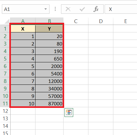
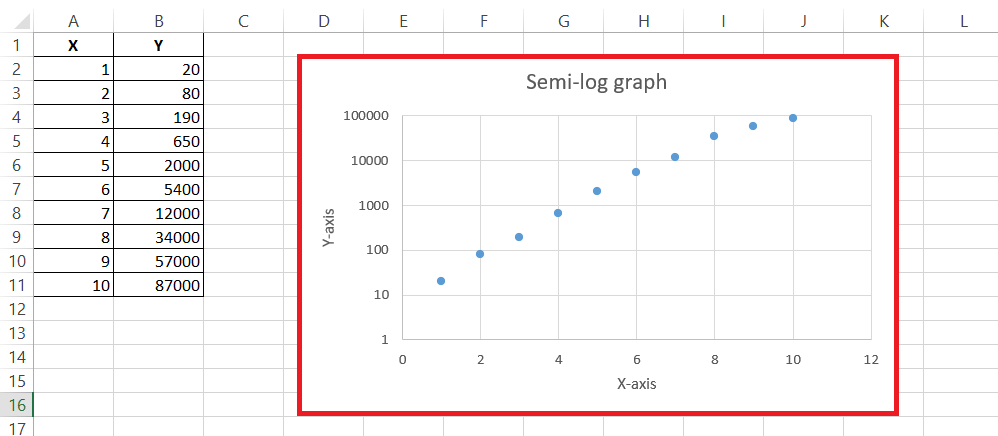
To make sure your semi-log graph has a solid foundation, start by laying down your data in Excel correctly. Begin by entering each data series in columns, with your independent variable data (often time or another linear measure) on the leftmost column and your dependent variable data (the one that may need a logarithmic scale) right next to it.

Keep things organized by labeling each column—that way, you won’t mix up your axes later on. Remember to confirm that all data points are in the right format, such as dates, numbers, or currency, to avoid any hiccups during the graphing process.

Inputting data correctly is critical— it’s like prepping ingredients before cooking. Get this step right, and you’ll set yourself up for smooth sailing as you craft your semi-log graph.

semi log graph in excel

Transforming Data into a Scatterplot

Transforming your data into a scatter plot is the next step on your semi-log graph journey in Excel.

STEP 1: After ensuring your data is neatly inputted, highlight all the necessary data cells.

semi log graph in excel

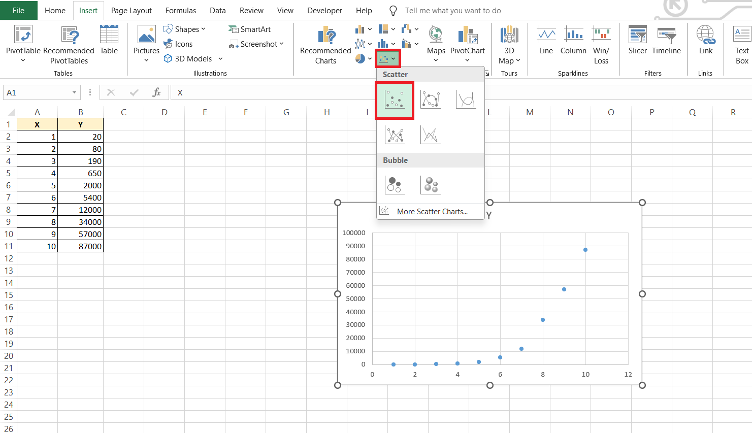
STEP 2: Navigate to the ever-so-helpful ‘Insert’ tab and glance over to the Charts group where you’ll find various chart options.

semi log graph in excel

STEP 3: Click on the first option under the ‘Scatter’ graph types.

semi log graph in excel

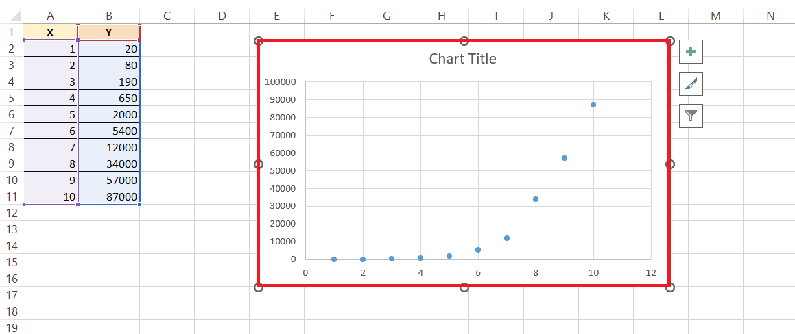
RESULT: And just like that, a scatterplot springs to life with your data points elegantly plotted.

semi log graph in excel

This scatter plot serves as the canvas for your semi-log masterpiece; it’s raw and ready for you to add the logarithmic touch. Keep an eye on the scatter plot—it should reflect a higher variability on the y-axis, indicating that you’re on the right track toward creating a meaningful semi-log graph.


Customizing the Semi-Log Graph

Modifying the Y-Axis Scale for Logarithmic Representation

Switching the y-axis to a logarithmic scale is where the semi-log graph truly takes shape.

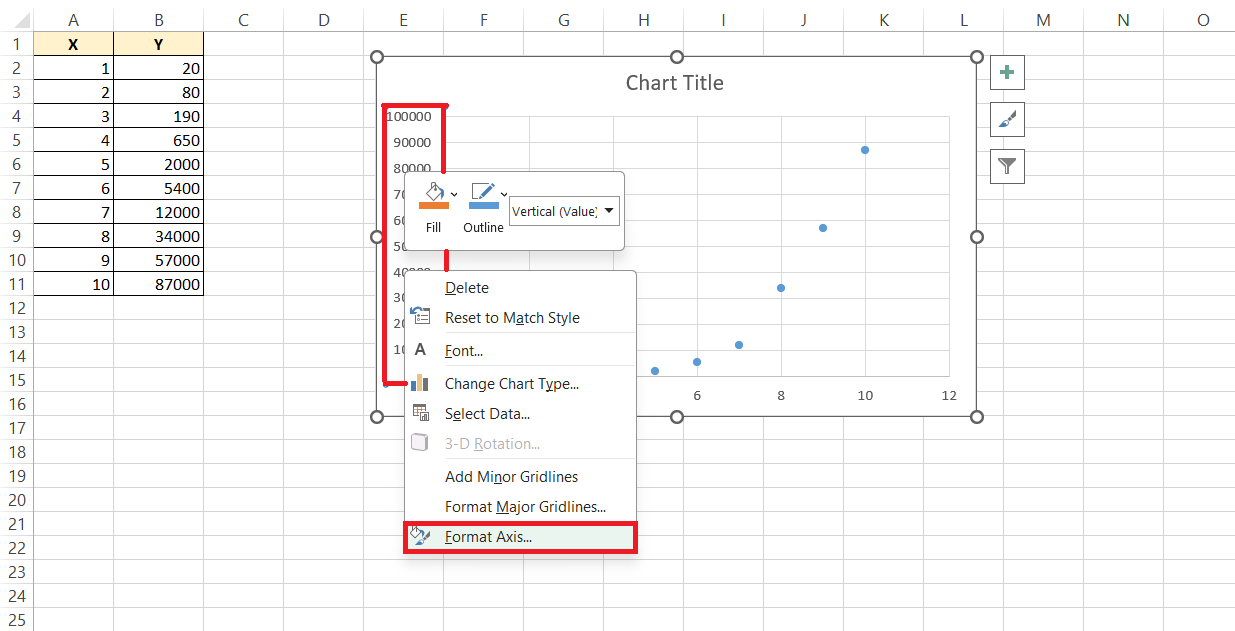
STEP 1: Right-click the y-axis, and a dropdown menu will appear—look for the ‘Format Axis’ option.

semi log graph in excel

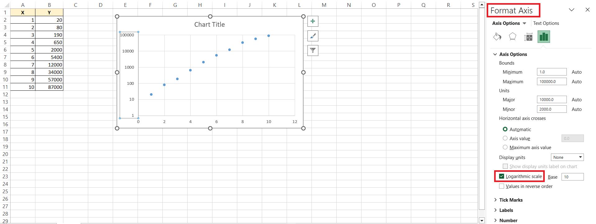
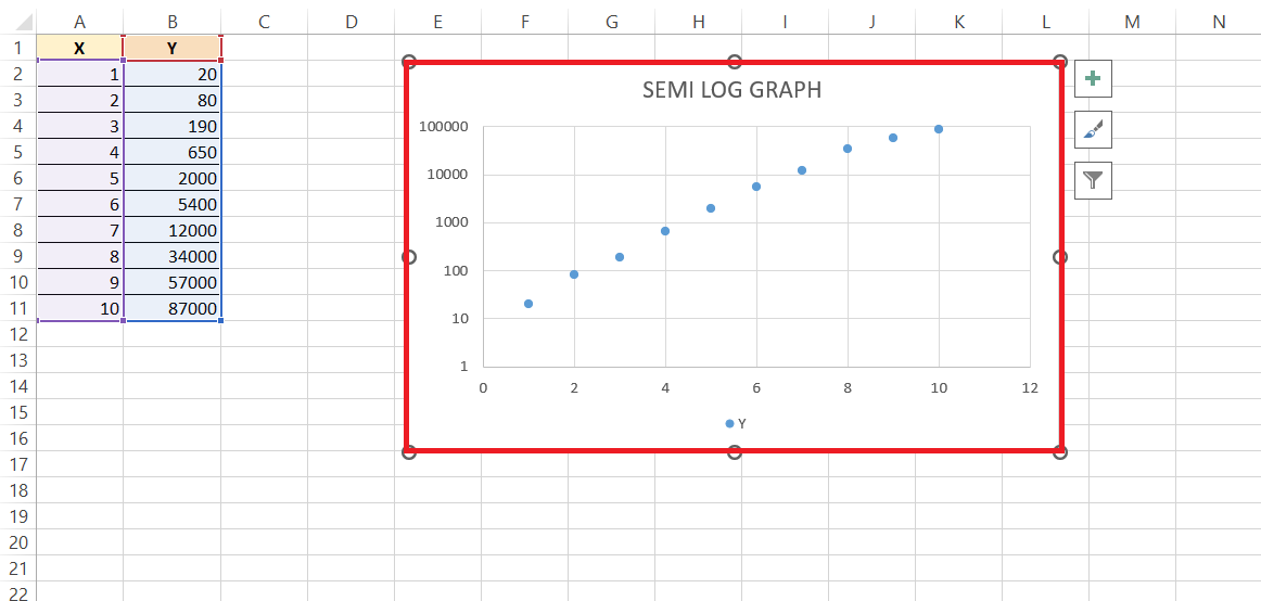
STEP 2: Once you’re in the Format Axis menu, you’ll see a box that deserves a check, aptly named ‘Logarithmic scale’. After checking it, Excel will work its magic, and your y-axis will transform from its mundane linear state to an exciting logarithmic scale.

semi log graph in excel

This might seem like a small step, but it has a big impact: your data points will now spread out more appropriately, making those previously cramped values easier to interpret. The difference will be clear—it’s like suddenly being able to read the fine print with the perfect pair of glasses!

Enhancing Chart Aesthetics with Titles, Legends, and Gridlines

For those final aesthetic enhancements that make your semi-log graph not just analytical but also visually appealing, let’s get creative with titles, legends, and gridlines.

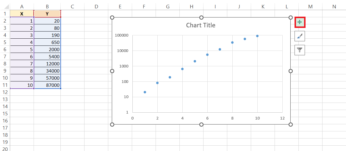
STEP 1: Head over to the ‘Chart Elements’ button (it looks like a plus sign near the chart), and let’s start by giving your graph a descriptive title to instantly clue your audience about the data story being told.

semi log graph in excel

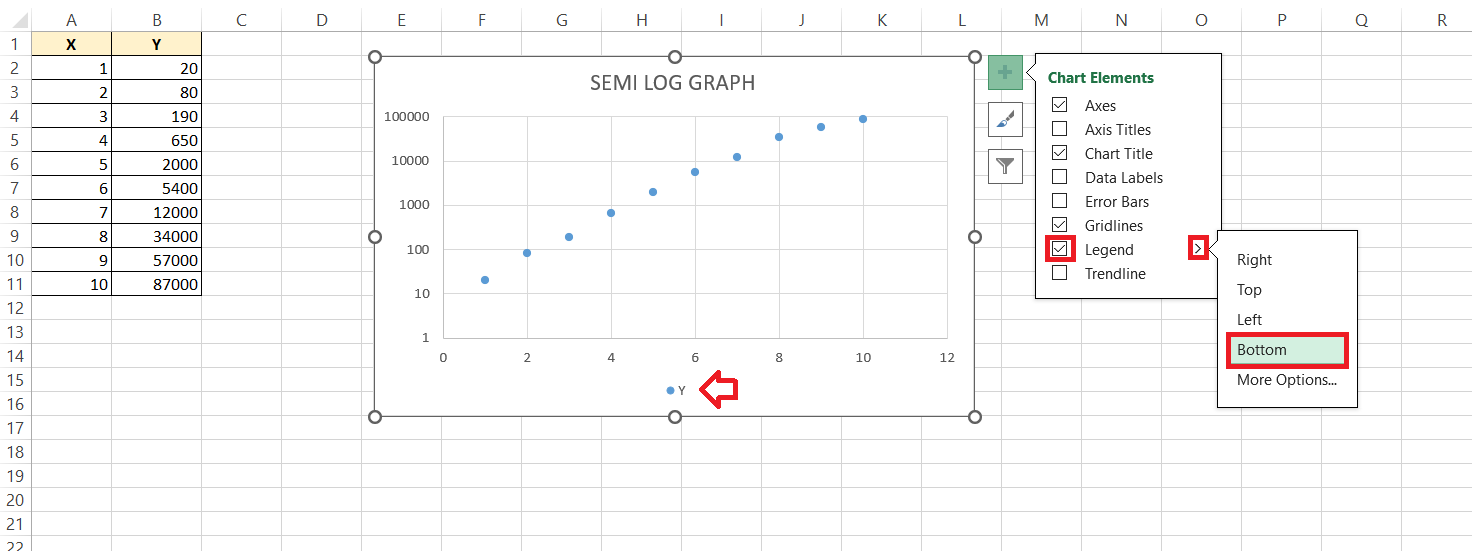
STEP 2: Next, toggle on the legend to craft a clear guide for different data series, ensuring nobody gets lost in translation.

semi log graph in excel

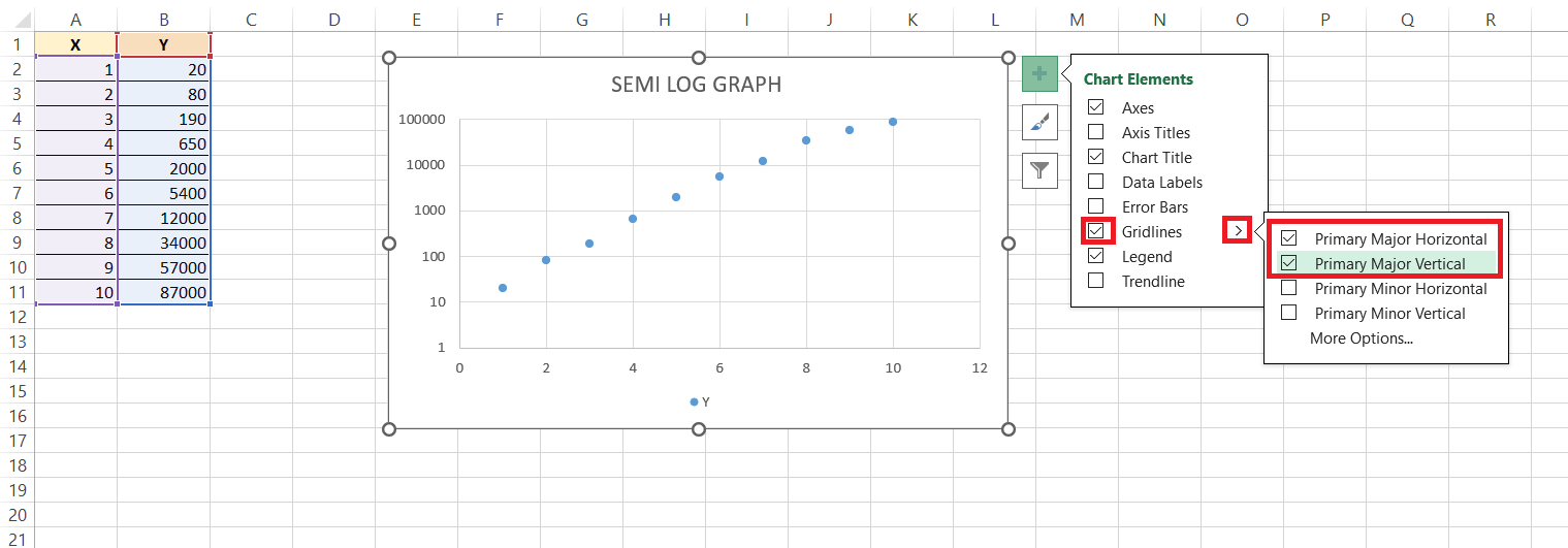
STEP 3: Gridlines are like the unsung heroes of chart readability—they bring order and ease to data interpretation. Add horizontal or vertical gridlines, or perhaps go for both, to help viewers smoothly trace data points back to their actual values.

semi log graph in excel

All these elements combined make your semi-log graph informative, accessible, and let’s face with it, better looking. It’s like dressing your chart for success, and who wouldn’t want that?


Tips for Efficient Semi-Log Graphs in Excel

Shortcuts for Faster Chart Manipulation

After you’ve got the basics down, let’s talk speed. In Excel, efficiency is key, and keyboard shortcuts are your fast pass. Here are a couple to keep up your sleeve: Press Alt + F1 immediately after creating a chart to whip it into an existing worksheet, leaving your data view undisturbed. Want to create a new chart on a separate sheet? F11 is your friend.

Drag-and-drop also comes in handy when you need to adjust data ranges on the fly; simply click on the chart, then pull the blue outline to cover the new data range. Lastly, for duplicating any formatting—perhaps you’ve styled one axis and want the other to match—use the Format Painter tool (a little paintbrush icon), which you can double-click to use multiple times.

Speedy shortcuts and nifty tricks like these can turn a task that feels like a crawl into a swift sprint.


Advanced Features for Dynamic Semi-Log Graphs

Adding a Trendline and Data Table for Detailed Analysis

Diving deeper into your data’s story means adding elements that reveal trends and précises. Enter the Trendline—a forecasting powerhouse that can highlight the underlying trend amongst the noise. To add one to your semi-log graph:

STEP 1: Click on your data series.

semi log graph in excel

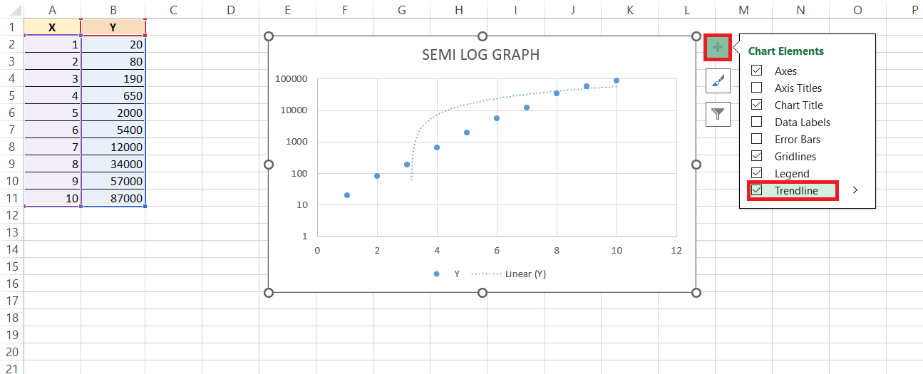
STEP 2: Go to the ‘Chart Elements’ button, and choose ‘Trendline’.

semi log graph in excel

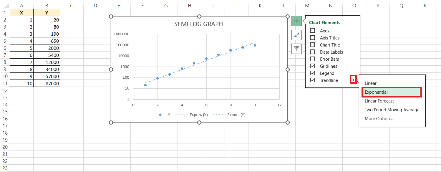
STEP 3: Excel offers several types, but for semi-log graphs, ‘Exponential’ often does the trick, meshing with the logarithmic scale seamlessly.

semi log graph in excel

These additions are like giving your viewers VIP backstage passes to your data analysis, offering them a more comprehensive understanding.


Exporting Your Graph for Presentations and Reports

When it’s time to take your semi-log graph beyond the Excel gridlines and into the wider world of presentations and reports, exporting it is a cinch.

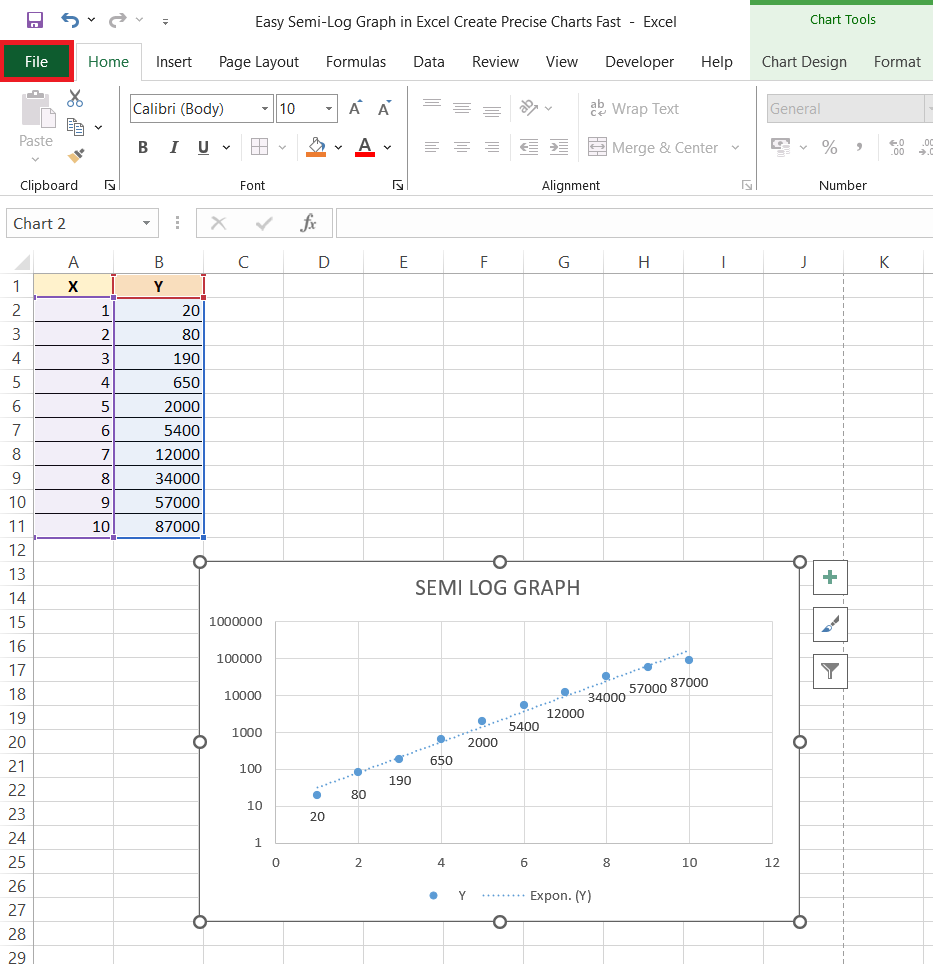
STEP 1: First, give your masterpiece a final check, then click on the ‘File’ tab.

semi log graph in excel

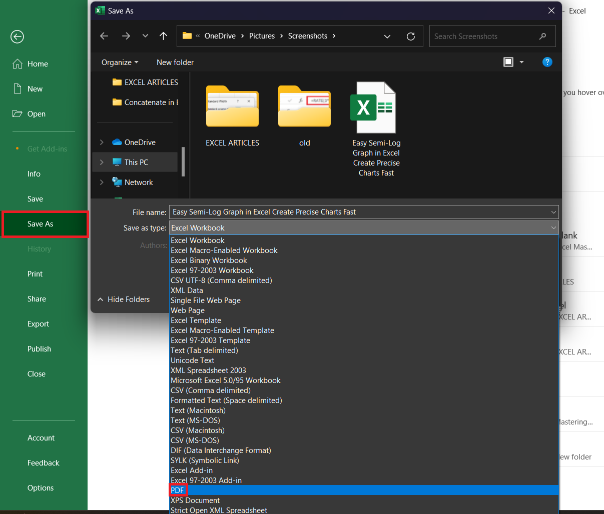
STEP 2: Navigate to ‘Save As’, and in the dialog box, you’ll find a plethora of formats. Choose ‘PDF’ for a document-ready look, ‘PNG’ or ‘JPEG’ for crisp images, or even ‘Excel Workbook’ if you want to keep your data intact for further editing.

semi log graph in excel

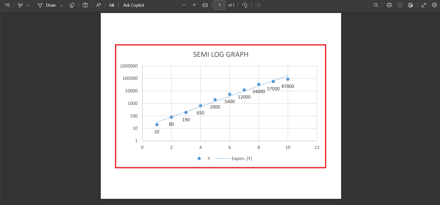
RESULT: Whether you’re zooming in for a boardroom presentation or distributing your findings in a comprehensive report, your semi-log graph can be right there, in high fidelity, ready to impress.

semi log graph in excel

Remember to name your file thoughtfully and select a save location you’ll remember — and just like that, your data is dressed up and ready to go wherever it’s needed.


FAQ: Fast Solutions to Common Semi-Log Graph Questions

How to do semi-log graph in Excel?

To create a semi-log graph in Excel, input your data into a spreadsheet. Next, select the data and insert a scatterplot using the ‘Scatter’ chart option—’Scatter with only Markers’ is perfect. Then, right-click the y-axis, choose ‘Format Axis’, and tick the ‘Logarithmic scale’ box. Your y-axis will update, and voila, you have a semi-log graph!

What is the rule for a semi-log graph?

For a semi-log graph, maintain uniform spacing along the x-axis for your linear scale and use logarithmic scaling on the y-axis. This allows each interval on the y-axis to represent a multiplication of values, accurately reflecting exponential growth or decay within your data.

What Are the Benefits of Using a Semi-Log Graph Over Other Charts?

Semi-log graphs are beneficial when you want to show exponential relationships or compare orders of magnitude. They excel over linear charts by displaying a vast range of data clearly, allowing you to see both minor variations in smaller values and significant shifts in the larger ones without skewing the visual representation. This makes it easier to analyze and understand datasets that would be cramped or unreadable on a standard linear graph.

What are some of the advantages of using a semI log graph?

Using a semi-log graph provides the advantage of visualizing data that depicts exponential growth or decline without distortion. It captures a wide range of data on a single chart, giving clarity to data sets that can be chaotic in a linear format. Semi-log graphs also excel in comparing relative growth rates of different sets, showing percentage change more clearly than absolute values, and can assist in forecasting trends by highlighting consistent multiplicative changes.

What are some of the disadvantages of using a semI log graph?

Despite their usefulness, semi-log graphs come with disadvantages. They require a certain level of understanding to set up and read correctly, potentially leading to misinterpretation, especially with highly fluctuating data or outliers. Comparing relative growth rates can also be challenging when dealing with different datasets because the logarithmic scale can obscure some details. These graphs are less intuitive than linear graphs, which can be a hurdle for those unfamiliar with them.

If you like this Excel tip, please share it


Founder & Chief Inspirational Officer

at

John Michaloudis is a former accountant and finance analyst at General Electric, a Microsoft MVP since 2020, an Amazon #1 bestselling author of 4 Microsoft Excel books and teacher of Microsoft Excel & Office over at his flagship MyExcelOnline Academy Online Course.

See also  Add High & Low Points in an Excel Sparkline

Star 30 Days - Full Access Star

One Dollar Trial

$1 Trial for 30 days!

Access for $1

Cancel Anytime

One Dollar Trial
  • Get FULL ACCESS to all our Excel & Office courses, bonuses, and support for just USD $1 today! Enjoy 30 days of learning and expert help.
  • You can CANCEL ANYTIME — no strings attached! Even if it’s on day 29, you won’t be charged again.
  • You'll get to keep all our downloadable Excel E-Books, Workbooks, Templates, and Cheat Sheets - yours to enjoy FOREVER!
  • Practice Workbooks
  • Certificates of Completion
  • 5 Amazing Bonuses
Satisfaction Guaranteed
Accepted paymend methods
Secure checkout

Get Video Training

Advance your Microsoft Excel & Office Skills with the MyExcelOnline Academy!

Dramatically Reduce Repetition, Stress, and Overtime!
Exponentially Increase Your Chances of a Promotion, Pay Raise or New Job!

Learn in as little as 5 minutes a day or on your schedule.

Learn More!

Share to...