Text highlighting in PowerPoint presentations can transform the way your audience engages with your content. Have you ever been in a presentation where you struggled to pinpoint what was crucial? That’s exactly what you avoid when you master the art of text highlighting. By bringing those critical chunks of text into the spotlight, you ensure that your key points don’t just skim the surface but rather sink in and resonate with the attendees. Think of it as a beacon, guiding your audience through the sea of information to the essential ports of knowledge.
Learn about Excel with our Free Microsoft Excel Online Course!
Key Takeaways
- Utilize the font color change option in PowerPoint to make selected text stand out by choosing a bright or contrasting color relative to your slide’s background.
- Insert shapes, like rectangles, behind the text and adjust their color to create a highlight effect; ensure the shape’s layer is behind the text for proper visibility.
- Apply custom animations that reveal a highlight effect upon click, enhancing the interactivity of the presentation and keeping the audience engaged with dynamic emphasis on key points.
Overview of Highlighting Techniques
In the toolbox of PowerPoint presentations, various text highlighting techniques offer you a range of options to ensure that your message stands out. The technique you choose can be as straightforward as altering the font color to more sophisticated methods like animated effects. Some presenters prefer the built-in “Text Highlight Color” option for quick emphasis, while others might opt for custom shapes that can wrap around the text for a more tailored look. Then there are the advanced techniques like animation, which add a dynamic layer to your presentation, grabbing your audience’s attention. Each method has its unique flair and serves different purposes, such as drawing focus to key stats or making a heading pop.
Table of Contents
Basic Methods for Highlighting Text
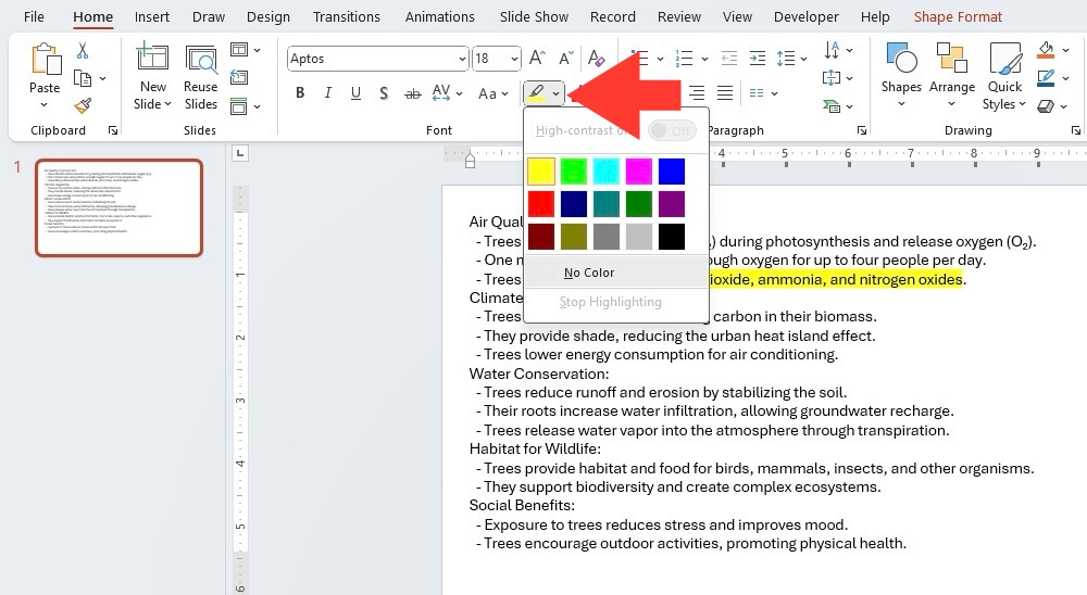
Using PowerPoint’s “Text Highlight Color” Option
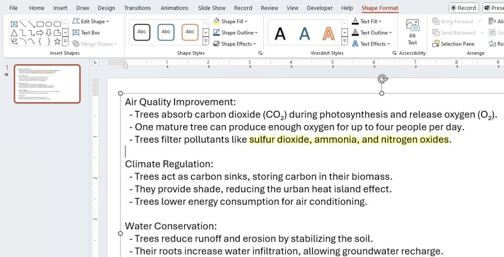
Using PowerPoint’s “Text Highlight Color” option is like wielding a trusty high-precision marker for your digital document. Simply select your desired snippet of text and then choose your highlight color from the Home tab for an immediate splash of attention. This is perfect for those who want to underscore important items quickly without any fuss. With an array of colors at your disposal, you can assign different hues for various categories of information, making it a breeze for your audience to follow along. Remember, it’s your visual call to action, so make it bold and eye-catching!
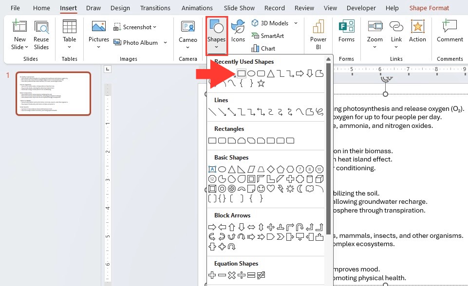
Highlighting Text with Custom Shapes
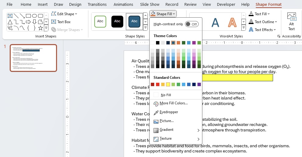
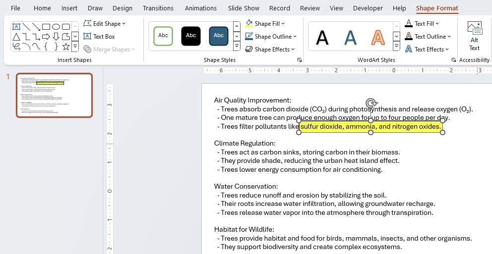
Introducing custom shapes into your text highlighting repertoire adds a creative twist to your usual emphasis strategy. Rather than a simple swipe across the text, you can draw interesting shapes around key phrases or numbers. Start by choosing a shape that compleates your message from the “Insert” tab. Draw it around the intended text, and then, take a trip to the “Format Shape” menu to fine-tune it with the perfect fill color, ensuring the text beneath is still readable. You could even play with the shape’s transparency to make your slide’s design as sophisticated or as playful as the context demands. While this approach allows for personalized touch, keep in mind that it could be tricky to get the text alignment just right within the shapes.
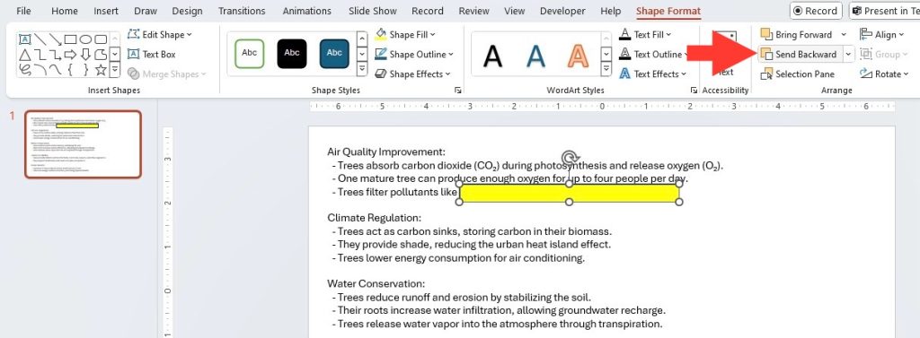
Use the “Send Backward” feature located in the Arrange panel to send the shape behind the text.
Custom shapes can serve various purposes, from encircling a statistic to putting an entire paragraph in a spotlight. However, it might seem inconvenient to adjust the fill or color for each shape or to position them accurately around the text. Remember, the goal is not just to highlight but to do so without distracting from the readability of your content. So, wield your shapes wisely!
Advanced Text Highlighting Techniques
Animated Highlight Effects for Dynamic Presentations
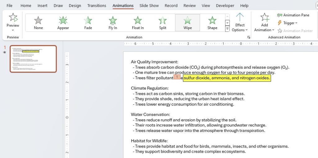
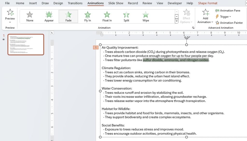
Breathing life into static slides, animated highlight effects create a sense of movement and grab your audience’s attention right where you want it. Picture a key term or phrase that not only stands out color-wise but also comes with its own spotlight — quite literally, with a glow or sparkle effect that fades in or out. Or envision a strategic line that is underscored by a moving underline, drawing eyes to your important conclusion.
These effects are accessible through the “Animations” tab, where you can assign custom animations to your highlights. They give a professional flair to your presentation, making it clear that you’ve gone the extra mile. It’s about giving your words the power to pop off the screen. But just a word of caution —animation can be like a strong spice: used correctly it enhances the dish, but overdo it and it overwhelms everything else.
When incorporating movement, timing is everything. Consider the pace of your presentation and use animations that complement it without causing a distraction. Also, loop back to using such effects sparingly, to reinforce, rather than detract from, the import of what’s being highlighted.
Creative Alternatives for When Standard Highlights Fall Short
Sometimes, the usual highlighter might not quite hit the mark when you’re looking to infuse creativity into your presentation. That’s when you turn to inventive alternatives. Think of using contrast with font size and styles to make text jump off the slide. Experiment with text boxes filled with color, paired with a contrasting text color to ensure the focus is unmissable. Moreover, you can use the power of imagery by placing transparent text over a striking photo, making sure your words are both read and felt.
Another imaginative approach involves using screen overlay techniques, where you progressively uncover highlighted sections. Think of it as peeling back layers to reveal your message, generating anticipation and focus. Using these creative alternatives requires a bit more PowerPoint savvy, but they can offer a fresh and memorable way to present your points when traditional highlights fall short. Always keep your audience in mind, ensuring that your creativity enhances comprehension rather than complicates it.
Remember to tailor these creative solutions to the tone of your presentation—subtlety might be key for a serious business meeting, while bold and bright could be just the ticket for a more casual talk. Use these alternatives to break up the monotony and keep your audience hooked on every word.
Step-by-Step Guides for Each Technique
Insertion of Brush Color Animation
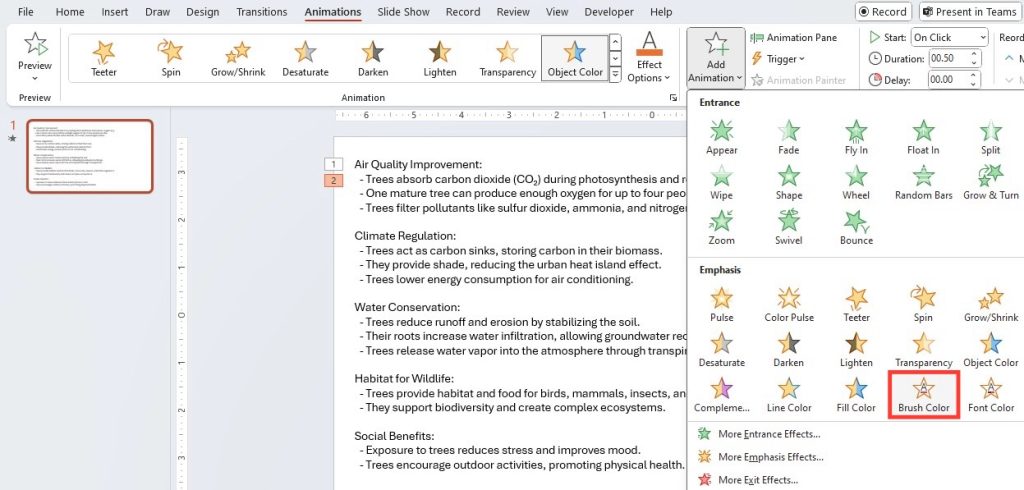
To truly tailor the design of your text with some pizzazz, the Brush Color animation is a gem in the PowerPoint toolkit. Imagine swiping a single color over your text, but one letter at a time, creating a wave of color that ushers your audience’s gaze across the words with rhythm and emphasis. Here’s the quick guide to making that happen:
STEP 1: Click your text and tap into the animation essence.
STEP 2: Hover over to “Emphasize,” then click “Brush Color.”
STEP 3: Catch that arrow for the dropdown menu—it’s sneakily important.
STEP 4: Navigate to “Effect Options,” the gateway to your color palette choice.
Crown the color suited for your text throne and let it reign over your slide.
It’s an effortless way to add sophistication and ensure that viewers not only see but also feel the significance of the words. Brush Color animation is especially nifty for highlighting numerical data where each number’s progressive revelation can build dramatic impact.
Adding Glow Effects and Underline Animations
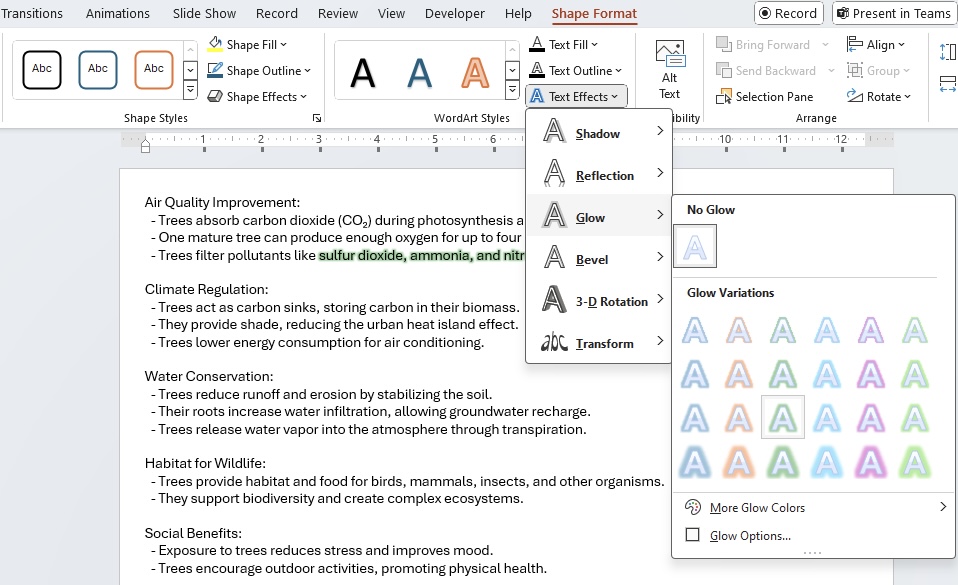
For that extra sparkle that makes your text come alive, adding glow effects is like wrapping your words with a halo of luminance. To get that ethereal outline radiating warmth and emphasis, you would venture to the ‘Format Text Effects’ panel, and from there, journey through ‘Glow & Soft Edges’. Within this oasis of options, you’ll find sliders and color wells to customize the celestial aura encompassing your text.
In the realm of underlines, animations add a kinetic underline that underscores not just your text, but the gravity of your points. Plunge into the ‘Animation’ tab to select an underline effect that doesn’t merely sit, but dances under your text, commanding undivided attention.
Both effects demand a dancer’s balance: too bright or too animated, and the glow or underline can overshadow the message rather than spotlight it. Here is how you elegantly swathe your text in glow and animate your underline without stealing the show:
STEP 1: Choose the piece of text that will wear the crown of glow.
STEP 2: Navigate to ‘Text Effects’ and find the warming embrace of ‘Glow’ settings.
STEP 3: Customize to the heart’s content but keep in mind the cardinal rule of subtlety.
STEP 4: Next, summon the Animation tab to animate your underline with the same careful deliberation.
Together, these effects form a duet on your slides, creating a spotlight that moves and breathes, allowing the audience to feel the pulse of your presentation—each animation a heartbeat.
Tailor these effects to fit your slide’s theme and remember, in the world of presentations, sometimes less is more, ensuring each word glows and each underline gesticulates with purpose and poise.
Tips and Tricks for Professional Presentations
Combining Animations for Enhanced Visibility
Sparking an unparalleled visual interest, the careful combination of animations in PowerPoint can turn a typical slide into an orchestration of emphasis and engagement. Like a conductor utilizing the strengths of each section in an orchestra, you can mix animations to direct the audience’s eye to key information. Maybe you’ll start with a fade-in to introduce a new point subtly, followed by an expand effect that magnifies the essential piece of data.
Here’s a mini blue-print to blend animations seamlessly:
- Dive into your key points and prime them with an entrance animation, setting the stage.
- Pique interest further with an emphasis effect, such as a color pulse, to mold the importance of the text.
- Conclude with an exit animation that either discreetly fades the text away or transitions into the next important element.
When combining animations, remember the narrative you’re weaving. The animations should complement each another and not compete for attention. A pointer is to play with the timing feature, staggering the start and duration of each animation, ensuring they unfold in a logical, digestible sequence.
Incorporating Best Practices for Consistency and Readability
Consistency and readability are the cornerstones for presentations that are both professional and powerful. To achieve that polished look, it’s crucial to maintain uniformity in the style, size, and color of your highlighted text throughout your slides. This helps in reinforcing your main messages and creates an intuitive flow for the audience to follow. Start by defining a theme that includes a specific set of fonts and colors and stick to it. Consistency breeds familiarity, and familiarity enhances understanding.
For readability, it’s all about clarity and comfort. The highlights should make the text easier to read, not harder. Contrast is your ally here—pair light highlights with dark text or vice versa, ensuring that your text doesn’t vanish into the background. Also, don’t let the spotlight of highlight upstage the actual performers; the font size should be ample, and the space around the text generous, giving each word its moment to shine.
Here are the commandments to uphold:
- Set a standardized format for highlighted text: color, size, and font style.
- Create a slide master to preserve uniformity across every slide.
- Remember the ‘less is more’ philosophy—don’t turn your slide into a kaleidoscope of different highlights.
- Periodically step back and view your slides from the perspective of a first-time viewer.
A presentation that’s consistent and easy to read speaks volumes of your attention to detail and respect for the audience’s engagement.
Avoiding Common Highlighting Mistakes
When Too Much Highlighting Can Distract
Finding the Goldilocks zone of highlighting requires a judicious hand. Here’s the deal: if everything is highlighted, then nothing is highlighted. Your safest bet is to be selective. Reserve the highlighter for the truly pivotal points you want to hammer home. A methodical approach is to highlight one key idea per slide or a select few words in a chunk of text. This way, you ensure that the audience’s attention is neither fragmented nor fatigued.
Remember, the aim is to make your presentation more effective, not more flamboyant. Treat highlighting as a strategic tool rather than decoration.
Choosing the Right Colors for Your Highlight
Selecting the perfect palette for your text highlights is akin to choosing the right frame for a masterpiece—it can either enhance the art or detract from it. The goal is to make certain elements pop without causing a visual clash that could lead to confusion or eye strain. Warm colors like yellow or orange usually make great highlights as they stand out, but aren’t harsh on the eyes. However, if you’re aiming for subtlety or a professional look, cooler tones like blue or green might be more appropriate.
Here are a few nuggets of wisdom for picking that ideal color:
- Mind your background. A dark-colored highlight might not fare well on a moody backdrop, while pastel highlights could be lost on a white canvas.
- Cater to color psychology. Different colors evoke different feelings—use this to your advantage.
- Ensure accessibility. Not everyone sees color the same way, so opt for hues that are universally distinguishable.
Always preview your choice in ‘Slide Show’ mode to see how it truly fares, and if in doubt, solicit a second opinion, because when it comes to presentation, perception is everything.
FAQ on Mastering Text Highlighting in PowerPoint
What is the Shortcut to Highlight Text in PowerPoint?
There isn’t a single-step shortcut to highlight text in PowerPoint, but you can use a keyboard sequence to access the highlight tool. Press Alt + H, then type T and C quickly in succession, and finally, press Enter. This uses the default or last-used highlight color. For more specific highlighting while in slideshow mode, you can toggle the highlight tool with Ctrl + I. Remember, these shortcuts help you navigate menus faster, but there’s no direct shortcut for text highlighting with a bespoke color.
How Can I Highlight Multiple Pieces of Non-Continuous Text?
To highlight non-contiguous text in your PowerPoint slide, start by selecting the first section of text. Then, hold down the Ctrl key (use Command on a Mac), and while holding it, click on other sections of text you want to highlight. Each selection will be added to the group. Then you can apply the highlight color to all selected text at once. This approach proves handy when you want to emphasize different parts of your slide without altering each piece of text individually.
How do you highlight typed words?
To highlight typed words in PowerPoint, first, click and drag your cursor over the text you wish to emphasize. Then go to the “Home” tab, click the arrow next to the “Text Highlight Color” icon, and choose your desired color. The selected text will now be highlighted in your chosen hue. For quick access, familiarize yourself with the text highlighting options and use the ‘Ctrl’ key technique for non-continuous selections.
John Michaloudis is a former accountant and finance analyst at General Electric, a Microsoft MVP since 2020, an Amazon #1 bestselling author of 4 Microsoft Excel books and teacher of Microsoft Excel & Office over at his flagship MyExcelOnline Academy Online Course.

