Learn about Excel with our Free Microsoft Excel Online Course!
Key Takeaways
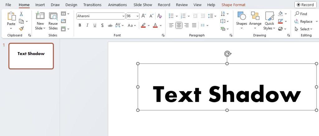
- Select the text on your slide that you want to enhance with a shadow effect.
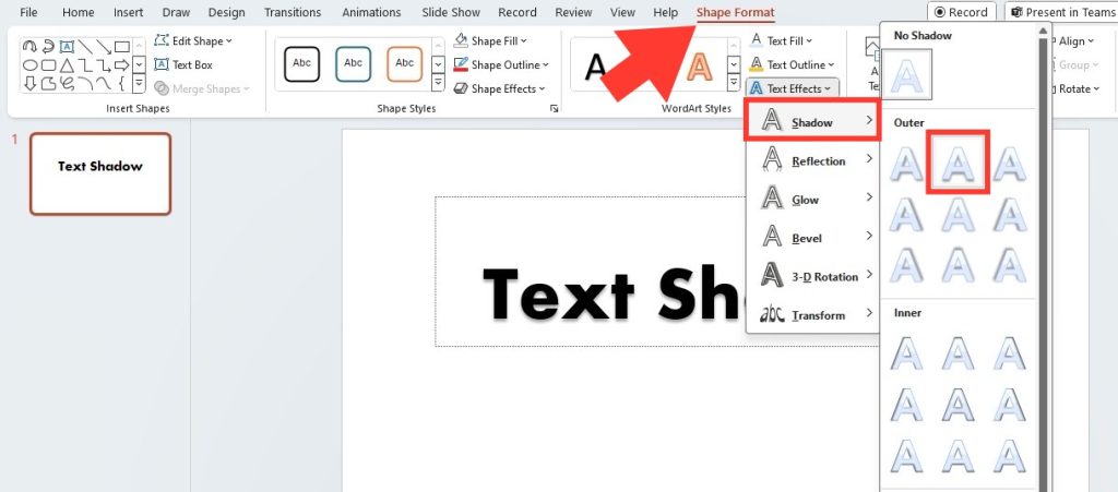
- Navigate to the ‘Format’ tab, click on ‘Text Effects’ in the WordArt Styles group, and choose ‘Shadow’ from the options available.
- Customize the shadow by adjusting the style, color, and opacity to fit the desired emphasis and aesthetic of your presentation.
Accessing the Text Shadow Options
Accessing the Text Shadow options in PowerPoint is like finding a hidden gem that can bring your text to life. It’s a simple process that begins with a click on the text box where your content lives. Then, navigate to the ‘Format’ tab on the ribbon—a treasure trove of text formatting features. Look for the ‘Text Effects’ dropdown; therein lies the ‘Shadow’ option, your gateway to adding depth and dimension to your presentation’s text elements. With a mere click, you’re ready to explore a wide array of shadow effects.
The Basics of Applying a Text Shadow
Applying a text shadow in PowerPoint is a walk in the park, and even if you’re new to it, you’ll pick it up in no time. Here’s how to get started:
STEP 1: Select the text you want to highlight with a shadow effect by clicking on the text box.
STEP 2: Click on the ‘Format’ tab > ‘Text Effects’ > ‘Shadow’.
STEP 3: Choose a shadow style that best fits your design needs. Instantly watch as your text gains depth and prominence on the slide.
STEP 4: Feel free to tweak the color, transparency, and size of the shadow to match your specific taste and presentation tone.
With these easy steps, you’ll see that adding text shadows is a breeze, transforming your slides from flat to fabulous.
Table of Contents
Customizing Your Text Shadow Effects
Adjusting Shadow Color and Transparency
Adding flair to your text with color and transparency adjustments can truly make your PowerPoint slides stand out. Follow these tips to get it just right:
Color Your World with Shadow
STEP 1: Select your text and hop into the ‘Format’ tab.
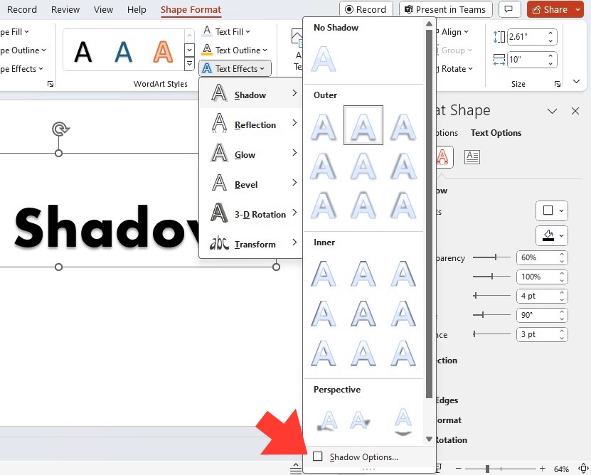
STEP 2: Click ‘Text Effects’ > ‘Shadow’ and then ‘Shadow Options’.
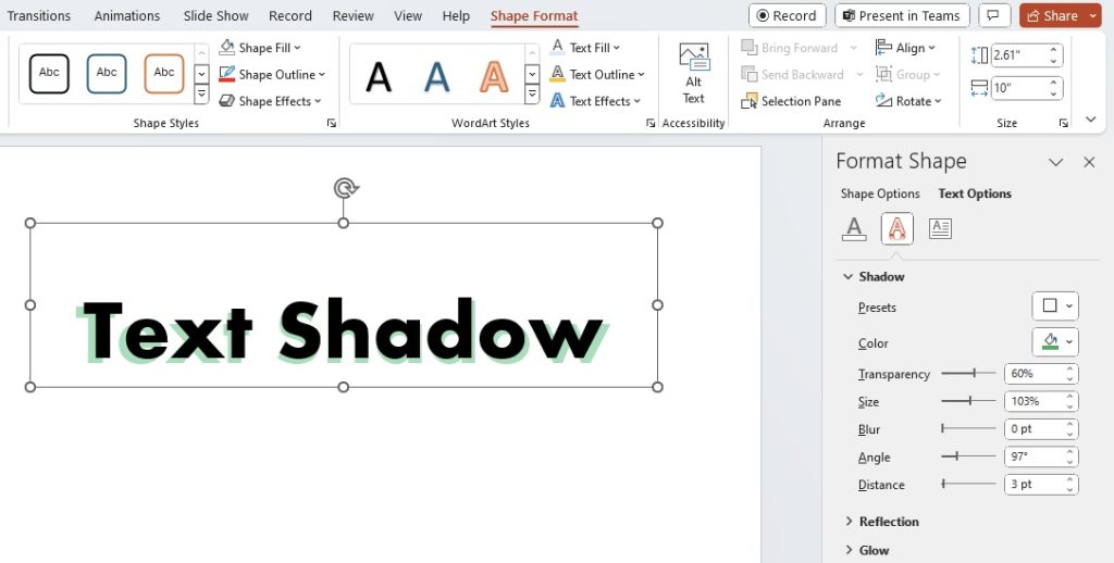
STEP 3: Here, hit the ‘Color’ button to unleash a palette of possibilities. Choose a hue from the Color Picker that complements your slide, or select from the pre-existing Color Swatches for quick matching.
Fine-tune with Transparency
- Still in ‘Shadow Options’, look for the ‘Transparency’ slider.
- Dragging this slider left or right dims or deepens your shadow effect, allowing for subtle nuances or bold statements, based on the desired visual impact.
By customizing the color and transparency of your text shadow, you can create a look that’s both eye-catching and coherent with your presentation’s design scheme.
Modifying Shadow Angle and Distance for Depth
To infuse your PowerPoint text with realistic depth, fiddling with shadow angle and distance is key.
STEP 1: In the ‘Shadow Options’, hunt down the ‘Angle’ and ‘Distance’ sliders.
STEP 2: Crank up the ‘Angle’ knob to pivot the shadow around your text, mimicking how light’s direction affects shadows in the real world.
STEP 3: Extend the ‘Distance’ slider to let your shadow stretch its legs, lending your text that sought-after 3D illusion. But remember, subtlety is a virtue – overextension might escalate into an unnatural look.
Just like sculpting, modifying the angle and distance of text shadow demands an aesthetic touch. You’re not just adding shadow; you’re crafting an invisible light source and playing with depth perception.
Advanced Text Shadow Techniques
Creating Hard and Soft Shadows
Crafting the perfect shadow in PowerPoint is about understanding the dance between hard and soft effects. It’s the difference between a whisper and a shout in visual form. Here’s your guide to mastering both:
Hard Shadows:
- Aim for a stark contrast? Head over to the ‘Shadow Options’.
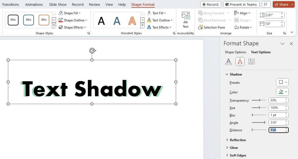
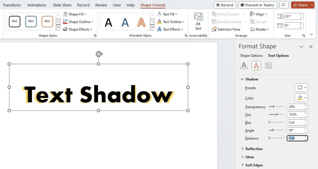
- Reduce the ‘Blur’ value to zero or close to it; your shadow will snap into a crisp outline.
- Keep the ‘Distance’ low to maintain the text’s readability while ensuring the shadow stands boldly.
- Yearning for a gentle touch? Again, bring up the ‘Shadow Options’.
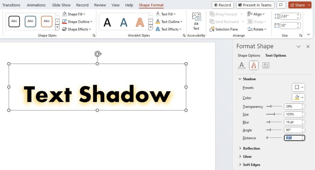
- Increase the ‘Blur’ to soften the edges of the shadow, creating a diffused glow.
- Slightly up the ‘Distance’ for a delicate separation, suggesting a more ambient light source.
Switching between hard and soft shadows allows you to set the right mood and focus for your slides. Just remember: the subtlety of a soft shadow whispers sophistication, while a hard shadow grabs attention with confidence.
Innovative Uses of Shadows for Emphasis and Style
Unleashing your creativity with text shadows can turn a mundane PowerPoint slide into a piece of art. Let’s explore two innovative ways to use shadows to add both emphasis and style to your presentations:
For Emphasis:
- Illuminate crucial points by using a text shadow that stands out. Opt for a bold color contrast and adjust the angle to draw the viewer’s eye directly to the key takeaways.
- Create a hovering effect by increasing the shadow distance and blur for selected text. This can make statistics or quotes appear to leap off the slide, commanding attention.
For Style:
- Pair shadows with unique fonts to echo a theme or era. A retro font with a long, soft shadow can transport viewers back in time, while a modern font with a tight, dark shadow screams sleek and contemporary.
- Layer shadows by applying multiple shadow effects with varied angles and distances to a single text element, building texture and depth that can mimic branding or design motifs.
Innovative use of shadows can help you highlight the most important elements of your presentation while adding a stylistic flair that aligns with your message and audience.
Overcoming Common Text Shadow Challenges
Ensuring Readability with the Right Shadow
Navigating the delicate balance between style and readability is crucial when implementing text shadows. Here’s how to ensure your slides remain clear and comprehensible:
- Always choose a shadow color that contrasts well with both the text and the background. This will help your words stand out without straining the audience’s eyes.
- Keep shadows crisp and close to the text for body copy to maintain legibility, especially when projecting in large rooms or onto big screens.
- If your background is busy or textured, use shadows to create a ‘halo’ effect around your text, setting it apart from the patterned backdrop while keeping it easy to read.
A well-placed shadow reinforces your message without overshadowing it, ensuring that your presentation communicates effectively with your audience.
Text Shadow Limitations and How to Work Around Them
Even with its visual appeal, it’s important to recognize the limitations that come with using text shadows in PowerPoint. Here’s a breakdown of what to watch out for and how to creatively work around these constraints:
- Visibility Across Slides: Remember, text shadows don’t carry over from one slide to the next. To maintain consistency, you’ll need to apply your preferred shadow settings individually or make use of the ‘Format Painter’ tool.
- Application on Text Only: Shadows can be applied exclusively to text elements. If you want to create a cohesive look with images or shapes, consider adding a similar shadow effect manually through image editing software or using PowerPoint’s ‘Shape Effects’ before incorporating them into the slide.
- Slight Adjustments Might Be Needed: Sometimes, what looks good on your screen may not project well. Be prepared to make minor shadow adjustments depending on the projection or screen quality where the presentation will be showcased.
By acknowledging these limitations and planning your design strategy accordingly, you can leverage text shadows to their full potential and keep your PowerPoint presentations looking sharp and consistent.
Saving Time with Text Shadow Shortcuts
Keyboard Shortcuts for Faster Formatting
Speed is key when you’re in the groove of designing an engaging PowerPoint presentation. Keyboard shortcuts are your secret accelerators, and here are a couple for applying text shadows without missing a beat:
- Text Selection Shortcut: Begin with Ctrl + A to select all text within a text box or placeholder, priming it for shadow effects.
- Clear Formatting: If you need to revert to the original text and start afresh with shadows, Ctrl + Space clears any current formatting.
Unfortunately, as of now, PowerPoint doesn’t offer a specific keyboard shortcut to directly apply text shadows. That said, you can still save time by using Alt followed by the sequential pressing of keys that navigate through the Ribbon interface to ‘Text Effects’ and ‘Shadow’.
Preset Shadow Styles for Quick Application
PowerPoint’s preset shadow styles are like having a personal stylist for your slides – they provide a swift makeover for your text. Here’s a snapshot of how they work:
- Select your text and head straight to the ‘Format’ tab, then ‘Text Effects’.
- Hover over ‘Shadow’ and a gallery of ready-made styles will appear, ranging from subtle glows to dramatic depth.
- Click on any of these presets, and voilà, your text is instantly dressed up with a shadow that sets the right tone.
Opting for these presets not only quickens the design process but also ensures a professional and consistent look across your slides. It’s an effortless way to add that extra pizzazz.
Practical Examples and Inspiration
Real-world Examples of Effective Text Shadows in Presentations
Real-world examples are invaluable when you’re looking to understand how text shadows can be applied effectively in presentations. Here’s what to look for:
- Seek out presentations from industry leaders or design-forward companies. They often use text shadows elegantly to enhance readability and emphasize key points.
- Observe how shadows are used in presentations at professional conferences or TED Talks. The use of shadows here is typically subtle yet effective, designed to add depth without distraction.
- Check out winning entries of design competitions or look for showcases on platforms like Behance or SlideShare, where professionals display their best work.
Seeing how others successfully use text shadows can inspire your own designs and give you a practical sense of what works in various presentation contexts.
Creative Ideas to Try in Your Next PowerPoint Project
Let your creativity run wild in your next PowerPoint project with these inventive text shadow ideas:
1. Evoke a Mood: Choose shadow colors and blur effects that reflect the vibe of your topic. A blue, lightly blurred shadow can feel serene, perfect for wellness topics, while a sharp, dark shadow may convey drama for more intense subject matter.
2. Layered Shadows: Cast multiple shadows on the same text at different angles and distances to create a multi-dimensional and sophisticated look that can make simple text appear complex and engaging.
3. Animated Shadows: Add motion to your shadows with PowerPoint’s animation features. A subtle fade in or movement can draw the eye compellingly to your message.
4. Shadow as a Graphic Element: Use text shadow not just for depth, but as a design element. For example, elongate a shadow to double as a directional line that connects different parts of your slide.
5. Text Cut-outs with Shadows: Make text appear as if it’s cut out from the slide background by using a shadow that matches the background color, creating a striking visual effect.
By integrating these creative shadow techniques, you can ensure that your next PowerPoint project will not only catch the eye but also keep your audience captivated throughout the presentation.
FAQs About Adding Text Shadow in PowerPoint
What Types of Text Shadow Can I Apply in PowerPoint?
In PowerPoint, you can choose from several types of text shadows, each adding a unique effect to your slides. The options include “Emboss,” which gives a raised look; “Glow,” for a radiant halo around the text; “Outer Shadow,” creating a traditional shadow behind the text; and “Inner Shadow,” which looks like the text is cut into the slide. Experiment with these to find the perfect fit for your presentation’s style and tone.
How Do I Remove or Adjust an Existing Text Shadow Effect?
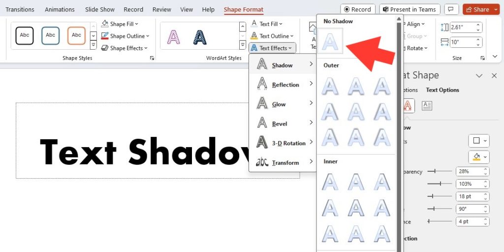
To remove or adjust a text shadow in PowerPoint, start by selecting the text with the shadow. Then, go to the “Format” tab and open the “Text Effects” menu. To remove the shadow, choose “No Shadow.” If you want to adjust it, click on “Shadow Options,” and tweak the settings to your liking, such as color, blur, and angle. Remember, modification is key to achieving the perfect visual tone for your presentation.
Are There Any Accessibility Considerations When Using Text Shadows?
Yes, when using text shadows, consider accessibility to ensure your content is readable for everyone, including those with visual impairments. Choose high-contrast colors and avoid excessive blurring, which can diminish text clarity. Keep shadows subtle to prevent a reduction in legibility and always test your slides with various display settings to ensure your presentation is clear and accessible to all audience members.
John Michaloudis is a former accountant and finance analyst at General Electric, a Microsoft MVP since 2020, an Amazon #1 bestselling author of 4 Microsoft Excel books and teacher of Microsoft Excel & Office over at his flagship MyExcelOnline Academy Online Course.

