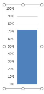
Thermometer Charts are one of the many Charts you can create in Excel. It does not really exist in Excel, however we can get creative and create our own.
A Thermometer Chart gives you a good view of the percentage of progress made on your project, budget etc.
We are going to use a Column Chart and customize it to make it look like a thermometer.
In this example I show you how easy it is to insert a Thermometer Chart using Excel.
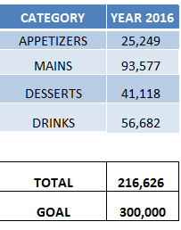
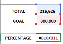
STEP 1: Given your data, ensure that you have the Percentage computed.
We have the Percentage computed as the Total divided by the Goal Amount.
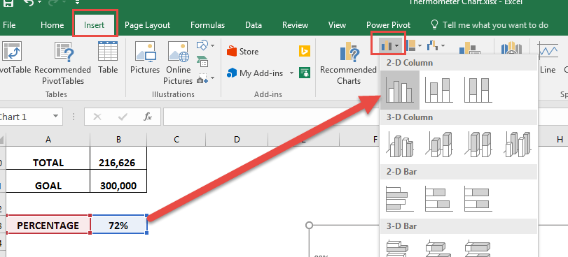
STEP 2: Select the Percentage value, and select Insert > Column Charts > 2-D Clustered Column
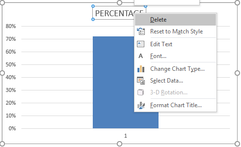
STEP 3: Right-click on the Header and Click Delete.
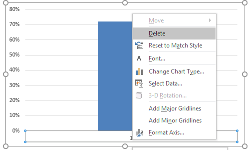
STEP 4: Right-click on the bottom column name and Click Delete
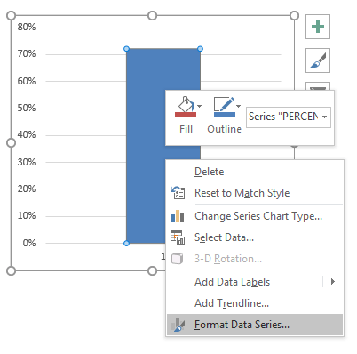
STEP 5: Right click on the Column itself, and Select Format Data Series.
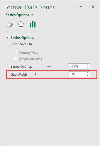
Set the Gap Width to 0%. This will ensure the column fills our entire chart.
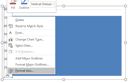
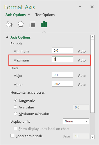
STEP 6: Right click on the Column percentages, and Select Format Axis.
Set the Maximum to 1. This will ensure our range is from 0% to 100%.
STEP 7: Resize the chart to a smaller size. You now have your Thermometer Chart ready.
Update your data values and see the chart go up and down!

Bryan
Bryan Hong is an IT Software Developer for more than 10 years and has the following certifications: Microsoft Certified Professional Developer (MCPD): Web Developer, Microsoft Certified Technology Specialist (MCTS): Windows Applications, Microsoft Certified Systems Engineer (MCSE) and Microsoft Certified Systems Administrator (MCSA).
He is also an Amazon #1 bestselling author of 4 Microsoft Excel books and a teacher of Microsoft Excel & Office at the MyExecelOnline Academy Online Course.

