Venn diagrams are a powerful tool for visualizing relationships and commonalities among different sets of data in Microsoft Excel. Although Excel does not have a built-in Venn diagram function, users can create a dynamic representation of their data by following a series of steps to construct a Venn diagram from scratch, allowing for clear graphical communication of overlapping data points.
Key Takeaways
- Organizing data into clear categories and intersections is critical for Excel to accurately represent relationships in a Venn diagram.
- To create a Venn diagram in Excel, use SmartArt by selecting it from the Insert tab to access different Venn diagram templates.
- For a professional-looking Venn diagram, maintain simplicity, select a coherent color scheme, balance the circle sizes, and use readable fonts for labels and data.
- Customize your Venn diagram in Excel by changing colors, styles, and layouts, ensuring the design complements the data and is visually balanced.
Grasping the Basics: What is a Venn Diagram?
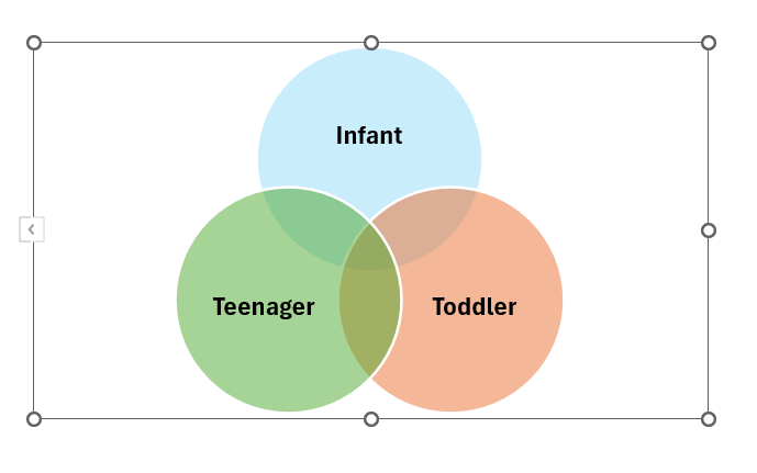
A Venn diagram is a visual representation of the relationships between different sets or groups of items. It consists of overlapping circles or other shapes, each representing a specific set. The overlapping regions represent the elements that belong to more than one set, showing the intersections and commonalities between the sets.
Venn diagrams are widely used in mathematics, logic, statistics, and various fields to illustrate the relationships and similarities between different groups or categories.
Excel as a Versatile Tool for Data Analysis
Excel is not just a spreadsheet program but a versatile tool for data analysis, offering an extensive range of features for sorting, organizing, and manipulating data to glean insights. With Excel, you can create interactive charts and diagrams, including Venn diagrams, which help visualize relationships and intersections between different datasets. Its intuitive interface and powerful analytical capabilities make Excel a go-to choice for professionals looking to convey their data graphically.
Excel’s Strengths:
- Customization options for modifying visual elements.
- Interactive charts that illustrate data with precision.
- Tools for meaningful and user-friendly reports.
Ideal for:
- Business analysts seeking actionable insights.
- Managers optimizing decision-making processes.
- Academics illustrating complex data relations.
Table of Contents
Step-by-Step Instructions for Constructing Venn Diagrams in Excel
Method 1: Using Excel SmartArt Graphics
Creating a Venn diagram in Excel is a breeze with SmartArt Graphics. Excel’s library offers a variety of pre-built Venn diagram templates under the SmartArt feature, simplifying your process. Here’s how you can get started:
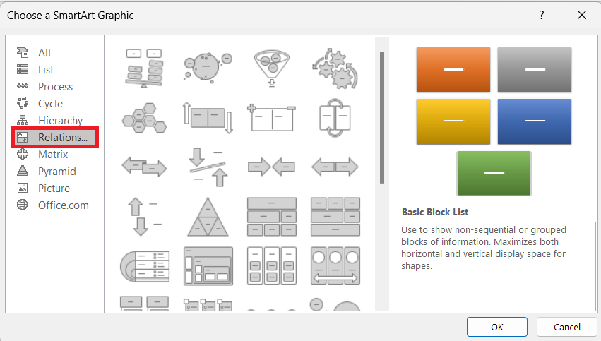
STEP 1: Click on the “Insert” tab at the top of your Excel worksheet. In the “Illustrations” group, find and select “SmartArt.”
STEP 2: A dialogue box appears, showcasing different types of graphics; click “Relationship” to narrow down your options.
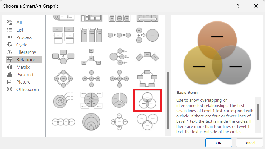
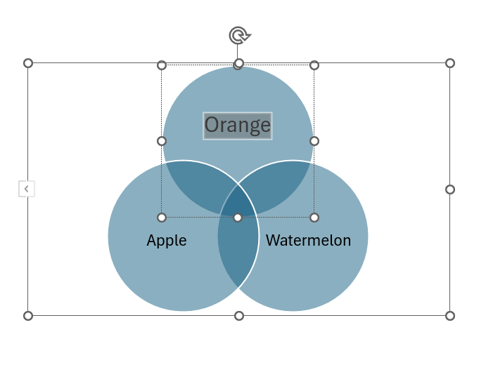
STEP 3: Look for the “Basic Venn” diagram template and click “OK” to insert it into your sheet.
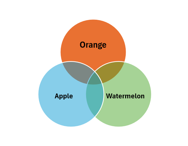
And just like that, you’ve inserted a professional-looking Venn diagram. Customize it by:
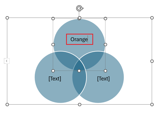
- Editing text labels directly within the graphic.
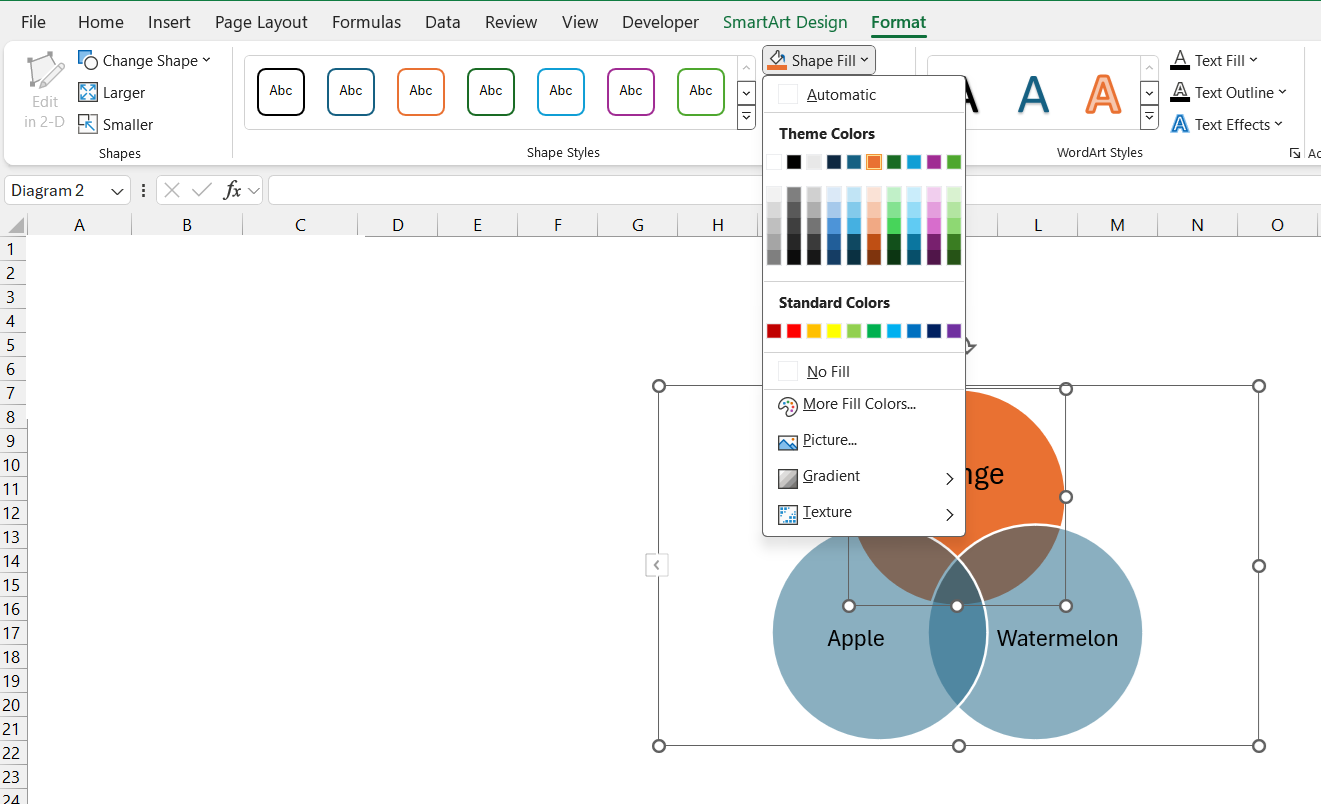
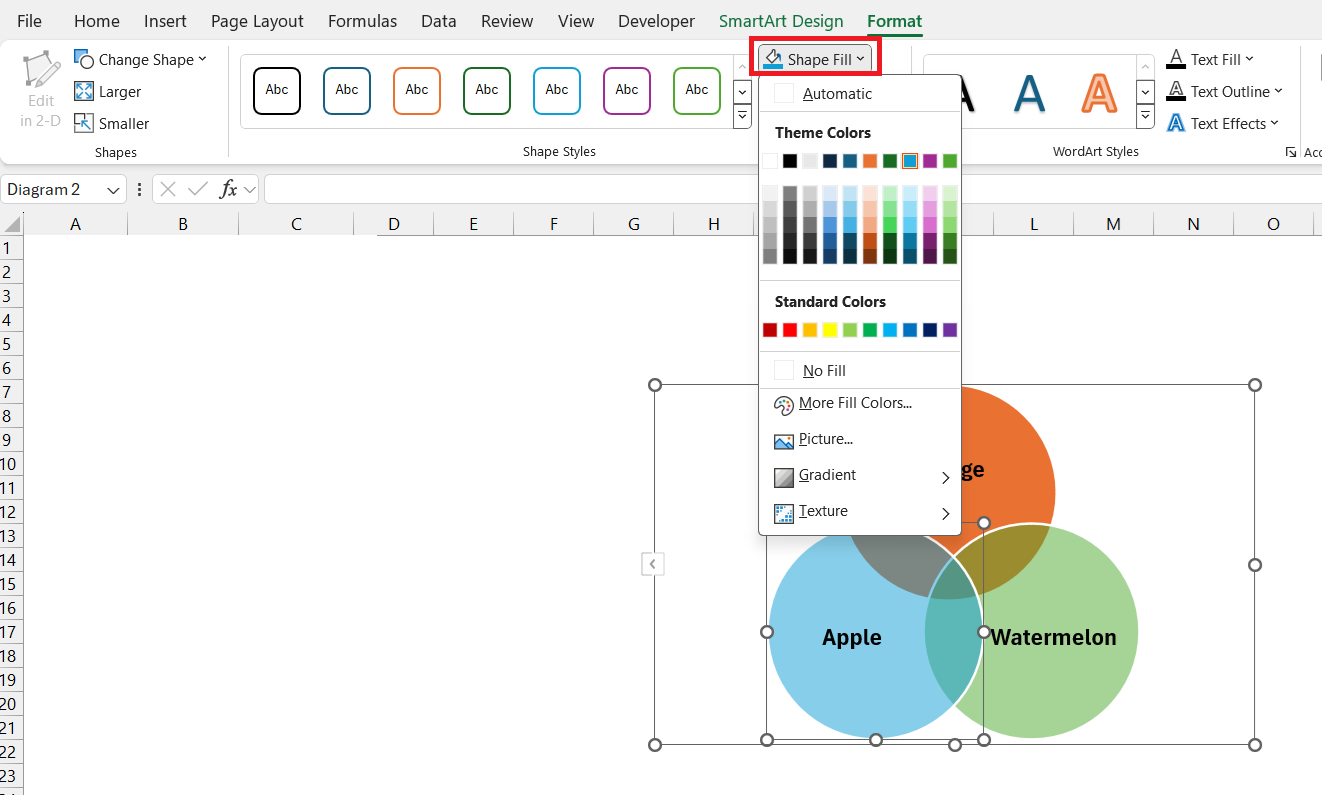
- Change colors using the “Format” tab.
- Adjusting sizes using the “Format” tab.
This method is particularly user-friendly for beginners or those seeking efficiency, ensuring you create a neat, accurate representation of your data intersections.
When to use this method:
- When you need a standard Venn diagram quickly.
- For presentations where simplicity and clarity are key.
- If you prefer using pre-defined templates over custom designs.
Method 2: Crafting Custom Circles via Excel Shapes
For those who want a more hands-on approach or need a Venn diagram that veers off the beaten path, creating custom shapes in Excel is the way to go. Here’s how you can manually craft your Venn circles:
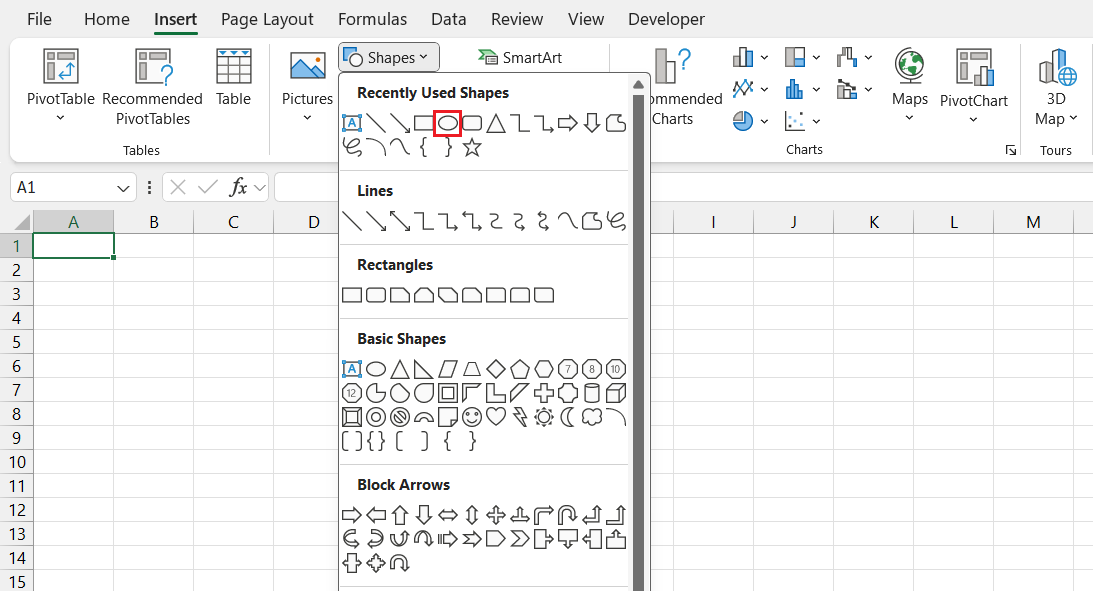
STEP 1: Navigate to the “Insert” tab.
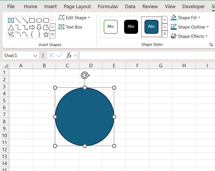
STEP 2: Click on the “Shapes” button to access a variety of shape options. Select the “Oval” tool to draw your circles; hold down ‘Shift’ to make them perfectly round.
Now, arrange your circles to form a Venn diagram.
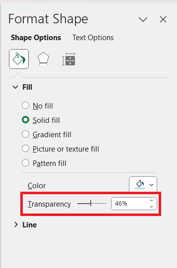
STEP 3: Right-click each circle, choose “Format Shape,” and adjust the fill color to a lighter tone and set the transparency to see through the intersecting areas.
STEP 4: Overlap them to represent the shared data points.
These steps allow you to create a Venn diagram that’s fully tailored to your specific data analysis needs. Experiment with:
- Varying circle sizes to represent different data magnitudes.
- Distinct colors for each set to enhance visual differentiation.
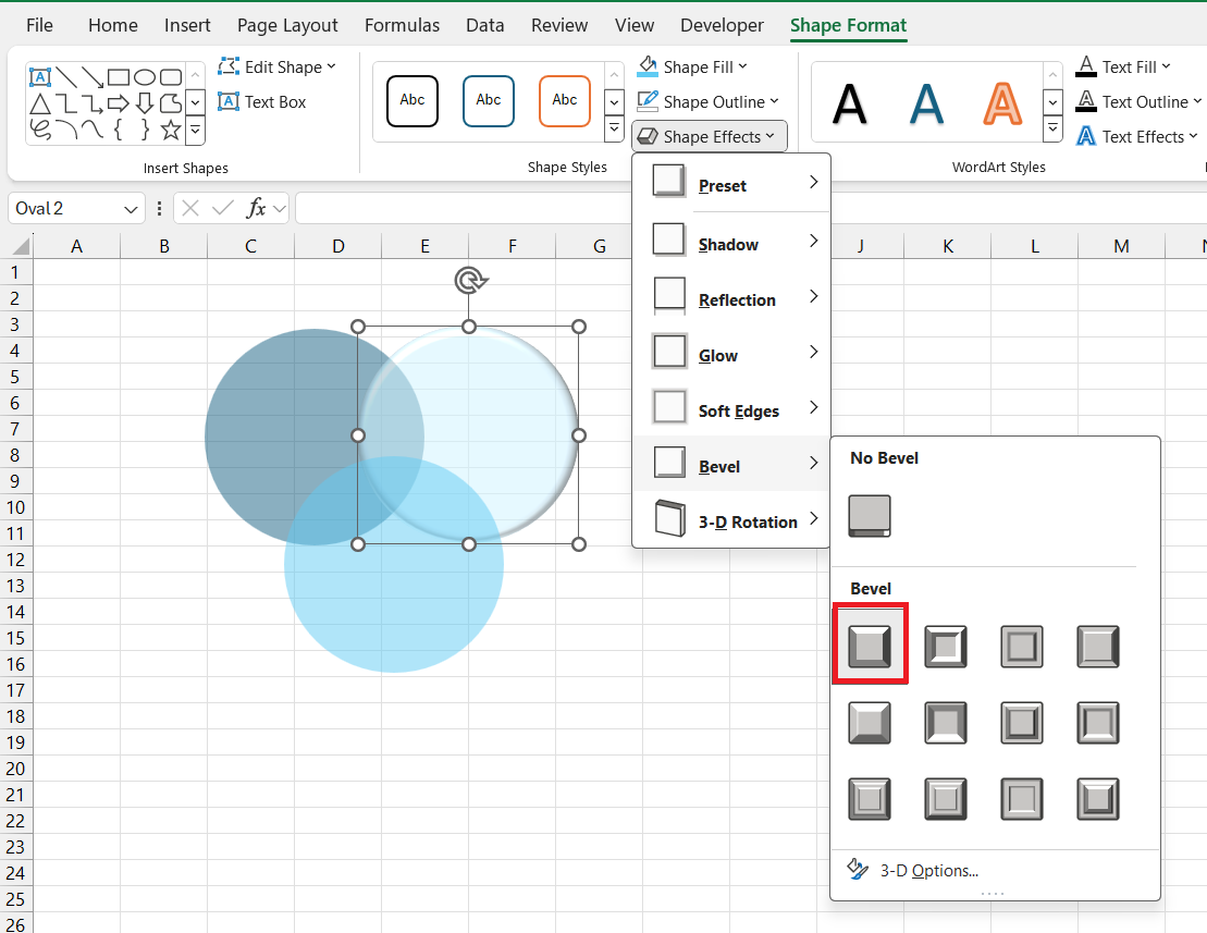
- Adding effects like shadows or glow for a more polished look.
This method’s appeal:
- Flexibility in design to match unique data sets.
- Direct control over sizing and overlap, to precisely illustrate relationships.
- Creativity freedom for a standout visual representation.
Remember, this approach requires slightly more time and design sensibility but offers a custom-made visualization that sets your data apart.
Customize the Venn Diagram in Excel
Change Layout
STEP 1: Click on the Venn diagram to select it.
STEP 2: In the Excel ribbon, go to the “SmartArt Design” tab.
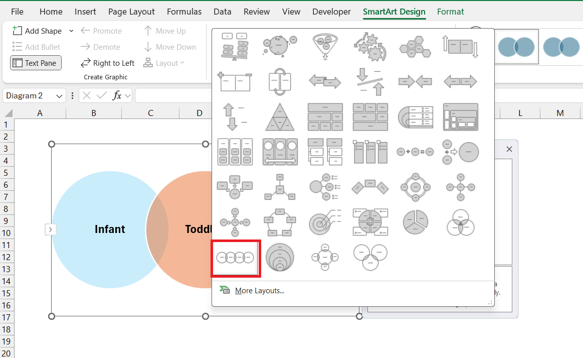
STEP 3: In the Layouts group, you can click on the different layout options to change the arrangement of circles in the Venn diagram.
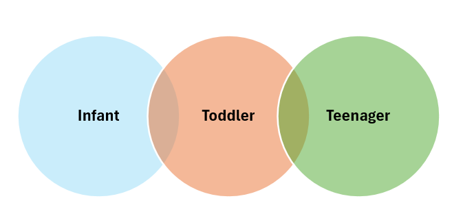
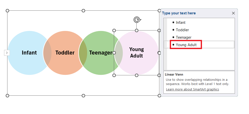
The layout will be changed from Basic Venn to Linear Venn Diagram.
Add Text
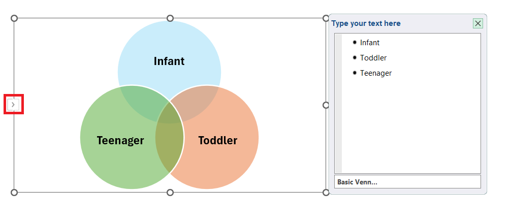
STEP 1: Click on the arrow on the left side of the Venn Diagram.
STEP 2: Press Enter and type the next item of the Venn Diagram.
Change Style
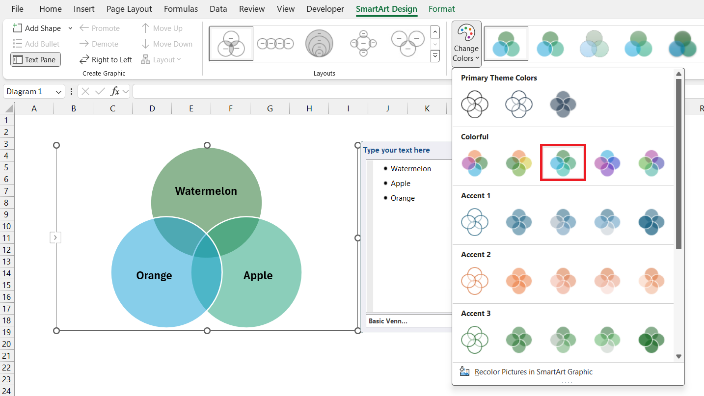
STEP 1: Click on the Venn diagram to select it.
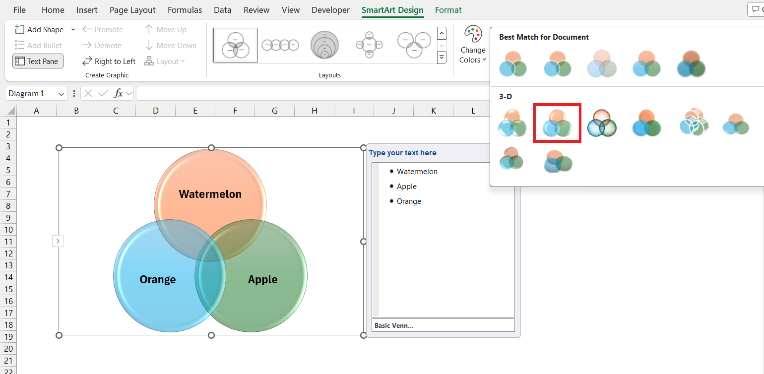
STEP 2: Navigate to the ‘SmartArt Design’ tab and choose ‘Change Colors’. Then, pick the color you want.
STEP 3: You can go to the Quick Style option and select the desired style.
Exporting and Sharing Your Venn Diagram Insights
Save and Share: Converting Your Excel Venn Diagram to Other Formats
After crafting your Venn diagram in Excel, sharing your insights is the next crucial step. Converting your diagram to other formats enhances accessibility and facilitates easy distribution. Here are ways you can save and share your Excel Venn diagram:
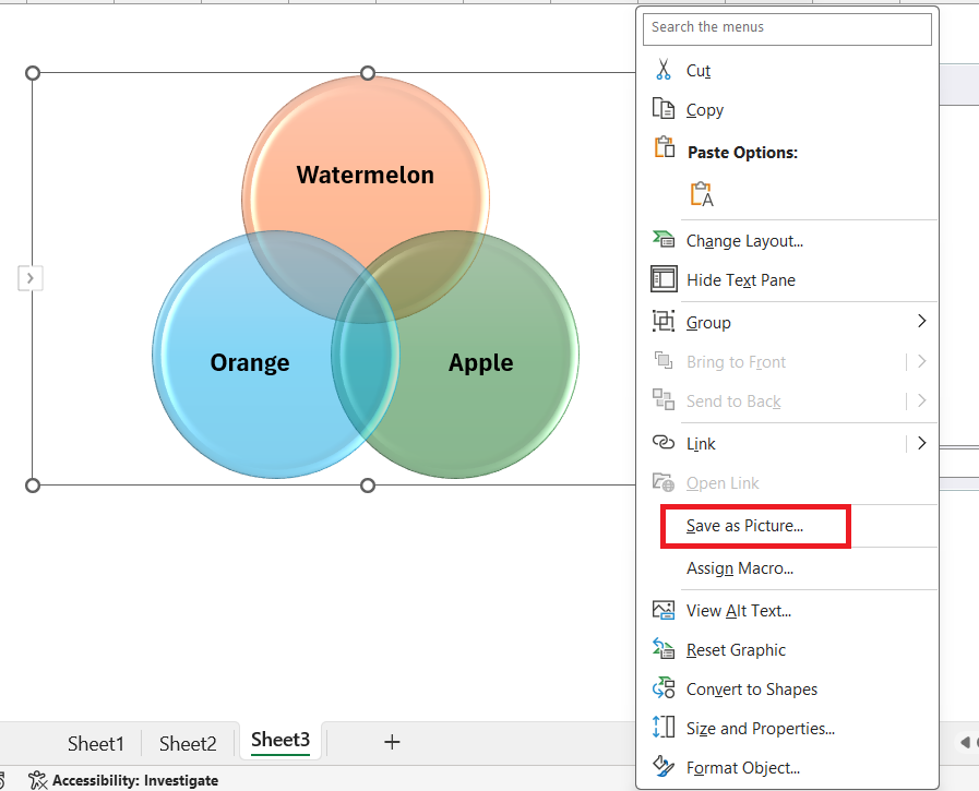
- To save your diagram as an image, right-click the Venn diagram and select “Save as Picture.” Choose formats like PNG or JPEG for universal access across various platforms.
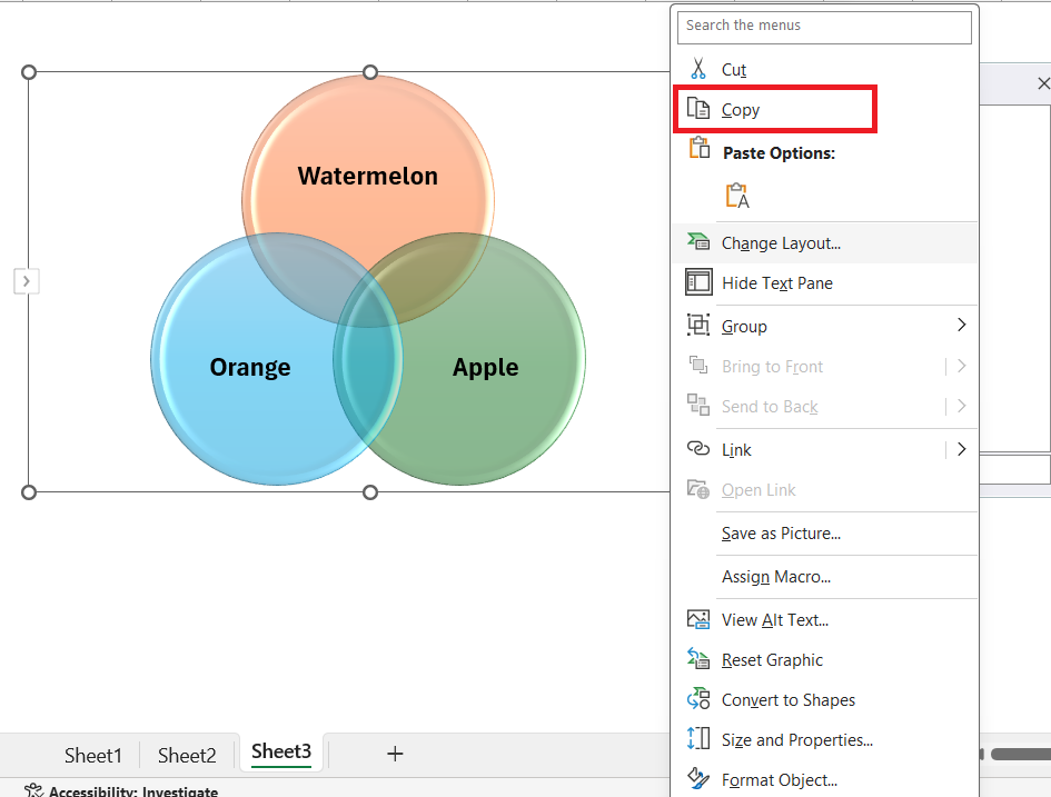
- Copying and pasting the Venn diagram into other Microsoft Office programs like Word or PowerPoint is useful for integrating your visualization into reports or presentations. Simply click on the diagram, copy it, and paste it directly into your desired Office document.
By saving and sharing your diagram in a variety of formats, you can effectively communicate your analysis, foster collaborative work environments, and reach a broader audience with your data-driven story.
Troubleshooting Common Venn Diagram Pitfalls
Resolving Overlapping Issues between Circles
When creating Venn diagrams in Excel, one common issue you may encounter is managing the overlap between circles, especially as you add more data sets. Addressing these overlapping issues is critical for a clear and accurate representation of data intersections. Here’s how you can resolve these concerns:
- Adjust Transparency: Use the “Format Shape” option to make overlaps visible by reducing the fill opacity of your circles. This way, you maintain visibility for each section, even where they intersect.
- Reposition Shapes: If you’re dealing with a crowded Venn diagram, it can be helpful to slightly reposition some of the shapes. This doesn’t mean changing the meaning of the data but optimizing space so that all overlaps and interactions are clear and discernible.
- Use Distinct Colors: Apply different colors to each circle in your Venn diagram to help distinguish between them. You can also vary the intensity of colors within the overlapping sections to further differentiate them.
- Amend Circle Size: Represent the volume of data proportionally by adjusting the size of your circles. Smaller or slightly altered sizes can help fit all the necessary overlaps without clutter.
- Provide a Key or Legend: When overlaps become particularly complex, including a key or legend can guide viewers through the visual representation without misinterpretation.
- Leverage Data Labels: Ensure that data labels are placed strategically so they don’t add to the clutter. Sometimes placing labels outside the circles with lines pointing to the specific areas can help.
Excel’s flexibility allows you to tweak and adjust your Venn diagram until it presents a clear and cohesive visualization. By being mindful of these overlapping issues and employing the strategies above, you’ll promote better understanding and analysis of your data points.
Taking these steps ensures that when others view your Venn diagram, they can immediately grasp the relationships and key intersections between the sets, making your work not only visually attractive but more importantly, an effective tool for data communication.
Navigating overlaps with precision enhances your Venn diagram’s readability, leading to better insights and more impactful data storytelling.
Tips for Venn Diagram Best Practices
Creating a Venn diagram in Excel can be straightforward if you stick to some essential do’s and don’ts, ensuring your diagram is as effective and as accurate as it can be.
Do:
- Keep It Simple: Aim for a clean, uncluttered layout to improve understanding and focus on key insights.
- Use Legible Text: Choose clear, readable fonts for labels and data points, ensuring that your text is easily decipherable at different sizes.
- Maintain Consistency: Apply consistent styling across circles and text elements to provide a cohesive visual experience.
- Check Data Accuracy: Double-check your data for correctness before plotting it within the diagram; the right data leads to reliable insights.
- Format for Clarity: Use contrasting colors and shades to effectively distinguish different sets and their intersections, but avoid overly bright or clashing combinations.
Don’t:
- Overcomplicate: Resist the temptation to add too many overlapping sets, which can confuse rather than clarify.
- Use Inconsistent Styling: Avoid mixing different color palettes or font styles that can distract and detract from the data story.
- Neglect White Space: Do not crowd your diagram with excessive text or graphics; white space is an integral design element.
- Forget to Proofread: Never skip reviewing your diagram for errors in text or data, as even small mistakes can compromise credibility.
- Ignore Accessibility: Be mindful of accessibility issues; not everyone can distinguish between certain colors, so consider alternative differentiation methods such as patterns or annotations.
By following these guidelines, you ensure your Venn diagram is not only accurate and informative but also visually appealing and accessible to all.
Adhering to these do’s and don’ts is a fundamental part of the Venn diagram creation process in Excel, playing a significant role in the effectiveness of your data presentation.
Frequently Asked Questions
Can you automate the creation of Venn Diagrams in Excel?
No, Excel does not have built-in automation for creating Venn diagrams directly from data sets. You have to manually craft your diagram using SmartArt, shapes, or a combination of other features and functions within Excel.
How do you put data into a Venn diagram?
To put data into a Venn diagram in Excel, you typically manually enter text labels corresponding to your data within the circles or use text boxes for precise positioning. There isn’t a direct method to automatically populate a Venn diagram from a dataset in Excel; it involves a step-by-step manual input process.
Why do we use a Venn diagram in excel?
We use a Venn diagram in Excel to visually display the relationships between different sets of data, highlighting overlapping characteristics and unique elements, which can enhance the comparative analysis and decision-making process. It’s a powerful tool for identifying commonalities and differences across variables.
How do you make a 4 way Venn diagram?
To make a 4-way Venn diagram in Excel, use either SmartArt Graphics or Shapes. With SmartArt, insert a Venn diagram from the Relationship category and add an extra circle. With Shapes, draw four overlapping circles manually, adjust their transparency, and label each section to represent the data sets and their intersections accurately.
John Michaloudis is a former accountant and finance analyst at General Electric, a Microsoft MVP since 2020, an Amazon #1 bestselling author of 4 Microsoft Excel books and teacher of Microsoft Excel & Office over at his flagship MyExcelOnline Academy Online Course.

