When I’m working with charts in Excel, one of the most important elements I focus on is the vertical axis, or what’s commonly known as the “Y-axis.” The vertical axis is essential in visually conveying the values that each data point represents, making it easier to interpret trends, comparisons, and overall patterns in data.
In this guide, I’ll show you everything you need to know about customizing and formatting the vertical axis to enhance your charts and make your data stand out.
Key Takeaways:
- Vertical Axis Basics: The vertical (Y-axis) is crucial in making data values clear and enhancing trend interpretation in Excel charts.
- Axis Customization: Customizing the vertical axis improves chart readability and ensures data is displayed accurately for the audience.
- Adjusting Scale: Changing axis scale settings, like minimum, maximum, and intervals, helps focus on specific data ranges or trends.
- Adding a Secondary Axis: A secondary Y-axis is helpful for displaying multiple data series with different units or scales in one chart.
- Label Alignment: Properly aligned and oriented labels make charts more readable and visually appealing, aiding quick data comprehension.
Table of Contents
Introduction to Excel Chart Axes
The Importance of Axis Customization
When it comes to conveying data effectively in Excel, axis customization is a powerful tool. Have you ever faced the frustration of trying to interpret a chart where the axes made no sense?
That’s why, as an expert journalist, I understand the critical role that well-defined axes play in making sure charts convey a clear message. Customizing the vertical axis of a chart ensures that the displayed data is not only accurate but also digestible for the audience. After all, the goal is to transform raw numbers into compelling visual stories.
Overview of Vertical Axis in Excel Charts
The vertical axis in Excel charts, commonly referred to as the Y-axis, is pivotal in charting as it represents the scale of values displayed. This axis is critical because it gives context to the data points — without it, interpreting the chart would be guesswork at best.
When properly utilized, the vertical axis can accommodate a range of data types, be it currency, percentages, or any unit of measure. Its versatility allows it to adapt to various chart formats, including bar, line, and scatter plots, making it a foundational element in Excel’s robust data visualization toolkit.
Understanding how to manipulate this axis effectively can turn a confusing graph into an insightful analysis tool. We’ll delve into how to do just that, covering the steps from setting up and modifying to troubleshooting and enhancing the vertical axis to optimize your data representation.
Setting Up Your Chart’s Vertical Axis
Adding a Secondary Y-Axis
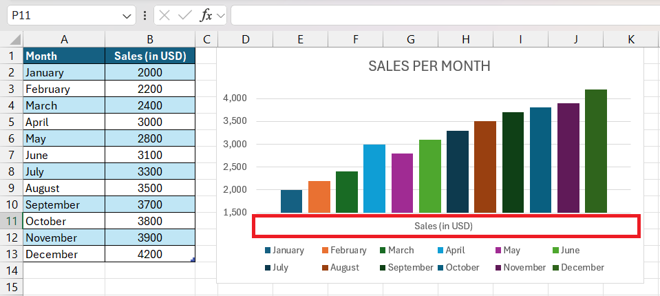
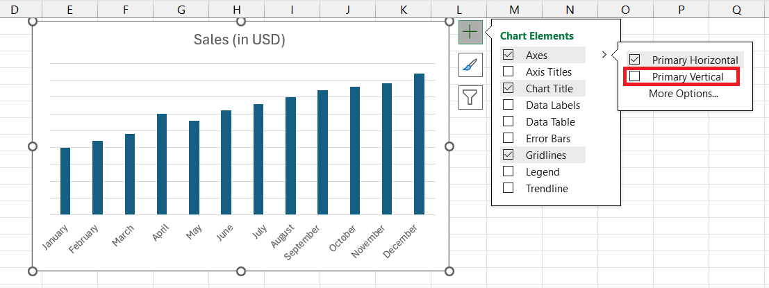
Most Excel charts, like line charts, bar charts, and column charts, have a vertical axis by default. However, sometimes I want to adjust which axes are displayed, particularly if I’m working with a simple chart or a custom data visualization. Here’s how I add or remove the vertical axis:
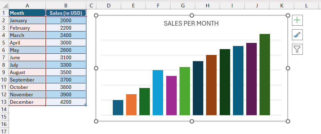
STEP 1: Click on the chart to make sure it’s selected.
STEP 2: Click the green Chart Elements icon (the “+” symbol) next to the chart.
Enable or Disable Axis – In the drop-down list, I select or deselect the Axes option to add or remove the vertical axis.
This feature is particularly useful if I’m creating a minimalist chart where the values are directly displayed on the data points and I don’t need the extra clutter of a vertical axis.
Adjusting the Scale of the Vertical Axis
Sometimes, I find that Excel’s automatic scaling doesn’t fit the specific needs of my data. Adjusting the scale can make a big difference in how data trends and details appear on the chart.
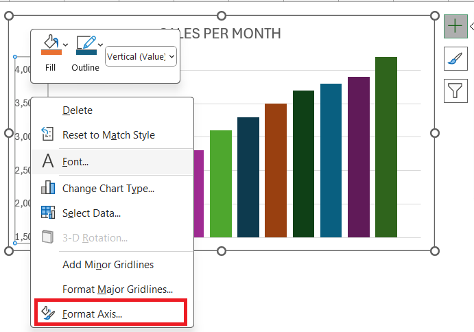
STEP 1: Right-click directly on the vertical axis in the chart and select Format Axis from the context menu.
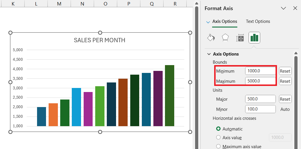
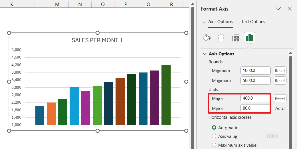
STEP 2: In the Format Axis pane that appears, I can change the Minimum and Maximum values.
This is especially useful if I want to zoom in on specific ranges or set custom start and end values that better fit my data.
STEP 3: Adjust the Major and Minor units to control how frequently values are labeled along the axis. Setting a smaller interval creates a more detailed display, which is great for data with frequent changes.
For instance, when I’m working with sales data that spans a large range, I might set the axis minimum at zero and adjust the maximum based on my highest sales figure. This helps prevent outlier values from skewing the scale.
Fine-Tuning the Vertical Axis Display
Adding a Secondary Vertical Axis
In cases where I’m comparing two data series with different units or ranges, I find it helpful to add a secondary vertical axis.
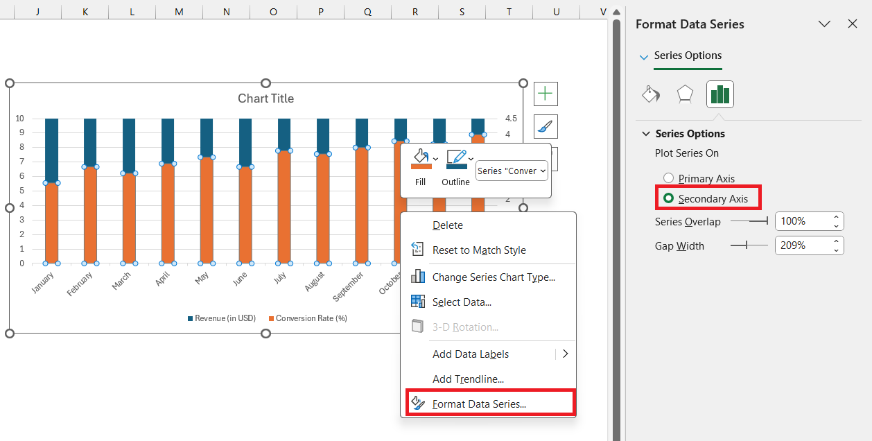
STEP 1: Click on the data series that I want to place on a separate axis.
STEP 2: Right-click and select Format Data Series. In the Format Data Series pane, I check the box for Secondary Axis.
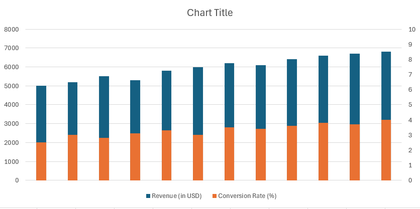
This adds a second vertical axis to the right side of the chart, allowing me to display the series independently from the primary axis.
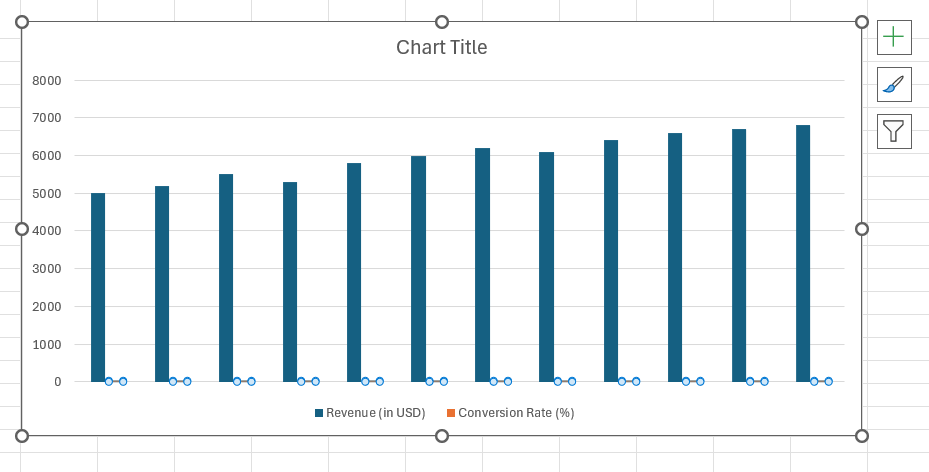
This feature is handy when I’m comparing metrics like revenue (primary axis) and conversion rate (secondary axis) in a single chart.
Troubleshooting Common Vertical Axis Issues
Removing an Unwanted Secondary Axis
Removing an unwanted secondary axis in Excel can be as satisfying as decluttering a busy workspace. At times, a chart might benefit from being simplified, and eliminating an extraneous Y-axis is just the remedy.
To get started, I select the chart, click on the secondary axis that I intend to remove, then press the Delete key. It’s that straightforward. The chart immediately reverts to a single-axis format, which often makes the data more approachable and less overwhelming, especially for those who prefer clean visuals.
Additionally, another method I use involves the Chart Elements menu — a quick click on the Chart Elements button, a small click on the arrow next to ‘Axes’, and then unchecking the ‘Secondary Axis’ box makes the same transformation.
And voila! The chart is streamlined, and cleaner, carrying forward just the essential data elements necessary for a clear analysis.
Aligning and Orienting Labels Correctly
Aligning and orienting labels correctly in an Excel chart is akin to setting the table right for dinner. Just as proper place settings make the meal enjoyable, well-aligned labels ensure that data consumption is effortless and pleasurable.
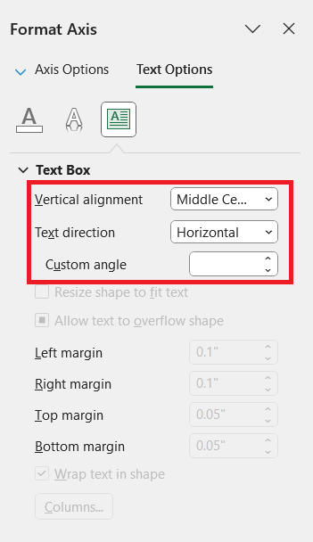
I start by right-clicking on the axis labels, then I dive into the Format Axis menu to fine-tune their orientation. Under the Text Options section, I explore the Text Box settings, making adjustments to the vertical alignment, text direction, and custom angle as needed.
I might tilt them at an angle if they’re overlapping or too tightly packed, or I could choose to orient them horizontally or vertically for the best readability.
The goal is always to align and orient the labels in a way that feels both natural to read and looks clean aesthetically. With appropriately aligned labels, the eye smoothly follows the data, making analysis not just accurate but also visually pleasing.
FAQ: Mastering Vertical Axis Customization
How to set vertical axis in Excel?
To set the vertical axis in Excel, right-click on the existing vertical axis labels and choose ‘Format Axis’. Within the Format Axis panel, you can define the axis bounds, units, number format, and other options to customize the display according to your dataset’s needs for clear and effective visualization.
How Can I Add a Secondary Y-Axis in My Excel Chart?
To add a secondary Y-axis in your Excel chart, click on your chart, go to the Chart Design tab, and select ‘Change Chart Type’. In the dialogue that appears, choose ‘Combo’ and pick ‘Cluster Column – Line on Secondary Axis’. Check the box for ‘Secondary Axis’ next to the data series you want to plot differently, then click OK.
What Steps Should I Follow to Change the Axis Scale?
To change the axis scale in Excel, click the chart’s vertical axis to reveal the Format Axis pane. Under ‘Axis Options’, adjust the minimum and maximum bounds to set the scale’s beginning and end. You can also change the major and minor units to alter the interval between tick marks.
How Do I Change How Text and Numbers Appear in Axis Labels?
To modify text and numbers in axis labels, click the axis you want to format and select ‘Format Axis’. In the Format Axis pane, choose ‘Number’ to set the desired number format, like currency or percentage. For text, use the Home tab’s Font group to adjust the font, size, and color for label clarity.
Can I Make Label Text Different from the Worksheet Labels?
Yes, you can make label text in the chart different from the worksheet labels. Right-click on the chart’s category axis and select ‘Select Data’. In the ‘Select Data Source’ dialog, click ‘Edit’ near ‘Horizontal (Category) Axis Labels’ and type your custom labels, separated by commas. Click OK to apply your custom text.
John Michaloudis is a former accountant and finance analyst at General Electric, a Microsoft MVP since 2020, an Amazon #1 bestselling author of 4 Microsoft Excel books and teacher of Microsoft Excel & Office over at his flagship MyExcelOnline Academy Online Course.

