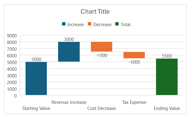
Have you ever needed a clear, visual way to show how individual components contribute to a total? This is where the Waterfall Chart in Excel becomes a lifesaver. It’s particularly useful in finance for showing changes in financial data over time, like profit margins or budgets, but it can be used across various domains.
In this article, I’ll walk you through everything you need to know to create and customize a waterfall chart in Excel.
Key Takeaways:
- A waterfall chart shows how individual components contribute to a total with both positive and negative values.
- It’s ideal for tracking financial reports, project management, or sales analysis by visually breaking down changes over time.
- Creating a waterfall chart in Excel involves organizing data, inserting the chart, and marking totals for clarity.
- Customizing colors and data labels enhances the readability and impact of your waterfall chart.
- Waterfall charts are great tools for financial reporting, project tracking, and performance analysis, making complex data easy to understand.
Table of Contents
Introduction to Waterfall Charts in Excel
What Is a Waterfall Chart?
A waterfall chart helps you see the cumulative effect of sequential values, both positive and negative, on a starting point. It’s a great way to visualize data where you start with a total, then have various increases and decreases, and finally end up with a net result.
Think of it like building blocks. Some blocks stack upward (positive values), while others lower the height (negative values). The final block shows your net outcome. This makes it easy to trace how a starting value changes over time or due to different factors.
When to Use a Waterfall Chart
In my experience, waterfall charts shine when you need to explain changes between two points—whether that’s tracking profits, project timelines, or changes in inventory. I often use them when I need to break down revenue growth or cost analysis in a presentation. Some specific scenarios include:
- Financial reports: Show how net profit is impacted by revenue, costs, taxes, and other components.
- Project management: Visualize how changes in resources or timelines affect overall progress.
- Sales analysis: Break down the growth or decline across different periods.
Step-by-Step Guide to Creating a Waterfall Chart
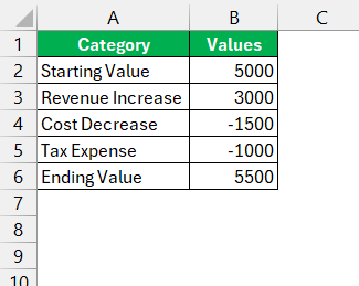
STEP 1: First, I start by organizing my data into a table. Make sure you have the following columns:
- Category: This is the label for each bar in your chart (e.g., Revenue, Costs, Profit).
- Values: The numeric values represent how much each factor impacts the total.
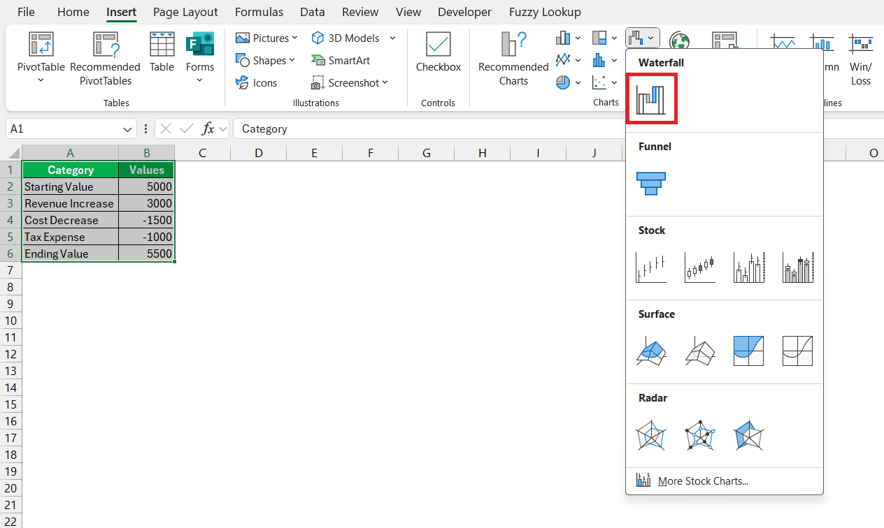
STEP 2: Select your data range (including the headers). Go to the Insert tab. In the Charts group, click the Waterfall Chart icon.
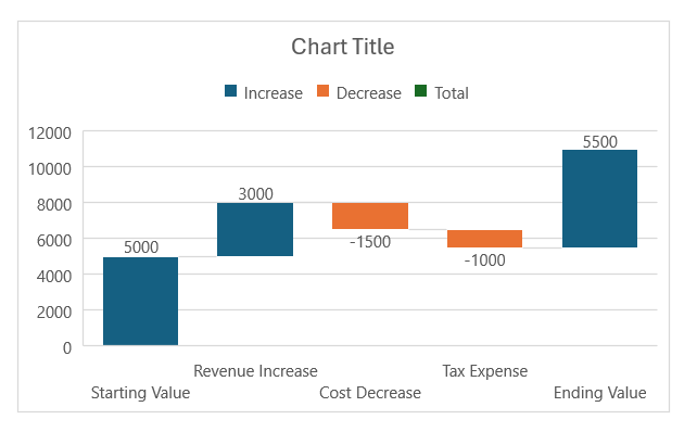
At this point, Excel will generate a basic waterfall chart.
The bars represent your data, and you’ll be able to see the progression from your starting value through to the ending value.
Visual Tweaks for Clarity and Impact
Marking Totals
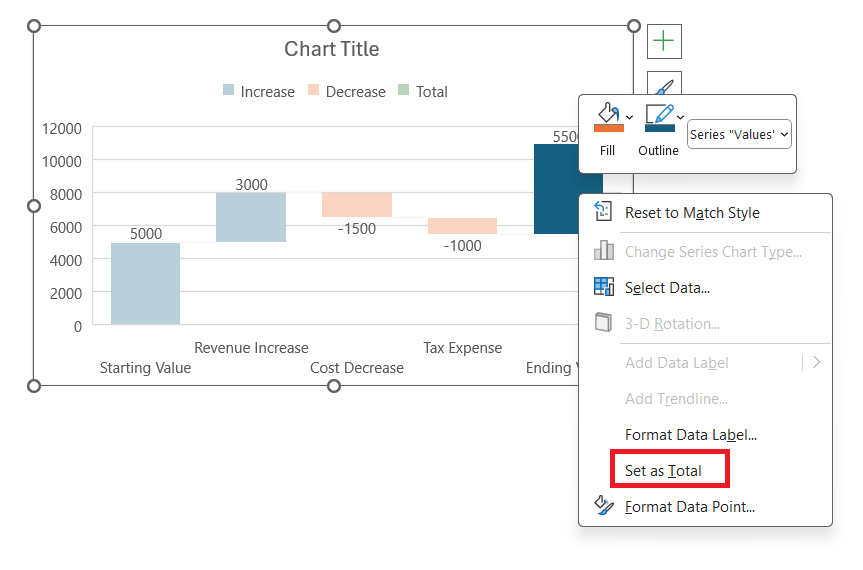
By default, Excel might treat every value as a contributing factor, but we want to mark the starting and ending values as totals. Click on the bar representing your total (like the final “Ending Value”) and right-click and select Set as Total.
This step ensures that the total values aren’t floating, but rather, they anchor the cumulative changes between them.
Adjusting Colors for Better Data Interpretation
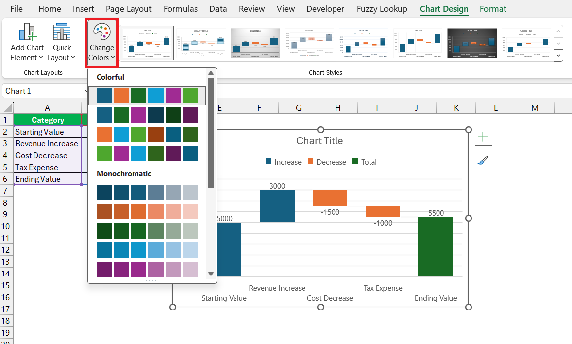
Choosing the right colors can be as crucial as the data itself for interpretation. We can visit the ‘Chart Design’ tab and open the ‘Change Colors’ gallery to modify the default color scheme which might not always serve our purpose.
Here, I select a palette that amplifies clarity—for example, setting up to exhibit positive values in green and negatives in red, a staple in financial reporting. By doing so, our chart transforms into an intuitive visual tool, engaging viewers immediately in the data’s ebb and flow.
Customizing Data Labels for Enhanced Understanding
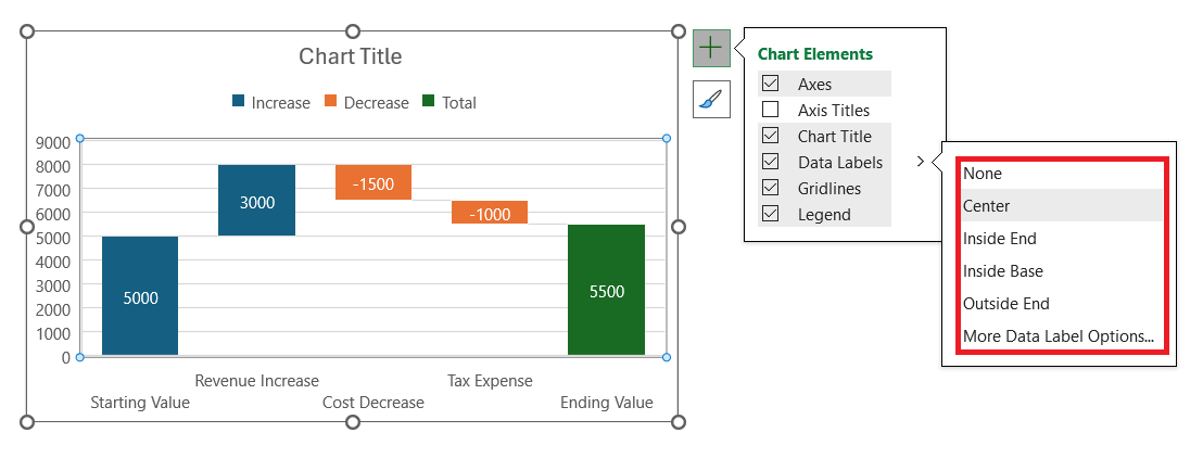
After adjusting colors, enhancing our chart with custom data labels is the next step in the refinement process. With a simple click on the + sign, I delve into ‘Add Data Labels’ and then select further customization options.
Here, I prefer placing labels inside the end of each bar for a cleaner look, and I make sure the labels are formatted to match the currency or percentage as required. Displaying the exact values or changes in each segment turns the chart into an informative narrative, allowing the audience to grasp the detailed story at a mere glance.
Best Practices for an Effective Waterfall Chart
Ensure Readability with Clean Design Choices
Ensuring readability starts with clean design choices. A minimalist approach works wonders; I favor a chart free from excessive gridlines and opt for a subtle axis with marked intervals that don’t overshadow the data. For the text, a legible font size and style offer ease of reading without straining the viewers’ eyes.
Moreover, aligning the labels horizontally, despite the temptation to fit more text with diagonal placement, preserves the chart’s neatness. A consistent design language across each element transforms complexity into a clear, visual digest.
Utilize Full Bars for Start and End Points to Drive Messages Home
Utilizing full bars to represent the start and end points solidifies the message I want to convey with the waterfall chart. These bars act as bookends to the data story, with the starting bar firmly grounded at the baseline and the ending bar soaring to illustrate the final outcome.
I make sure these are color-coded distinctively, often in a neutral hue like blue or gray, to differentiate them from the fluctuating intervals in between. By ensuring these bars are full and prominent, I cue the viewer into the journey’s origin and destination at a glance, creating a powerful visual anchor.
Use Cases: When to Implement Waterfall Charts
Financial Reporting and Performance Analysis
In financial reporting and performance analysis, waterfall charts serve as invaluable tools for us. They effortlessly dissect complex fiscal narratives, allowing us to see transparently how revenue drivers, expenses, and other financial activities contribute to net profit or losses over time.
In performance analysis, these charts help elucidate precisely where and how our strategies impact the bottom line, enabling stakeholders to make informed decisions quickly. A well-crafted waterfall chart in such contexts becomes an irreplaceable asset in the financial storyteller’s arsenal, transforming rows of numbers into actionable insights.
Project Management and Progress Tracking
When it comes to project management and progress tracking, the waterfall chart is a cornerstone for illuminating the journey toward milestones. It delineates the sequential achievement of project phases and tasks, each cascading down to influence the next.
As we navigate through the project’s lifecycle, this chart is a steadfast ally, visually mapping out completions, pending actions, and forecasted steps. Not only does it create a comprehensive narrative of progression but also acts as a diagnostic tool to spot delays or overruns early on, steering the project back on course toward its defined objectives.
FAQs: Mastering Waterfall Charts in Excel
What is a waterfall chart in Excel?
A waterfall chart in Excel is a graphical representation that maps the sequential impact of positive and negative values on an initial value, culminating in a final result. It’s particularly useful for visualizing how different factors contribute to a cumulative total over time, making it easier to understand the progression of values such as financial earnings or budget changes.
What are waterfall charts used for?
Waterfall charts are used to demonstrate how an initial value is influenced by subsequent intermediate positives and negatives, leading to a final value. They’re indispensable for visual explanations across various contexts including financial results, inventory management, and analyzing website traffic sources.
What are the key elements of a waterfall chart?
The key elements of a waterfall chart include the initial and final columns that bookend the chart, intermediate columns representing incremental increases or decreases, and sometimes total columns that aggregate the values to that point. Each element collectively adds depth to the data story being presented.
Can waterfall charts be used for tracking project progress?
Absolutely, waterfall charts can be used for tracking project progress. They excel in breaking down the project into phases and visualizing the completion of each stage, cumulative efforts, and the impact of individual tasks on the project’s overall trajectory.
How do I handle negative values in a waterfall chart?
Handling negative values in a waterfall chart involves color-coding them—usually in red—to clearly differentiate from the positive values, which might be colored green. This visual cue instantly alerts viewers to decreases in value, such as reductions in revenue or budget cuts, amidst the flow of data.
John Michaloudis is a former accountant and finance analyst at General Electric, a Microsoft MVP since 2020, an Amazon #1 bestselling author of 4 Microsoft Excel books and teacher of Microsoft Excel & Office over at his flagship MyExcelOnline Academy Online Course.

