Table of Contents
Learning how to make a Graph in Excel can make your report aesthetically pleasing and easy to analyze!
Graphs can be used to convert a plethora of rows and columns in Excel into simple charts that are easy to evaluate.
In this step by step tutorial on How to Make a Graph in Excel, you will learn the basics of an Excel Chart, including:
- How to Create a Graph in Excel
- Different Types of Excel Charts
- Customize an Excel Chart
- Save Chart as a Template
Make sure to download the exercise workbook to follow along and learn how to make a graph in Excel:
How to Create a Graph in Excel
Excel Charts are visual representations of data that are used to make sense to the gazillion amounts of data jammed into rows and columns. It is essential to learn how to create a graph in Excel if we want to obtain more information from the data. Charts are extremely useful to:
- Understand the meaning behind the numbers
- Summarize large amounts of data
- Draw comparisons between data sets
- Spot data outliers that are unrelated to the rest of the data
- Identify data trends & patterns
You can either work on existing data stored in Excel or you can import data from other applications. Just keep in mind that the data should have headers and no blank rows.
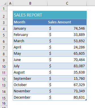
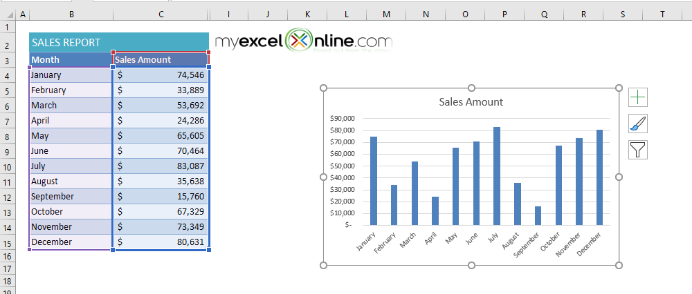
In the example below, we have monthly sales data recorded in Excel and want to know which month achieved the highest and lowest sales:
Below is the step-by-step tutorial on How to Create a Graph in Excel:
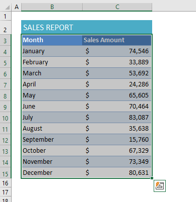
Step 1: Select the range of data (B3: C15) in Excel
Step 2: Go to Insert Tab
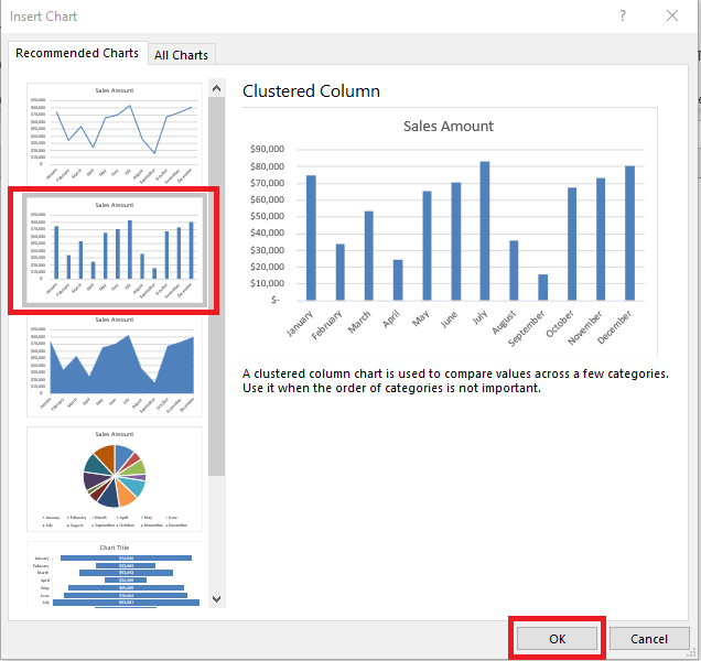
Step 3: Under the Charts group, you can choose from a variety of chart types available or select Recommended Charts to let Excel decide the appropriate chart for your data.
Step 4: The Insert Chart dialog box will open and from the left panel you can select the chart based on a chart preview. Based on our data, a clustered column chart will be the most appropriate. So, you can select that and click OK.
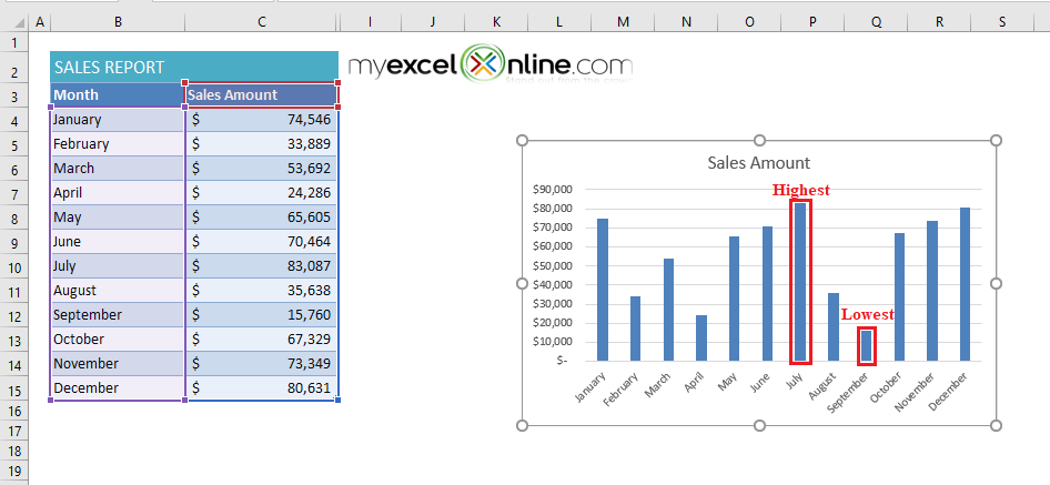
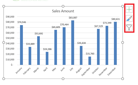
This will create a Graph in Excel with each bar representing a month.
From this visual representation of monthly sales data, you can easily spot that the highest sales are achieved in July and the lowest in September.
You can even update the data used to make your Excel graph.
Let’s say you want to remove months, November and December, from the chart created using the step-by-step tutorial on how to make a graph in Excel above. You can use either of the two methods mentioned below to do so:
Method 1:
- Go to Chart Design Tab and then click on Select Data
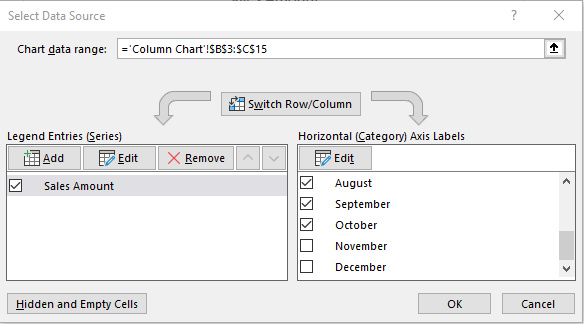
- In the Select Data Source dialog box, under Horizontal Axis Labels, scroll below and un-check November and December.
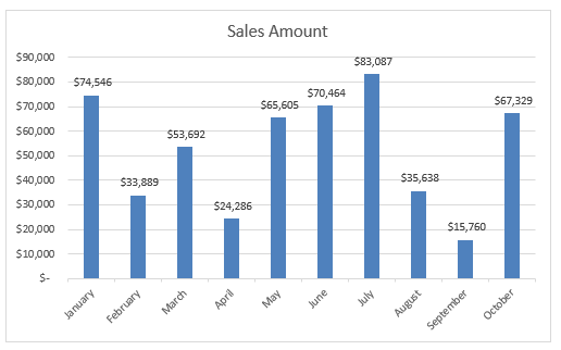
- Click OK. You will have the edited chart displayed.
Method 2:
- Select the chart.
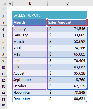
You can see the data used to make a graph are highlighted.
- Hover the mouse towards the end of the data table and drag up the data handle to exclude the cells containing data for November and December.
- You will have the edited chart displayed.
Now that you are familiar with how to make a graph in Excel, let’s move on to the different types of Excel Charts available and their uses.
Types of Excel Chart
The different types of Excel Charts are elaborately explained here:
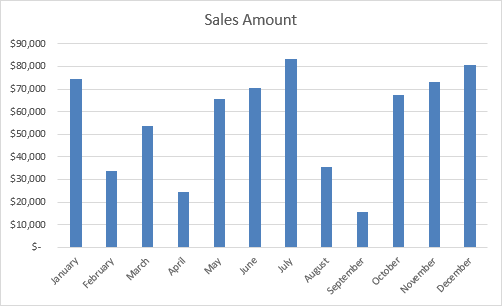
- Column Chart – Use this Chart if you have less than 12 data points & want to show trends E.g. Monthly or Annual data points: Column charts are used to visually compare values across a few categories by using vertical bars. In this graph below, each vertical bar represents a month and the vertical axis represents the sales month. This is an example of a Clustered Column chart.
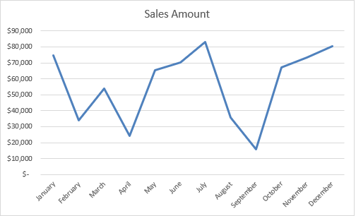
Excel offers seven different column chart types: clustered, stacked, 100% stacked, 3-D clustered, 3-D stacked, 3-D 100% stacked, and 3-D. - Line Chart – Use this Chart if you have more than 12 data points & want to show trends E.g. Historic results or Statistical data: Line charts are used to display trends over time. In this graph below, it shows the sales trend over the months. There are 7 different line charts available on Excel – line, stacked line, 100% stacked line, line with markers, stacked line with markers, 100% stacked line with markers, and 3-D line.
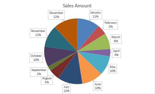
- Pie Chart – Use this Chart for component comparisons only (Sums to 100%) E.g. Market share: Pie charts are used to display the contribution of each value (slice) to a total (pie). It can quantify items and show them as a percentage where the total of the numbers is 100%. In this graph below, each pie shows the percentage of sales of a particular month.
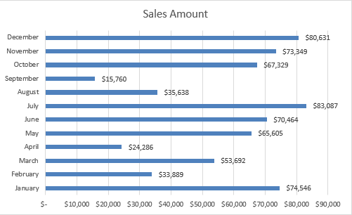
Excel offers 5 different pie chart types: pie, pie of pie (this breaks out one piece of the pie into another pie to show the sub-category), bar of pie, 3-D pie, and doughnut. - Bar Chart – Use this Chart if you have long names and want to compare E.g. Competitor analysis: It is similar to a Column chart but here the constant value is assigned to Y-axis and the variable is assigned to X-axis. In this graph below, each bar represents a sales amount for each month.
You can also take a look at this video by Microsoft on how to make a graph in Excel.
There are other chart types available in Excel like Area Chart, Surface Chart, Radar Chart, Funnel Chart, etc. You can also create a graph called the Combo Chart that displays multiple sets of data in different ways on the same chart.
You can even look at this blog to view our Excel Chart Infographic and also learn about the new Excel Charts that were introduced in 2016.
Now that you have understood How to Make a Graph in Excel and the different types of Excel Charts that are available, it is essential to customize the chart to enhance its appeal.
Customize an Excel chart
When you create a graph in Excel and then click on it, you will see two new tabs appearing on the Excel Ribbon – Chart Design & Format. These two tabs can be used to customize the chart as per your requirements.
Chart Design Tab –
Chart Design Tab in Excel contains design commands including Chart Layout, Chart Styles, Switch Row/Column, Select Data, Change Chart Type & Move Chart.
Format Tab –
This ribbon contains format commands like Current Selection, Insert Shape, Shape Styles, WordArt Styles, Arrange Group & Size Group.
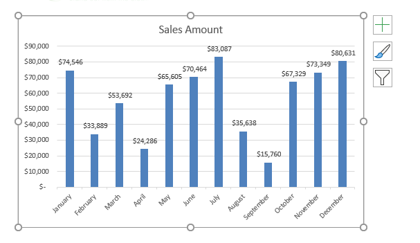
You can also click on the chart and access the Chart Elements button on the upper-right corner of the chart. It contains three options – Chart Elements, Chart Style and Chart Filters
Chart Element Option (with the + sign icon)
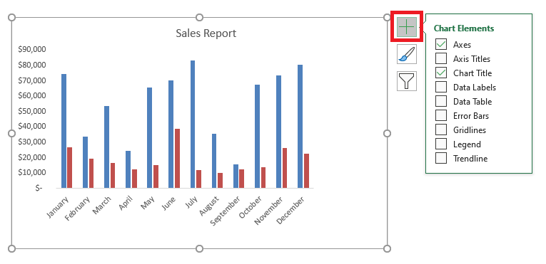
Using this option you can customize different chart elements like Chart Title, Axes, Axis Title, Data Labels, Data Table, Error Bars, Legend, Gridlines, and Trendline.
To add or remove a chart element, you can simply use the Chart Element Options and check or un-check the boxes you want to show or hide.
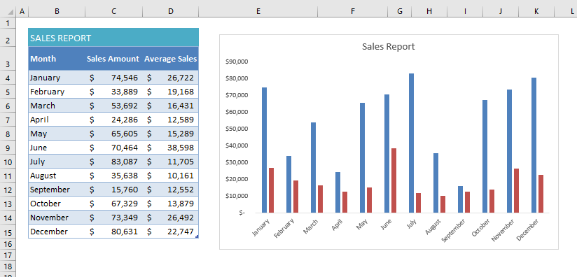
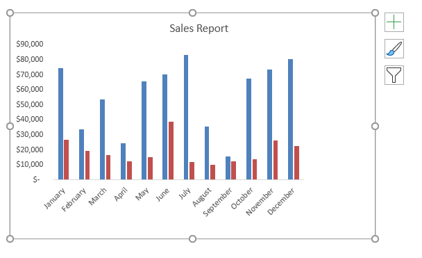
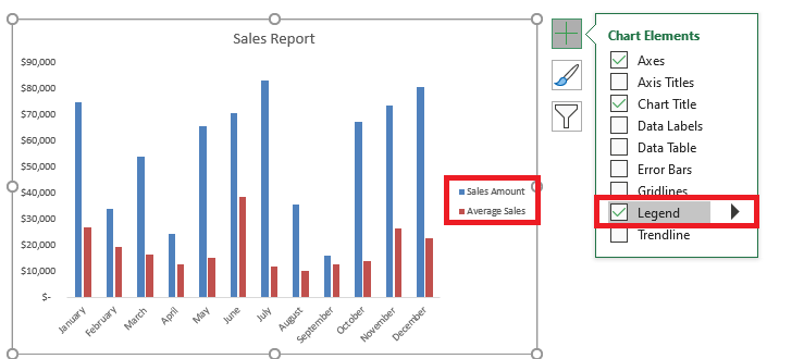
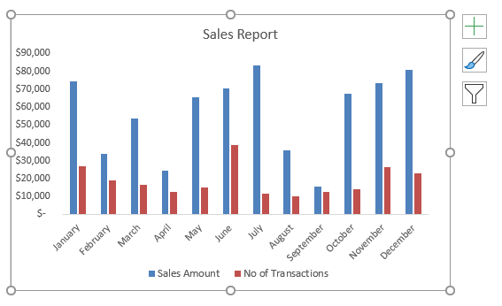
For example, if you have monthly sales data including sales amount and average sales and you can create a column chart using that data.
Now if you wish to add a Legend key to your chart, follow the steps below:
Step 1: Click on the Chart.
Step 2: Click on the + sign icon to access the Chart Elements Options.
Step 3: Check the box next to Legend.
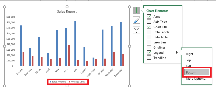
This will add a legend keys next to the chart. To make further customizations like shifting the legend keys to the bottom of the chart: Point to Legend, select the arrow next to it and select bottom.
Chart Style
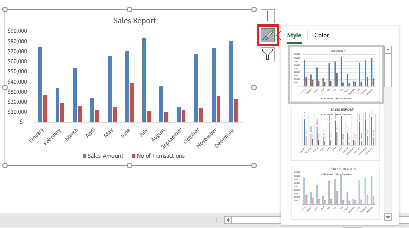
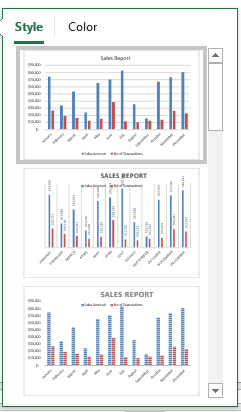
After you have learned How to Make a Graph in Excel and customize the elements, you should move on to making the charts more impactful. You can change the style or color of your chart using this step by step tutorial below:
Step 1: Click on the chart you want to change
Step 2: Click on the Brush icon in the upper right corner of the chart
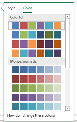
Step 3: Click Style or Color and pick the option you want.
Step 4: You can scroll below the different options available and hover over them to get a preview of the styles and colors available and select the one that suits you the best.
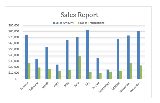
This is how your edited chart will look like. Pretty cool right? 🙂
Learning how to make a graph in Excel is not enough. You can match the style and color of the chart as per your company theme colors, font, and layout.
Chart Filters
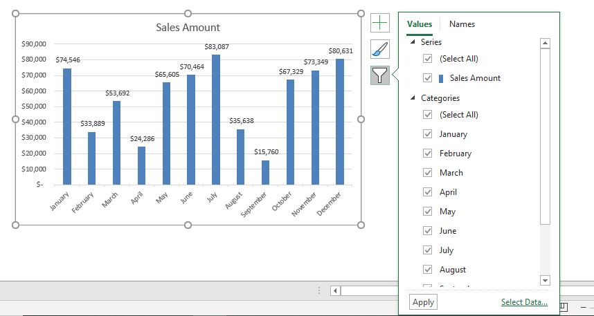
Ever faced a situation where you want to display only certain data for an Excel Chart. Here is a tutorial on How to Create Graphs in Excel with Filters. Follow the steps below:
Step 1: Click anywhere on the chart
Step 2: Click on the Chart Filter button on the upper right corner of the chart
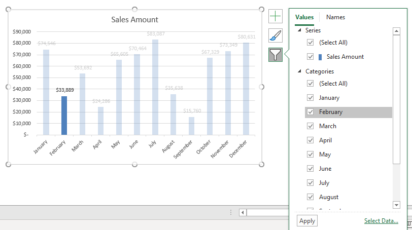
Step 3: On the Values tab, you can hover the Categories and the corresponding data for that category will be highlighted. In the example below, when you hover over February with your mouse pointer, you can see the bar of February in the Chart being highlighted. Cool!
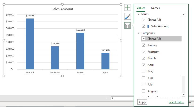
Step 4: To filter the data, you can check or uncheck the series or categories you want to show or hide. In the example below, I have checked the first four months (Jan, Feb, Mar, Apr) and clicked on Apply.
This will let you filter the data in your Excel Charts and allow you to select the data you want to display or hide.
Save as Chart Template
Imagine you have around 20 charts that you want to create in Excel. You went through all the steps mentioned above to add Chart Elements, Customize a Layout and Style, and created an excellent Chart.
Now, are you ready to repeat all these steps for the remaining 19 Charts? Well, you don’t have to do that.
You can Save the Chart as Template and then simply apply that template for the remaining charts. Let us follow the steps below and learn how to create a graph in Excel and save it as a template:
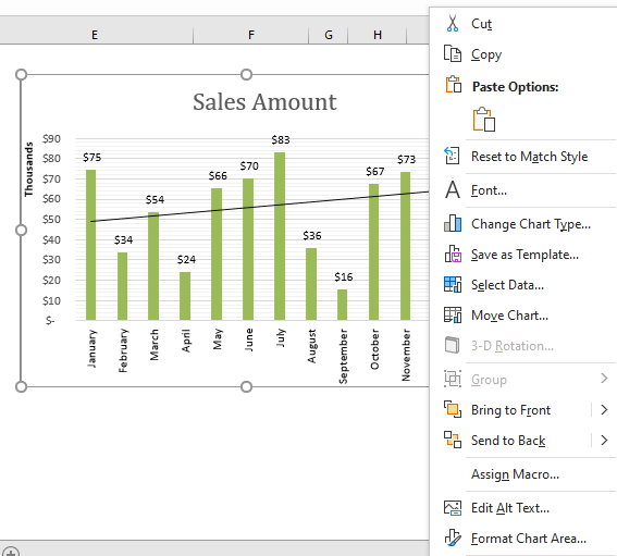
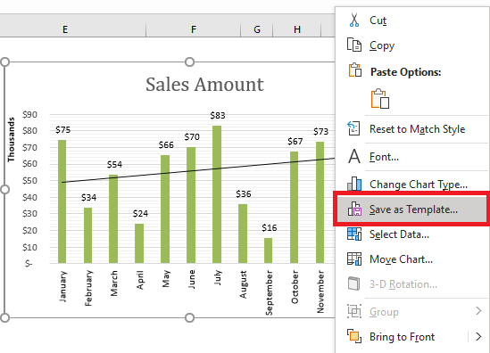
Step 1: Right Click on your perfect Chart
Step 2: Click on Save as Template
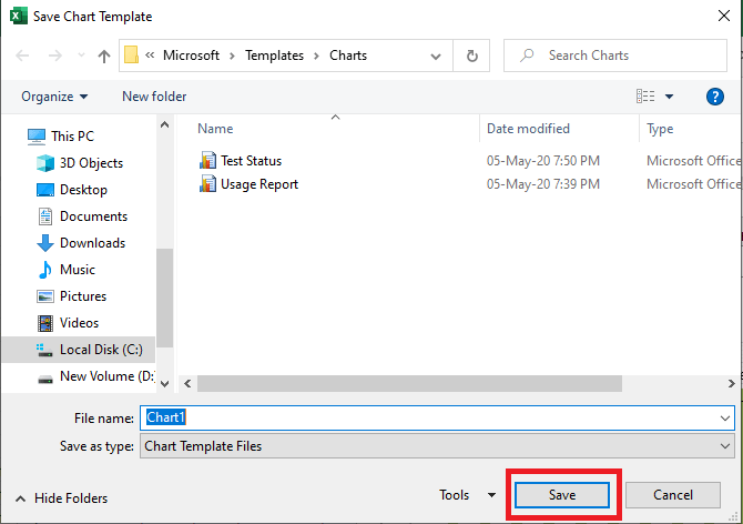
Step 3: In the Save Chart Template dialog box, give your template a “name” and click on Save.
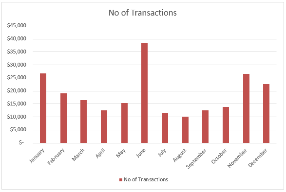
Step 4: Now you move to the next chart where you want to paste this format.
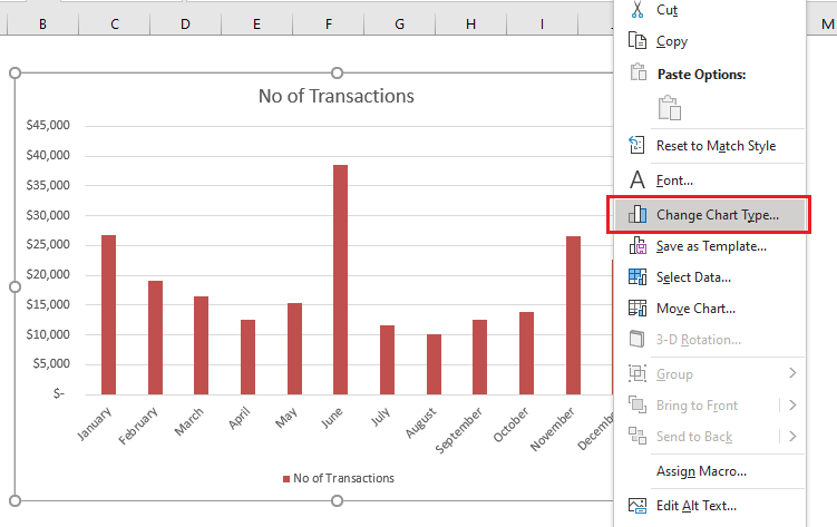
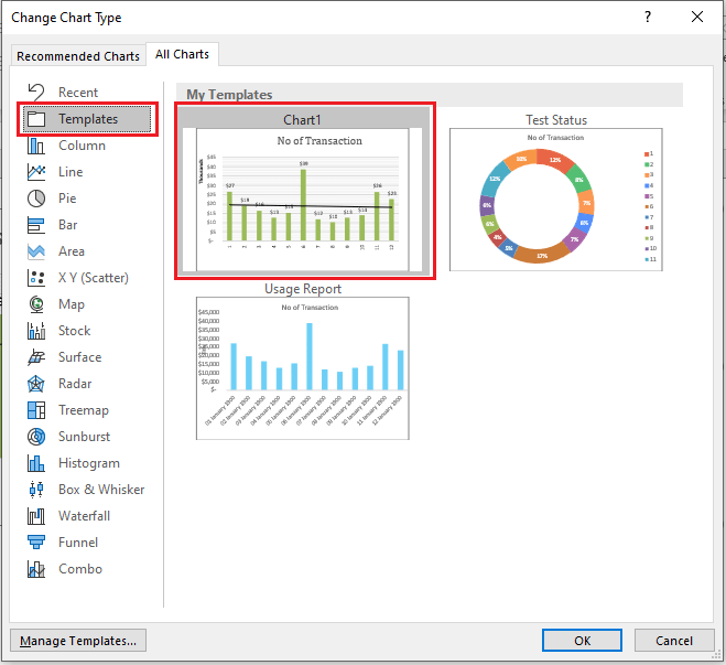
Step 5: Right-click on that chart and select Change Chart Type
Step 6: In the Change Chart Type dialog box, under the All Charts tab click on Templates and then select the template you have saved. Click OK.
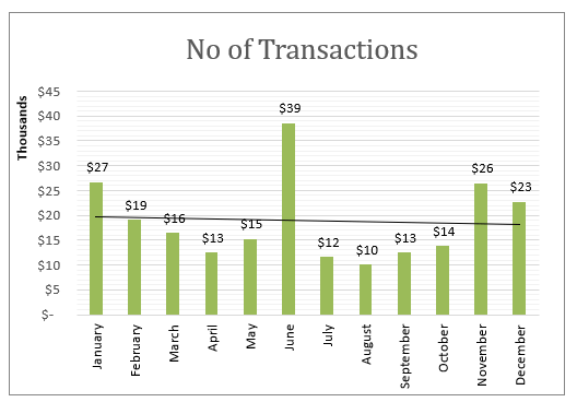
Your second chart will automatically change to the format of your saved template!
Using the steps mentioned above, you can learn not only how to make a graph in Excel but also how to save the created graph as a template and reuse it whenever you want.
Conclusion
In this tutorial, you have learned how to make a graph in Excel, the different types of Excel charts, how to customize an Excel Chart, and save a chart as a Template.
You can learn more about How to Make a Graph in Excel by viewing our Free Excel tutorials on Excel Charts!
Make sure to download our FREE PDF on the 333 Excel keyboard Shortcuts here:
You can follow our YouTube channel to learn more about How To Create a Graph in Excel!
John Michaloudis is a former accountant and finance analyst at General Electric, a Microsoft MVP since 2020, an Amazon #1 bestselling author of 4 Microsoft Excel books and teacher of Microsoft Excel & Office over at his flagship MyExcelOnline Academy Online Course.


