Benchmark Charts or Budget Charts are a great way to show your actual sales versus your benchmark in a graphical way, highlighting the strong v weak months.
There are a few steps but in Excel 2013 it has been made much easier to create these charts with the new Combo charts.
Download excel workbookBenchmark-Chart.xlsx
STEP 1: Enter your data into three columns, the month, the actual sales and the benchmark sales
STEP 2: Click inside your data and go to the ribbon and choose Insert > 2-D Clustered Column
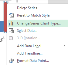
STEP 3: Select the Benchmark series chart and Right Click and choose the Change Series Chart Type
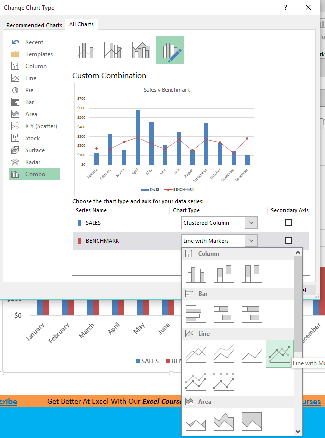
STEP 4: This will automatically take you to the Combo chart box and you need to select the drop down for the Benchmark and select Line with Markers
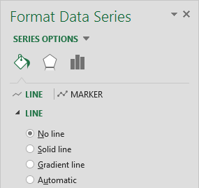
STEP 5: Click on the line chart and press CTRL+1. This will open up the Format Chart dialogue box
STEP 6: Select the Line option and choose No Line
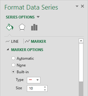
STEP 7: Select the Marker Options and choose Built In, select the horizontal line type and increase the Size to 10. You can also format the color of the line.
John Michaloudis is a former accountant and finance analyst at General Electric, a Microsoft MVP since 2020, an Amazon #1 bestselling author of 4 Microsoft Excel books and teacher of Microsoft Excel & Office over at his flagship Academy Online Course.


