A Bubble Chart is an extension of the XY Scatter Chart. Bubble Chart with 3 variables adds a 3rd variable to each point in the XY Scatter Chart. XY Scatter plots x and y values and Bubble Chart plots x values, y values, and z (size) values.
Bubble Chart is extremely useful to graphically represent three dimensions of data and show the relationship between them.
<!—->
Table of Contents
What is a Bubble Chart?
Bubble Chart is used to visualize data with three dimensions. Instead of plotting just two variables (x and y) in a traditional chart, Bubble Chart lets you add a third variable as well. The first variables are visualized as coordinates, the third as the size of the bubble.
This chart can be used when you have a third value that can be used to determine the relative size of the bubble. Higher the value, the bigger will be the size of the bubble.
For example, if you have a Scatter Chart that shows the relationship between the age of a house and its proximity to the city and want to add the value of the house (the 3rd variable), then a Bubble Chart will get you there.
How to Create a Bubble Chart?
This Excel graph with 3 variables is very easy to create in Excel. Let’s see how to create a scatter plot in Excel with 3 variables with the help of some examples.
Download the Excel Workbook and follow along:
Example 1:
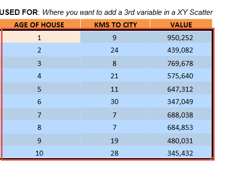
In the table, you have the age of the house, proximity to the city (in km) and the value of the house. So, using Bubble Chart with 3 variables, you can plot the age of the house on the X-axis, the proximity to the city is on the Y-axis and the value of the house (the 3rd variable) as the size of the bubble.
Follow the steps below to understand how to create a bubble chart with 3 variables:
STEP 1: Select the table on where we want to create the chart.
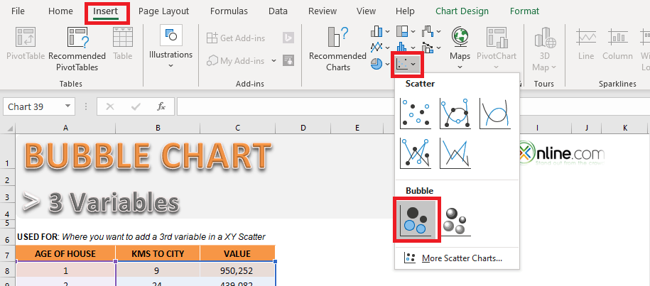
STEP 2: Go to Insert > Insert Scatter Chart or Bubble Chart > Bubble.
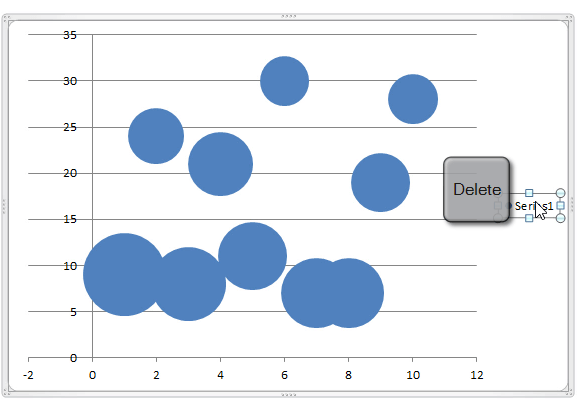
STEP 3: Click on Series1 and Click Delete to remove it.
The horizontal axis contains negative values as well. Since X-axis represents the age of the house, it cannot be negative. Formatting this axis to restrict negatives value is a good idea to avoid confusion.
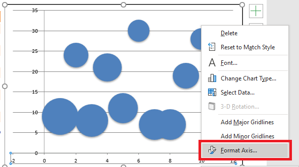
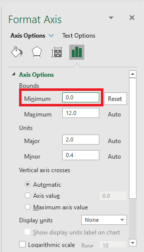
STEP 4: Right Click on the axis and select Format Axis to open the Format Axis Panel.
STEP 5: Under Axis Options > Minimum >Set the value to 0.
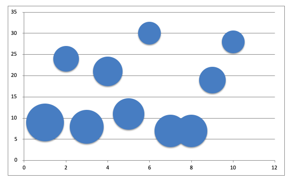
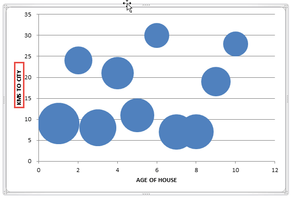
This is how the chart will look:
Example 2:
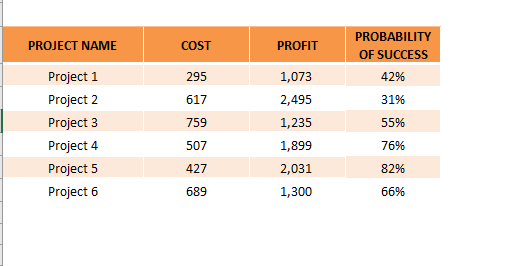
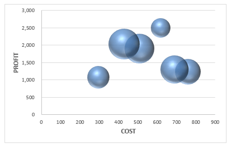
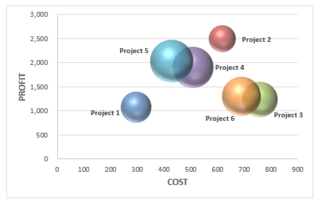
In this data table, you have project-wise data including cost, profit, and probability of success.
Using this data, let’s try to create a 3D Bubble Chart with 3 variables!
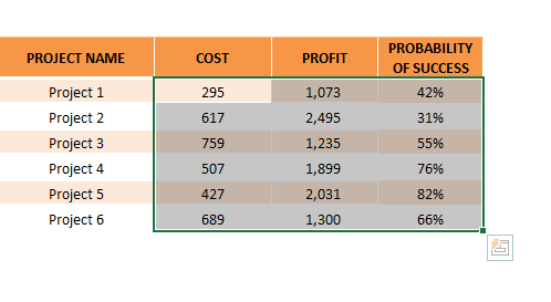
STEP 1: Select the table on where we want to create the chart.
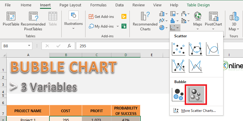
STEP 2: Go to Insert > Insert Scatter Chart or Bubble Chart > 3D Bubble.
STEP 3: Add the horizontal and vertical axis title.
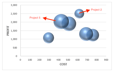
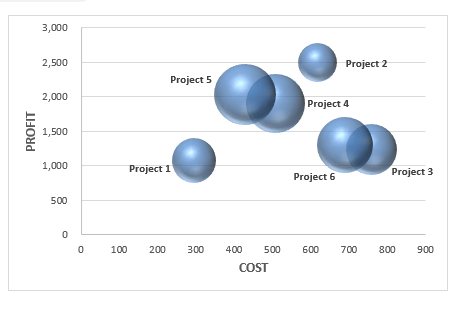
As you can interpret from this chart that even though Project 2 has the maximum profit the chance of success is low. So, it is better to opt for Project 5 which has a high probability of success and high profits as well.
Formatting a Bubble Chart
Formatting a Bubble Chart is vital to enhance the visual appearance of the chart. You can add colors, data labels, axis titles, etc. to make the data really stand out.
Add Axis Title to the Bubble Chart
STEP 1: Select the Chart
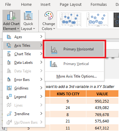
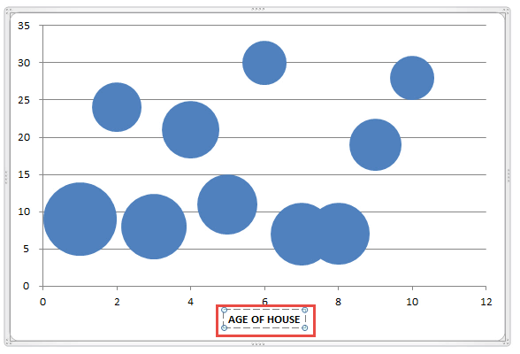
STEP 2: Got to Chart Design > Add Chart Element >Axis Titles > Primary Horizontal
STEP 3: Type Age of House.
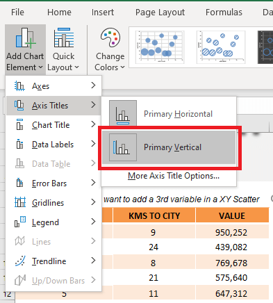
STEP 4: Got to Chart Design > Add Chart Element >Axis Titles > Go to Primary Vertical.
STEP 5:Type KMs to City.
Add Colors to the Bubble Chart
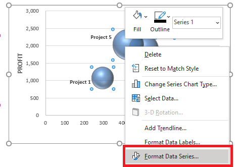
STEP 1: Right-click on a bubble and click on Format Data Series.
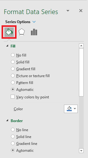
STEP 2: In the Format Series Panel, Select the Fill icon.
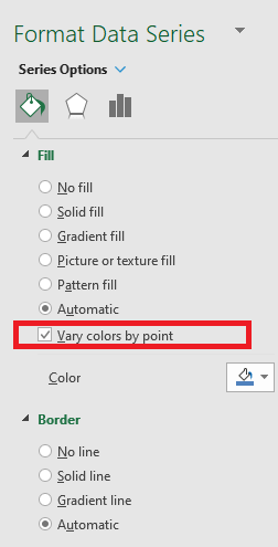
STEP 3: Check Vary colors by point.
STEP 4: Your desired Bubble Chart with 3 variables is ready!
Add Data Labels to Bubble Chart
STEP 1: Select the Chart
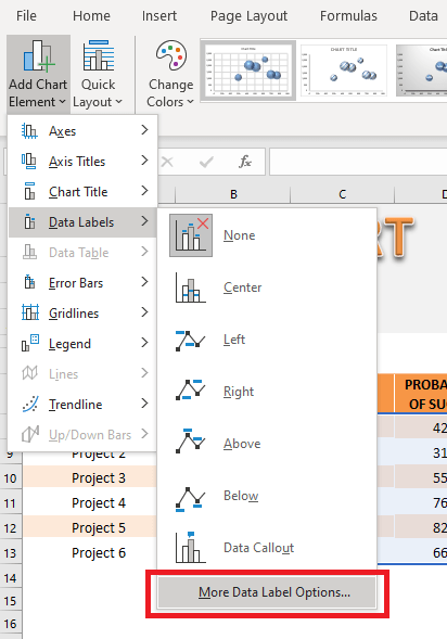
STEP 2: Go to Chart Options > Add Chart Elements > Data Labels > More Data Label Options
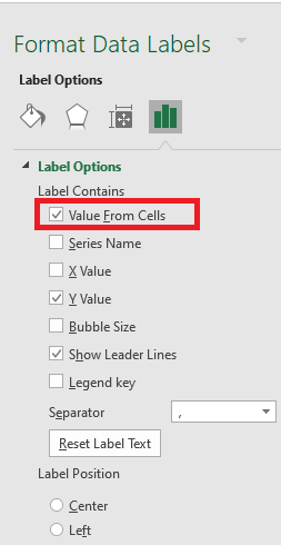
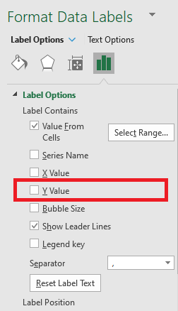
STEP 3: From the Format Label Panel, Check Value from Cell
STEP 4: Select the column Project
STEP 5: Uncheck Y value.
This is how the chart will look:
Pros and Cons of using Bubble Chart
Now that you understood how to make a graph with 3 variables (Bubble Chart), it is important to know the pros and cons of using it.
Advantages:
- It lets you add a third dimension to the data set.
- It can be used to depict the relationship between the data sets.
- It can be used to convey a lot of information at once.
Disadvantages:
- Too many bubbles can make the graph unreadable.
- Overlapping bubbles may create hindrance.
Further Learning:
- Project Milestone Chart Using Excel
- How to Create Overlay Charts in Excel
- Logarithmic Scale In An Excel Chart
Helpful Resource:
Make sure to download our FREE PDF on the 333 Excel keyboard Shortcuts here:
You can learn more about how to use Excel by viewing our FREE Excel webinar training on Formulas, Pivot Tables, and Macros & VBA!
John Michaloudis is a former accountant and finance analyst at General Electric, a Microsoft MVP since 2020, an Amazon #1 bestselling author of 4 Microsoft Excel books and teacher of Microsoft Excel & Office over at his flagship Academy Online Course.
