Stock Data Analysis is no easy feat! Once you have a lot of historical stock data it’s hard to visualize the trend using technical analysis.
Thankfully Excel has a lot of stock charts to help you with that, and one of them is the Candlestick Chart!
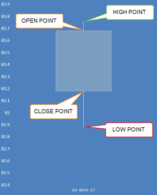
A Candlestick Chart has a vertical line that indicates the range of low to high prices and a thicker column for the opening and closing prices:
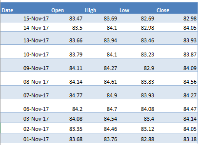
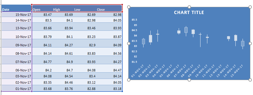
Below is the data source that we are going to use in Excel:
You need a Date column which should be the first column.
Then this should be followed by a Open, High, Low, and Close column. This is the exact order that needs to be followed in order to create the Candlestick Chart.
In this example I show you how easy it is to insert this using Excel.
Download excel workbookCandlestick.xlsx
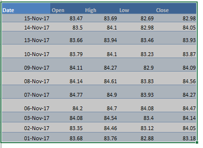
STEP 1: Highlight your data of stock prices:
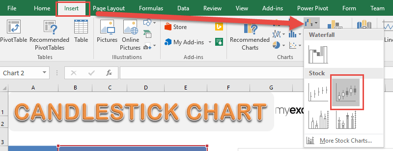
STEP 2: Go to Insert > Stock Charts > Open-High-Low-Close
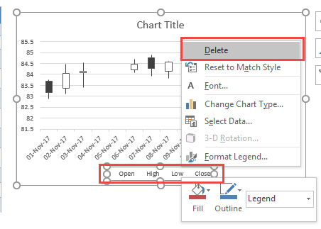
STEP 3: Right click on your Legend and choose Delete as we do not need this.
STEP 4: Go to Chart Tools > Design and select the preferred design to make your chart more presentable!
And there you have it! Your own Candlestick Chart!
Further Learning:
- Project Milestone Chart Using Excel
- How to Create Overlay Charts in Excel
- Logarithmic Scale In An Excel Chart
Bryan
Bryan is a best-selling book author of the 101 Excel Series paperback books.
