If you want to compare products or businesses using Year on Year Comparison Chart Excel, then the Clustered Bar chart is the one for you.
What is a Clustered Bar Chart?
Clustered Bar Chart in Excel is used to display more than one series of data in clustered horizontals columns or bars. They are one of the most common tools used for a year on year comparison chart.
It is used to compare values across different category or time periods.
Advantages and Disadvantages
Advantages of Clustered Bar Chart
- It is easy to create a bar chart with just a few clicks.
- It can convert complicated numbers into simple charts that are easy to understand.
- It can be used when the category name is too long.
- It can be used to compare multiple categories.
Disadvantages of Clustered Bar Chart
- If data is too large, it can make the chart confusing.
- It cannot be used when you want to show a portion of a whole.
Here, a Pie Chart would be a better option.
Create a Year on Year Comparison Chart Excel
Clustered Bar Chart can be used for a year on year comparison chart template. Each bar representing a year is clustered together making the comparison more clear.
Want to know how to create a Clustered Bar Chart: Year on Year comparison Chart Excel?
*** Watch our video and step by step guide below with free downloadable Excel workbook to practice ***
Follow the step-by-step tutorial on How to create a Clustered Bar Chart: Year on Year comparison Chart Excel Template and make sure to download the exercise workbook to follow along:
download workbookClustered-Bar.xlsx
Example 1:
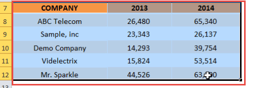
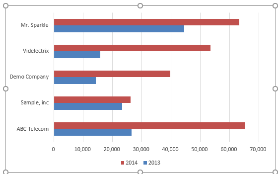
In the example below the category names relate to companies and I am comparing their sales for 2013 and 2014. Simply looking at this data table will not be very helpful in comparing the data over the year.
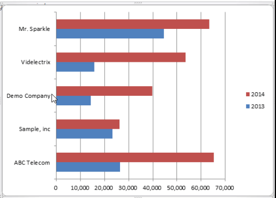
Let’s create a Clustered Bar Chart and make this year on year comparison chart easy to understand.
STEP 1: Select the table on where we want to create the chart.
STEP 2: Go to Insert > Bar Chart > Clustered Bar.
Your Clustered Year over Year Excel Template is now ready:
Example 2:
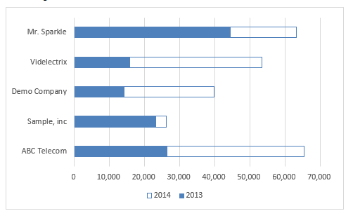
You can also create this Bar Chart to show Year over Year Growth Chart in Excel and it will look something like this:
In this chart, the original orange bars shown the sales amount for the year 2013 and the additional bar on top of that is the additional sales for the year 2014.
Now, let’s understand how to create this year over year comparison chart using a step-by-step tutorial:
STEP 1: Select the Table containing the Sales Data for the year 2013 & 2014.
STEP 2: Go to Insert > Recommended Charts.
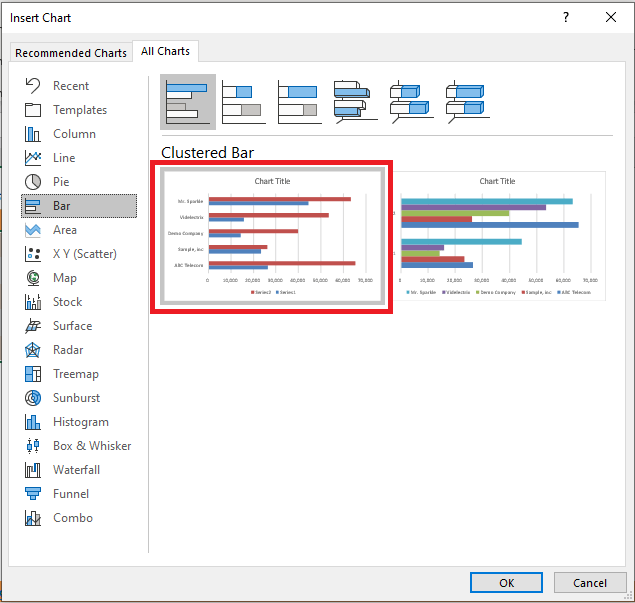
STEP 3: From the Insert Chart dialog box, select the All Charts > Bar Chart > Clustered Bar Chart.
You can even select 3D Clustered Bar Chart from the list.
STEP 4: This will insert a Simple Clustered Bar Chart.
Now let’s move to the advanced steps of editing this chart.
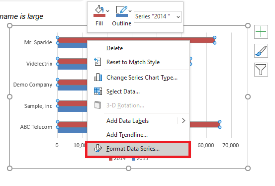
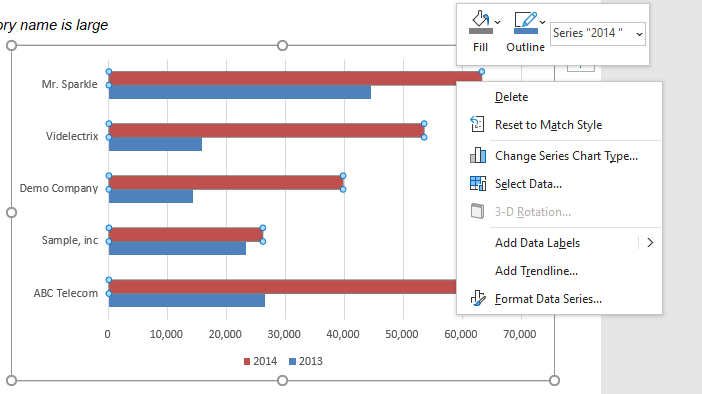
STEP 5: Right-click on the Bar representing Year 2014 and select Format Data Series.
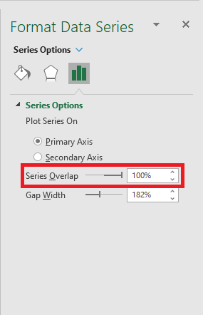
STEP 6: In the Format Data Series dialog box, under Series Overlap scroll to the right towards 100%.
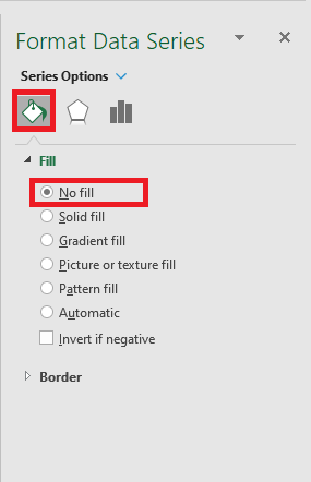
STEP 7: Under the Fill Icon tab, select No Fill.
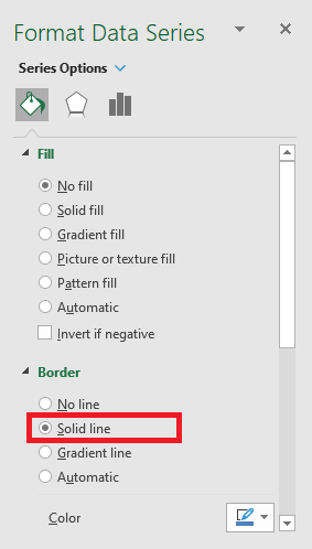
STEP 8: Under the Border section, select Solid Line.
STEP 9: Your Year over Year Growth Chart in Excel is ready!
Interpretation:
The solid blue bars indicate the sales amount for each company for the year 2013 and the additional transparent bar on the top indicates the additional sales amount reported in the year 2014.
This chart helps you focus on the growth achieved by each company and know which company has performed better than the other.
Now that you know how to create year on year comparison chart excel using clustered bar, you should read through the next section and understand how to format them.
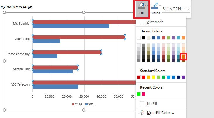
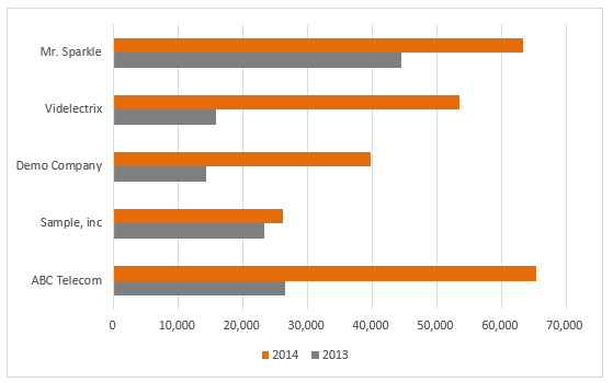
STEP 2: Select the Fill Icon and choose the appropriate color.
You can do the same for the bar representing the year 2013.
Move Series Up
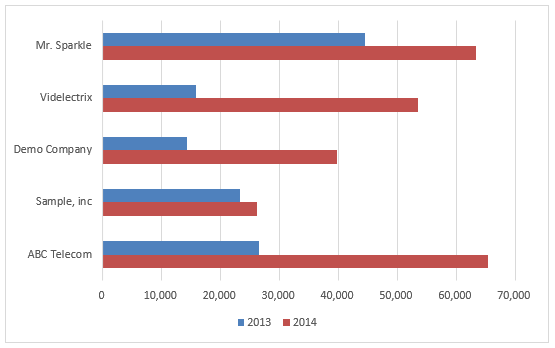
The clustered chart shows the year 2014 on the top. Let’s change that and push it below:
STEP 1: Select the Chart
STEP 2: Go to Chart Design > Select Data
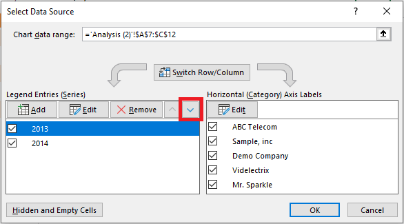
STEP 3: In the Select Data Source dialog box, click on Year 2013 and then select the Arrow Down button.
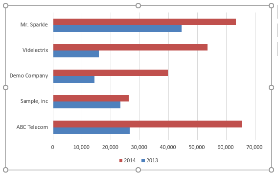
The Year 2014 is pushed to the bottom. This is how you can rearrange the data bars as per your requirement.
Switch Row/Column
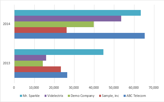
This will swap data over the axis and data plotted on the x-axis will be moved to the y-axis and vice versa. Something doing like, makes the chart easier to comprehend.
STEP 1: Select the Chart
STEP 2: Go to Chart Design > Switch Row/Column
This is how the swapped chart will look like:
Conclusion
In this article, you have learned how to create Clustered Bar Chart showing year on year comparison, a creative way to show year over year growth, change the color of the bars, move series up or down and switch row/column.
You can brush up your skills on creating charts by reading through our other blogs on Excel Charts.
Further Learning:
- Bubble Chart with 3 Variables On A Chart
- Change Chart Type Using Macros In Excel
- Convert Chart into Image Using Macros In Excel
Helpful Resource:
Make sure to download our FREE PDF on the 333 Excel keyboard Shortcuts here:
You can learn more about how to use Excel by viewing our FREE Excel webinar training on Formulas, Pivot Tables, and Macros & VBA!
John Michaloudis is a former accountant and finance analyst at General Electric, a Microsoft MVP since 2020, an Amazon #1 bestselling author of 4 Microsoft Excel books and teacher of Microsoft Excel & Office over at his flagship Academy Online Course.

