Color Scales are new in Excel 2010 and they highlight the smallest and largest data points within your Pivot Table.
It works like a heat map, in that it gives the highest number a shade of color and the lowest number a different shade of color, so your numbers can stand out at one glance.
Download workbookColor-Scales.xlsx
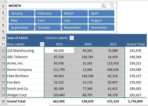
STEP 1: Select the range of cells that you want to apply the Color Scale to
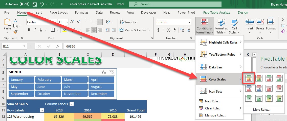
STEP 2: Go to Home > Styles > Conditional Formatting > Color Scales
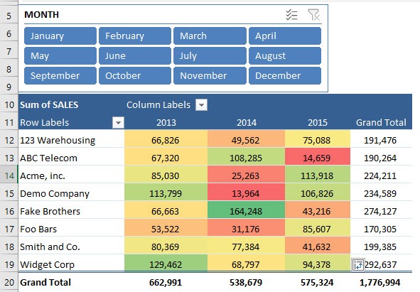
STEP 3: Now you have your Color Scale applied! Let us have some fun in the slicer above
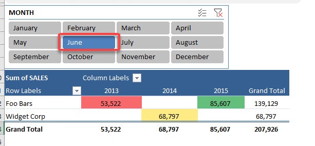
STEP 4: Select any month in the slicer and your Color Scale will still be applied
HELPFUL RESOURCE:
John Michaloudis is a former accountant and finance analyst at General Electric, a Microsoft MVP since 2020, an Amazon #1 bestselling author of 4 Microsoft Excel books and teacher of Microsoft Excel & Office over at his flagship Academy Online Course.


