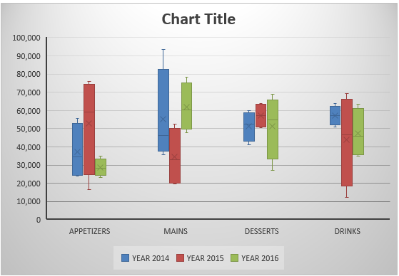
Box and Whisker Excel is one of the many new Charts available only in Excel 2016 and was originally invented by John Tukey in 1977.
They show you the distribution of a data set, showing the median, quartiles, range, and outliers.
The X in the box represents the Mean.
The Median divides the box into the interquartile range.
The box represents 50% of the data set, distributed between the 1st and 3rd quartiles.
For example, 25% of the data lie between the values of the 2nd Quartile box and the other 25% lie between the values of the 3rd Quartile box.
The lines extending vertically outside of the box (whiskers) show the outlier range outside of the upper and lower quartiles. So this is the lowest and highest data points within the data set.
Below is a Box and Whisker diagram explaining this:
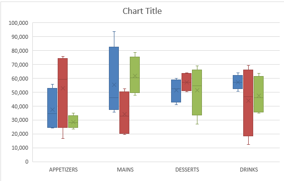
Here is how the Box and Whisker plot Excel 2016 version looks like:
In this example, I show you how easy it is to insert a Box and Whisker Excel 2016.
To upgrade to Excel 2016 you can use this link here: Microsoft Office 2016
Read this tutorial to create a box and whisker diagram (box plot) using Excel 2013 or below.
Table of Contents
Want to know how to create a Box and Whisker Excel?
*** Watch our video and step by step guide below with free downloadable Excel workbook to practice ***
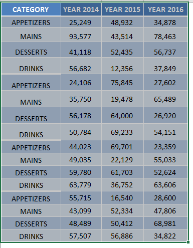
STEP 1: Highlight your table and go to Insert > Recommended Charts
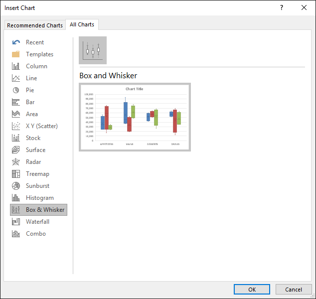
STEP 2: Select All Charts > Box and Whisker > OK
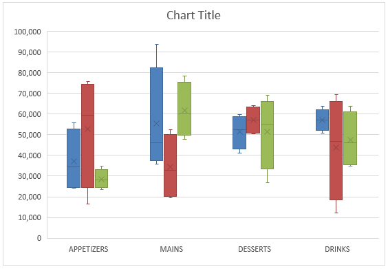
STEP 3: Now you have your Box and Whisker Chart.
STEP 4: You can further customize the look and feel of your Excel Box and Whisker Plot, by going to Chart Tools > Design / Format
STEP 5: In our example, let us go to Chart Tools > Design and pick one of the alternate designs.
Now you have your beautiful looking Box and Whisker chart and you can quickly point out to your management where the outliers lie…
Further Learning:
HELPFUL RESOURCE:
Bryan
Bryan is a best-selling book author of the 101 Excel Series paperback books.

