Let’s dive in!
Download the Excel Workbook below to follow along and understand How to Create a Histogram in Excel – download excel workbookHistogram-in-Excel.xlsx
Introduction to Histogram
Histogram is a graphical representation of data that shows frequency distribution i.e. count of data in a specified range. It is a way to visualize the frequency or occurrence of different values or ranges of values within the dataset. It is a commonly used tool to understand trends and patterns of the dataset.
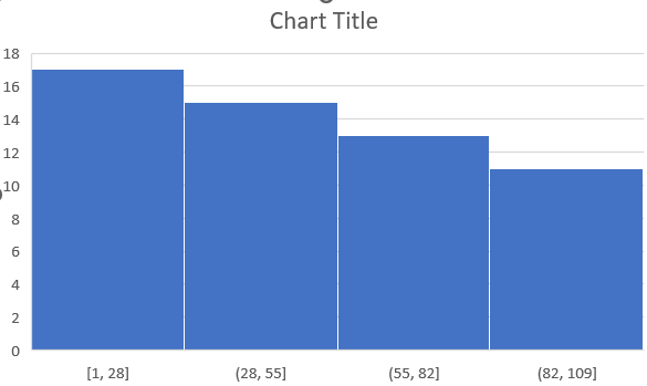
Histograms will categorize data into different “bins” and count the number of data points that fall within each of these bins. It will then plot the bins on the x-axis and the count of these bins as bars on the y-axis. This is what a histogram looks like –
Create a Histogram in Excel
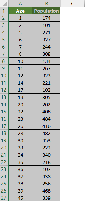
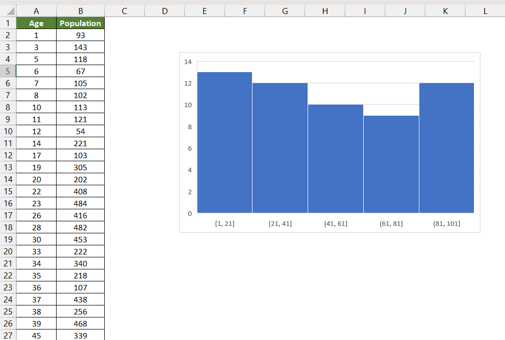
Suppose you have the age of individuals and their corresponding population as shown below.
Follow the steps below to create a histogram in Excel –
STEP 1: Select the data you want to use for your histogram.
STEP 2: Go to the Insert tab in Excel.
STEP 3: In the Charts group, click on the Insert Statistic Chart button and then select Histogram.
The histogram chart is now ready!
Customize Histogram in Excel
You can easily customize the histogram in Excel as per your needs. Here’s how you can make specific customizations –
Chart Title
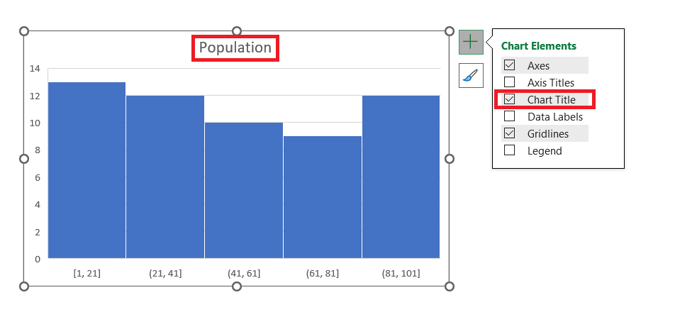
You can customize your chart title by simply clicking on the Chart Elements button (a plus icon usually found on the top right corner of the chart). Check the Chart Title option and edit the text.
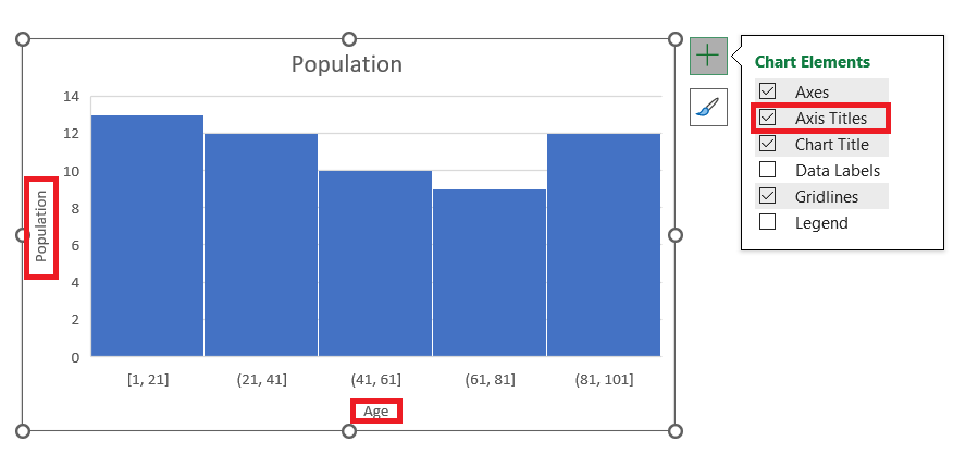
Axis Titles
You can label the x-axis and y-axis to make your chart more informative. Click on the chart, go to the Chart Elements button, and check the Axis Titles option to add labels to your axes.
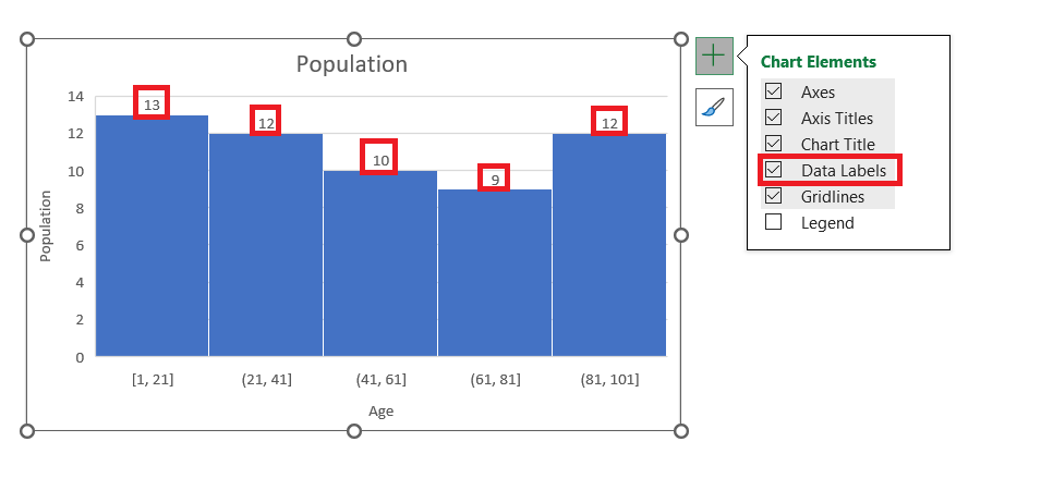
Data Labels
Data labels can be added to the bars of your histogram to display the frequency of data points in each bin. Right-click on the bars and select Add Data Labels.
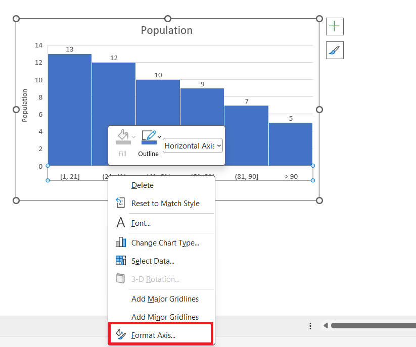
Adjusting Axis Option
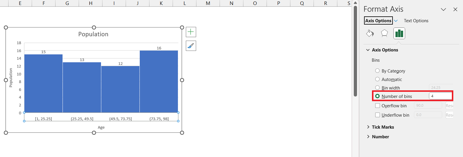
You can make any change in the axis by right-clicking on the x-axis and selecting Format Axis.
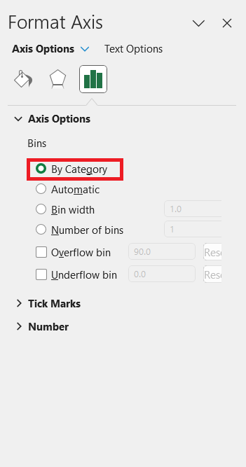
You can choose the any of following in the format axis section –
- Category – This option is used when you have text categories. There are repeated categories and you want a count of those text categories.
- Automatic – This option will automatically decide the bin for you.
- Bin Width – This option lets you decide the size of the bin. If you select 10, the size of each bin will become 10.
- Number of bins – This option lets you decide the number of bins that you want. If you select 4, Excel will divide the age into 4 groups.
- Overflow bins – Use this option, if you want all the values above a certain value clubbed together. Here, if you select 80, the last bin will be >80.
- Underflow bins – Use this option, if you want all the values below a certain value clubbed together. If you enter 18, the first bin will be <= 18.
Gridlines
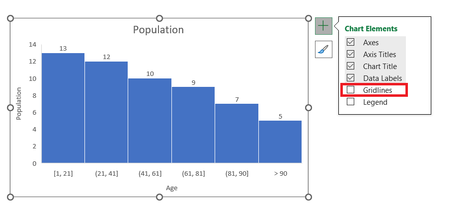
You can remove the gridlines by clicking on the Chart Elements button and unchecking the Gridlines option.
Conclusion
A Histogram in Excel is a visual representation of data distribution in Excel 2016. The article covers an introduction to histograms, how to create them, and customization options such as chart titles, axis labels, data labels, gridlines, and adjusting bin width.
Histograms categorize data into bins and display the frequency of data points within each bin on a chart, helping users understand data trends and patterns.
Further learning:
Click here to access Microsoft’s tutorial on Creating Histogram in Excel!
John Michaloudis is a former accountant and finance analyst at General Electric, a Microsoft MVP since 2020, an Amazon #1 bestselling author of 4 Microsoft Excel books and teacher of Microsoft Excel & Office over at his flagship Academy Online Course.
