Excel Sunburst Charts are one of the many new Charts available only in Excel 2016.
They are very visual as it can easily show you hierarchical data, like having a table with different levels of categorization.
In this article, you will be introduced to the following concepts regarding an Excel Sunburst Chart:
- What is an Excel Sunburst Chart?
- How to Create a Sunburst Chart in Excel 2016?
- Advantages and Disadvantages
- Key Tips & Tricks
- Conclusion
Let’s look into each of these points one-by-one!
What is an Excel Sunburst Chart?
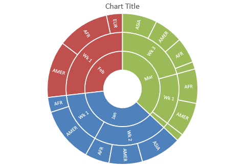
Excel Sunburst Chart is a built-in chart available in Excel 2016 that is used to display a hierarchical structure data in circular form.
Just like a doughnut chart, Sunburst Chart is also used to display a part of the whole data and compare relative sizes. But it can also show the relationships in the hierarchy.
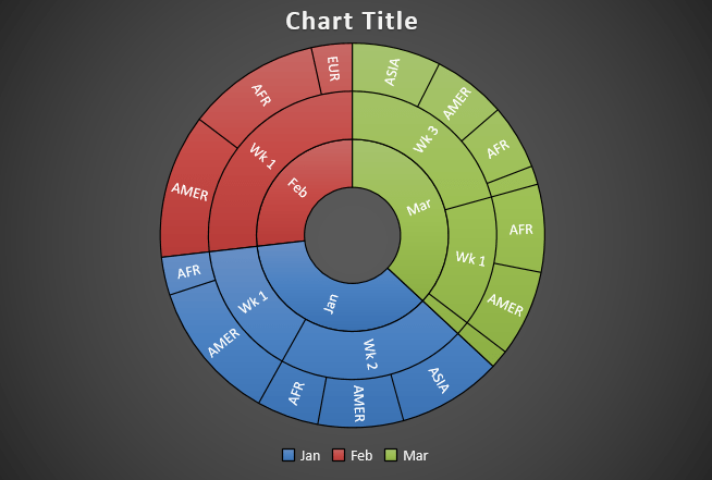
This is how an Excel Sunburst Chart looks like:
Since this chart looks somewhat like an exploding sun, it is called a Sunburst Chart.
Each level of the hierarchy is represented by a circle or ring with the innermost ring representing the top of hierarchy data and the outermost ring represents the last hierarchy.
Each group is represented by a different color and the subgroups are represented by a division. In the example above, January is represented by blue color and the subgroups like week and region are represented by different divisions.
How to Create a Sunburst Chart in Excel 2016?
Example 1:
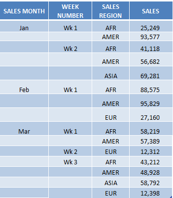
In the table, you have sales data containing the month, week, region, and sales amount.
Using this table, I show you how easy it is to insert an Excel Sunburst Chart using Excel 2016.
To upgrade to Excel 2016 you can use this link here: Microsoft Office 2016
Watch it on YouTube and give it a thumbs-up!
Follow the step-by-step tutorial below on how to create a Sunburst Chart in Excel 2016 and make sure to download the Excel Workbook to follow along:
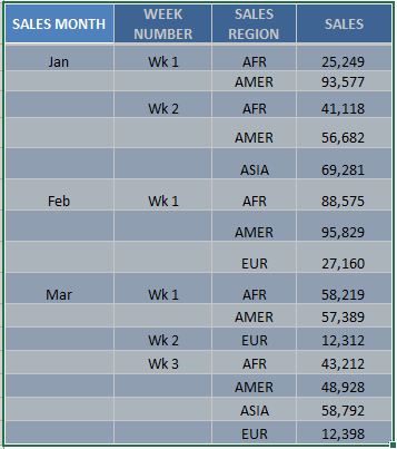
STEP 1: Highlight your table and go to Insert > Recommended Charts
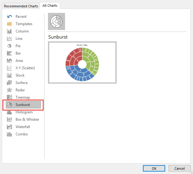
STEP 2: Select All Charts > Sunburst > OK
STEP 3: Now you have your Sunburst Chart.
STEP 4: You can further customize the look and feel of your Sunburst Chart, by going to Chart Tools > Design / Format
STEP 5: In our example, let us go to Chart Tools > Design and pick one of the alternate designs.
Now you have your beautiful looking Sunburst chart and you can quickly point out to your management where the biggest slice of the pie would be on…
Let’s take a look at another example!
Example 2:
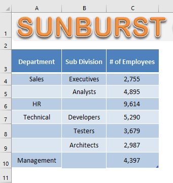
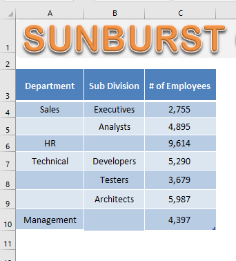
In the table below, you have the number of employees in a company based on the company organizational structure.
STEP 1: Select the Data Table.
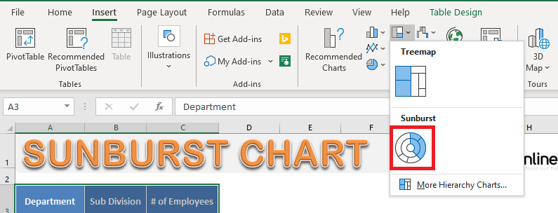
STEP 2: Go to Insert > Hierarchy Chart > Sunburst Chart.
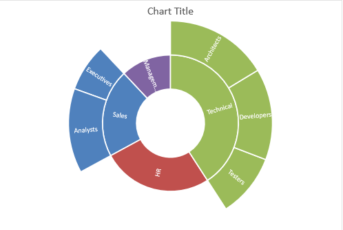
STEP 3: Your Sunburst Chart is ready!
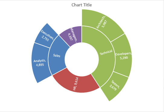
In this chart, you can see the proportionate number of employees in each department and subdivision.
It is clear that the maximum number of employees is in the technical department and the least number is in the Management department.
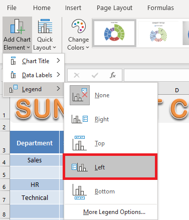
You can even add Legends to your chart.
STEP 4: Go to Chart Design > Add Chart Element > Legend > Left.
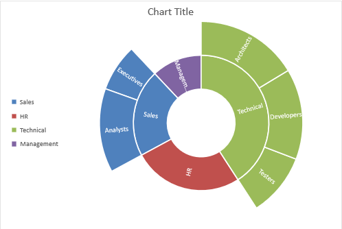
STEP 5: Legend to will added to the left of your Chart.
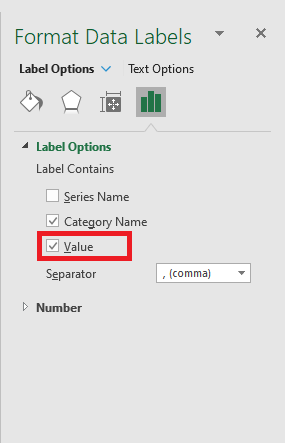
By default, the category name will b displayed on the chart. You can even add value to it.
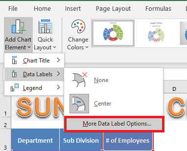
STEP 5: Go to Chart Design > Add Chart Element > Data Labels > More Data Label Options.
STEP 6: In the Format Data Labels dialog box, Check the Value box.
Value will be displayed next to the category name:
Now that you have learned how to create a Sunburst Chart in Excel, let’s move forward and know about the advantages and disadvantages of using them.
Advantages and Disadvantages
The advantages of using an Excel Sunburst Chart:
- It can be used to show relationships in the hierarchy.
- It can be used to show the breakdown of different categories.
The disadvantages of using a Sunburst Chart Excel are:
- It is hard to display labels on the Sunburst Chart.
- Data must be sorted by category.
- Not many options for formatting and customization.
Key Tips & Tricks
There are a few things you should keep in mind when you are working with Sunburst Charts
- There should be at least two levels of hierarchy for Excel to create these charts.
- Your data should not contain subtotal values as this will distort your chart.
Excel only needs data at the lowest level of the hierarchy to create Sunburst Charts. - Do not sort the data based only on the lowest level of hierarchy.
First, sort them based on the first level of the hierarchy and then the last level.
Conclusion
In this article, we have discussed this new chart in Excel 2016 – Sunburst Chart, a step-by-step tutorial on how to create and format it and its advantages and disadvantages.
You can learn more about the new charts introduced in Excel 2016 by clicking here.
Further Learning:
HELPFUL RESOURCE:
Bryan
Bryan is a best-selling book author of the 101 Excel Series paperback books.
