With Excel Pivot Tables you can do a lot of stuff with your data! But did you know that you can even create a Frequency Distribution Table?
Let’s have some fun below! I’ll show you how easy it is to create your own Frequency Distribution Chart!
We will create a chart based on this table with Sales values:
Table of Contents
Want to know How to Create Frequency Distribution with Excel Pivot Tables?
*** Watch our video and step by step guide below with free downloadable Excel workbook to practice ***
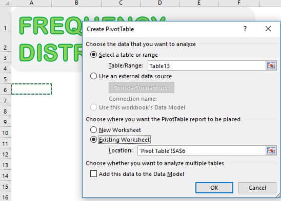
STEP 1: Let us insert a new Pivot Table. Select your data and Go to Insert > Tables > PivotTable
Select Existing Worksheet and pick an empty space to place your Pivot Table. Click OK.
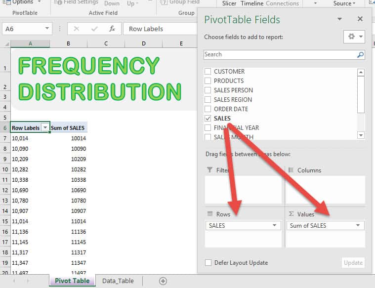
STEP 2: Drag SALES into VALUES and ROWS and you’ll see your Pivot Table get updated:
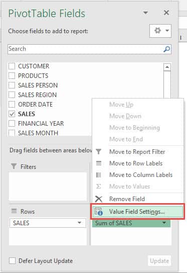
Click on Sum of SALES and select Value Field Settings.
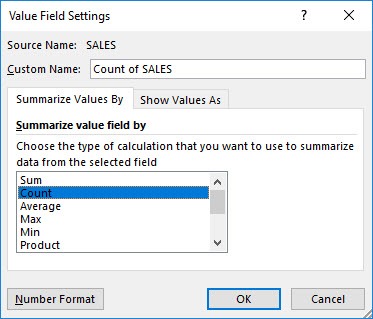
Select Count and click OK.
STEP 3: We are almost there! Right click on your Pivot Table and select Group.
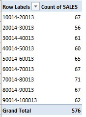
Accept the suggested values. It will group our values by ranges of 10,000. Click OK.
Now it’s grouped together!
STEP 4: Go to Analyze > Tools > PivotChart
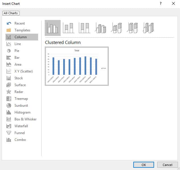
Ensure Clustered Column is selected. Click OK.
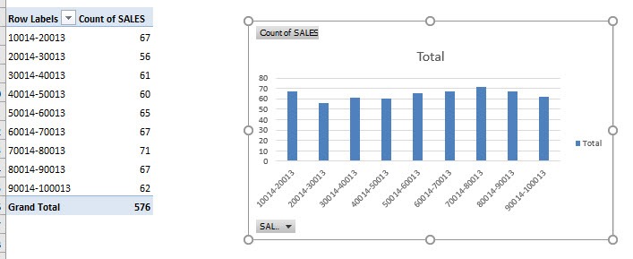
Your awesome Frequency Distribution is now ready!
Further Learning:
- Customising Excel Pivot Table Styles
- Move and Remove Fields and Items in Excel Pivot Tables
- Maximum in Excel Pivot Tables
Bryan
Bryan is a best-selling book author of the 101 Excel Series paperback books.


