In the realm of education, harnessing the power of data visualization is paramount. Before delving into the intricacies of creating grade charts in Microsoft Excel, it’s crucial to master the art of data gathering and structuring. With clean and uniform data, coupled with the essentials of histograms, you can embark on constructing insightful Bell Curve representations that unveil the nuances of student performance and inform targeted interventions.
Let’s explore the foundational steps and practical applications of the grade distribution chart!
Key Takeaways:
- Understanding the Bell Curve: It visualizes how data clusters around the average, aiding in comprehending normal distribution.
- Grading Systems Significance: The Bell Curve shapes grading practices, ensuring fairness and consistency in assessments.
- Excel Preparation: Structuring data is vital for creating accurate charts; cleanliness and uniformity are key.
- Histogram Essentials: Histograms in Excel illustrate frequency distributions and are crucial for creating Bell Curve visuals.
Table of Contents
Introduction to the Bell Curve
What is a Bell Curve?
Think of a Bell Curve as a graphical whisper telling the story of how certain data points cluster around the average, with fewer instances found as they move farther from the center. Picture that classic bell-shaped graph, symmetrically descending from a high point in the middle down to the tails at each end. That peak represents the most common occurrences. This view can help you understand the normal distribution in any given set of data, from test scores to heights.
Significance in Grading Systems
In the landscape of education, the Bell Curve wields significant power in grading systems. Most notably, it puts into perspective the spread of student grades across a course. This distribution, when visualized as a bell curve, often supports the practice of grading on a curve, where professors adjust scores so that the majority fall within the mid-range, reflecting a normal distribution.
By doing so, teachers can ensure fairness and consistency across different class sections and semesters. The reliance on a Bell Curve can counterbalance unusually difficult exams or assignments, bringing the mean score closer to an acceptable average. It ultimately aims for equity, preventing an overabundance of high or low grades that might not accurately reflect the student’s performance due to various anomalies in the assessment process.
Preparing Excel for Grade Chart Creation
Gathering and Structuring Your Data
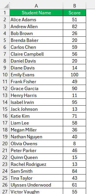
Before diving into the deep blue sea of Excel charts, start with gathering and structuring your data in a way that Excel can recognize and transform into comprehensible insights. For grade distribution, collect the individual scores of students and input them neatly into a spreadsheet column. To structure this information, you may categorize it by class periods, assignment types, or any other relevant factors.
Ensure that the data are clean and uniform — no stray marks or misalignments. For instance, if you’re dealing with test scores, ensure all values are in the same unit (points or percentages) and any absent data are handled correctly (marked as such or excluded, depending on your analysis needs).
The Essentials of Histograms in Excel
In Excel, histograms are a go-to tool for illustrating the frequency distribution of your gathered data points. Essentially, a histogram represents one aspect of the larger Bell Curve family and is constructed by binning ranges of data and then counting the number of occurrences within these bins. These bins are the pivotal actors, as they determine the intervals and the shape of the histogram. The more finely tuned your bins, the more precise your Bell Curve.
Creating a histogram in Excel usually involves specifying these bins — or class intervals — which can sometimes be as simple as letter grades (A, B, C, etc.) or numerical ranges reflecting grade thresholds.
Remember, the way you present your bins will profoundly impact how easily your audience, such as students or fellow educators, can interpret the grade distribution.
Step-by-Step Bell Curve Construction
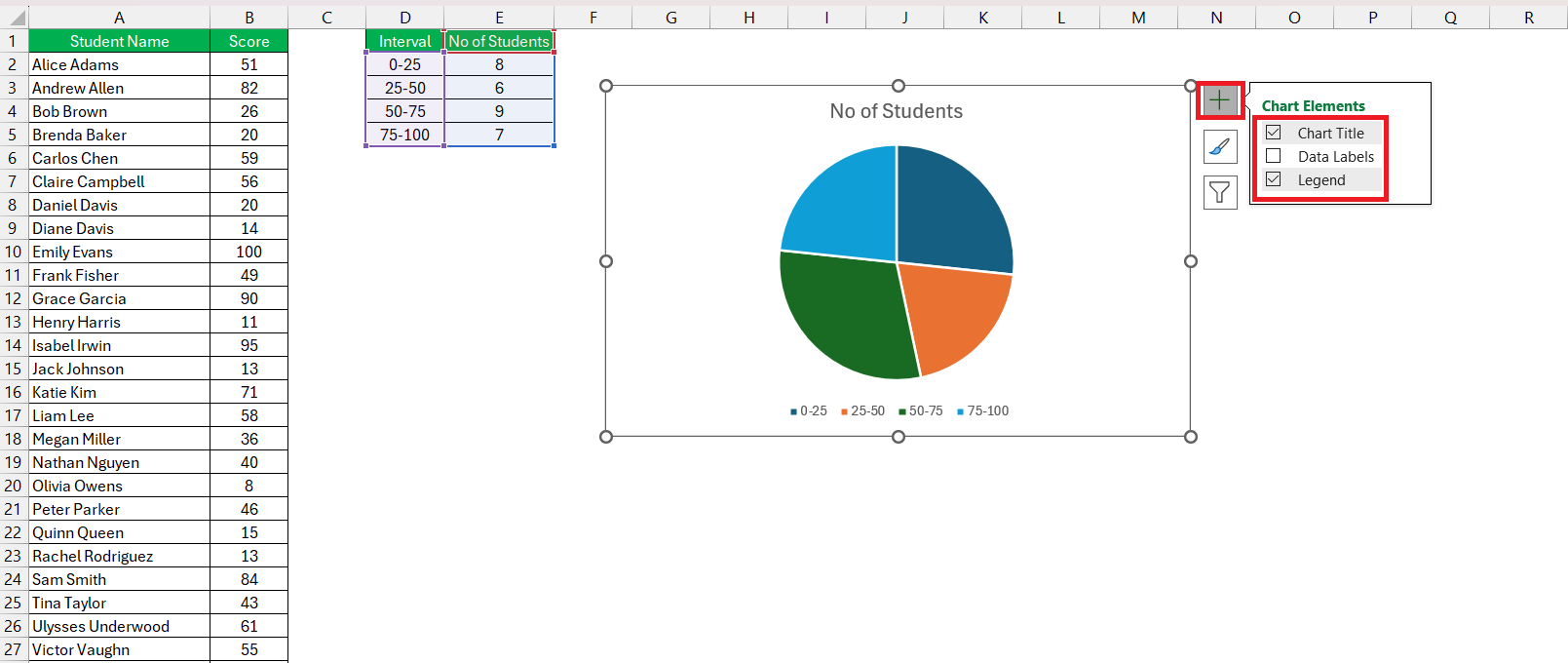
Create Pie Chart
Follow the steps below to create a Pie chart in Excel –
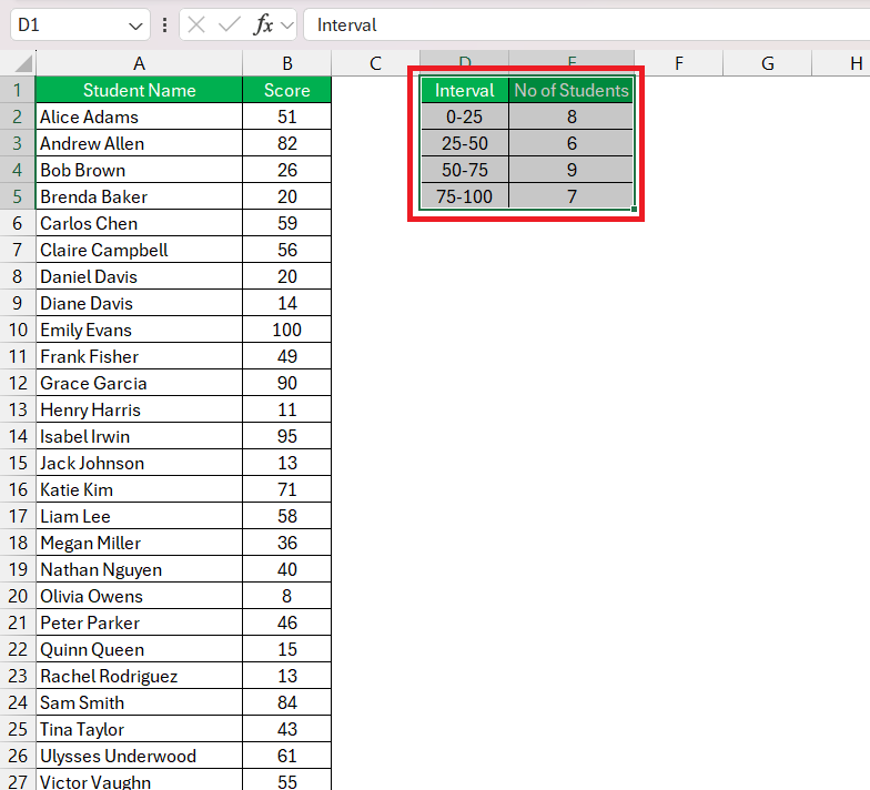
STEP 1: Select Data: Click and drag to select the range of cells containing your grade data, including any headers.
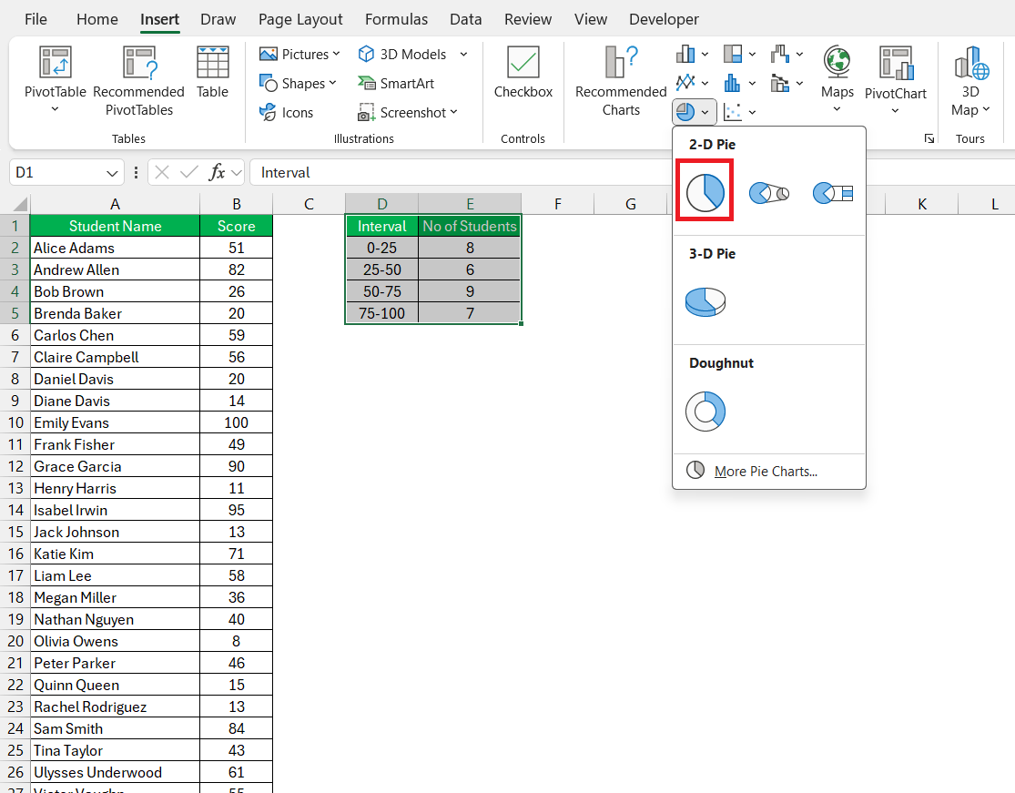
STEP 2: Insert Pie Chart: Go to the “Insert” tab on the Excel ribbon. In the “Charts” group, click on the “Pie Chart” icon.
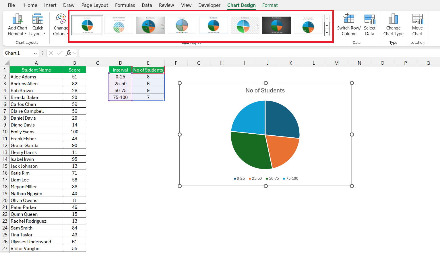
STEP 3: Choose Pie Chart Style: Excel will automatically generate a basic pie chart. You can choose different pie chart styles from the “Chart Styles” options in the ribbon.
STEP 4: Legend and Title: You can add or remove the legend and add a chart title by clicking on the chart and selecting the appropriate options.
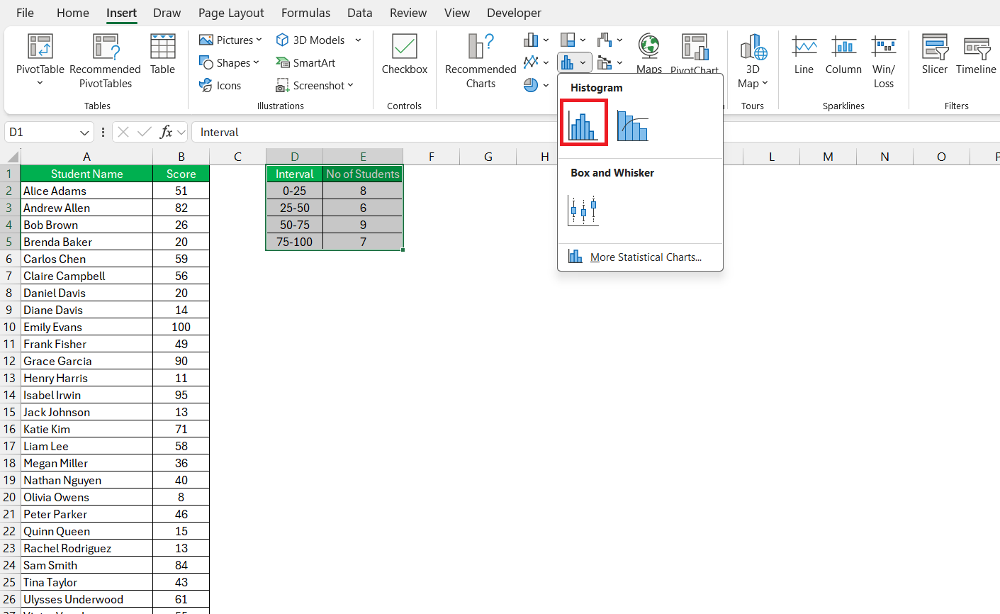
Create Histogram Chart
Follow the steps below to create a Histogram chart in Excel –
STEP 1: Select Data: Click and drag to select the range of cells containing your grade data, including any headers.
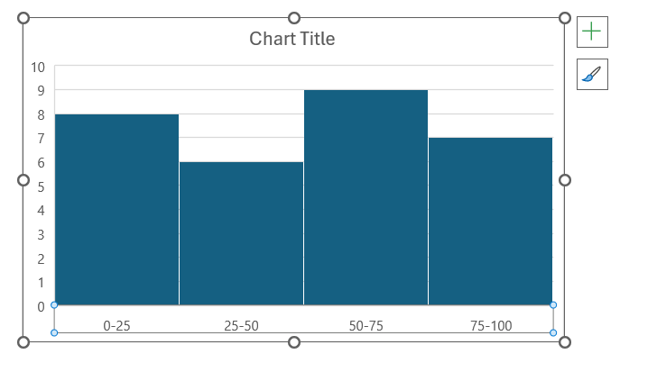
STEP 2: Insert Histogram: Go to the “Insert” tab on the Excel ribbon. In the “Charts” group, click on the “Insert Statistic Chart” dropdown menu. From the dropdown, select “Histogram.”
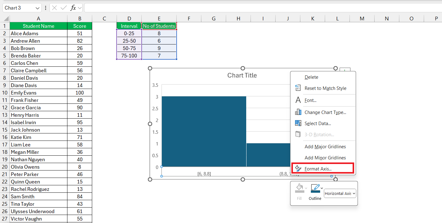
STEP 3: Customize Bins: Excel will automatically create bins for your histogram based on your data. To customize the bin width or number of bins, right-click on the x-axis and select “Format Axis.”
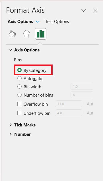
STEP 4: In the Format Axis dialog box, select Category.
Once your histogram is created, analyze the distribution of grades. Histograms help visualize how grades are distributed across different score ranges.
Practical Applications of the Bell Curve in Education
Assessing Student Performance Effectively
To assess student performance effectively, think of your Bell Curve as a spotlight, illuminating how your students fare against the course’s expectations. This graphic display assists in quickly identifying where the bulk of the class stands and highlighting those who defy the trend — be it positively or negatively.
This method brings data-driven insights into play, allowing you to tailor your teaching approach accordingly. Those riding the top of the curve could be in line for more challenging material, while the ones in the lower tails might benefit from some extra help or a review of foundational concepts.
By regularly analyzing these performance trends, you become more agile in your instruction, adapting to the evolving academic landscape of your classroom.
Implementing Interventions Based on Data Insights
Implementing interventions based on data insights is like being a strategic gardener who knows exactly when to water, prune, or fertilize plants for optimal growth. Once your Bell Curve has shone a light on the diverse academic landscape, targeted assistance can begin.
For students flourishing above the curve, offer enrichment activities to keep them engaged and growing. For those nestled within the curve’s embrace, continual support and solid instruction are key. For those at the fringes, dive into individualized instruction, supplementary tutoring, or modified approaches tailored to their needs.
Remember, the curve not only reflects the current state but can also predict where a bit of academic nourishment might yield a lush, robust garden of learners.
FAQ: Creating and Using a Bell Curve in Excel
What is a grade distribution chart?
A grade distribution chart is a visual representation, often like a histogram or bar graph, that shows how grades are spread across different levels within a class or course. It helps in understanding the overall performance of students at a glance.
How do you create a distribution chart in Excel?
To create a distribution chart in Excel, select your data range, go to the ‘Insert’ tab, click on ‘Insert Statistic Chart’, and choose ‘Histogram’. Fine-tune the bins and layout to match your distribution requirement, and your chart is ready.
How do I calculate the mean and standard deviation for my grade data?
To calculate the mean, use the =AVERAGE(range) function in Excel. For the standard deviation, if considering the whole population, use =STDEV.P(range), or =STDEV.S(range) for a sample of data.
Can I create a bell curve with a non-standard grading scale?
Absolutely, a Bell Curve can be crafted in Excel regardless of your grading scale, whether it’s numerical, alphabetical, or custom. Adjust the bins and axis to align with your unique grading metrics, and the resulting graph will reflect the distribution accordingly.
What should I do if my data isn’t normally distributed?
If your data isn’t normally distributed, consider applying data transformation techniques or a different type of chart. Investigate the potential causes for the skew and be cautious of making decisions solely based on the Bell Curve approach when your distribution significantly deviates from normal.
John Michaloudis is a former accountant and finance analyst at General Electric, a Microsoft MVP since 2020, an Amazon #1 bestselling author of 4 Microsoft Excel books and teacher of Microsoft Excel & Office over at his flagship Academy Online Course.
