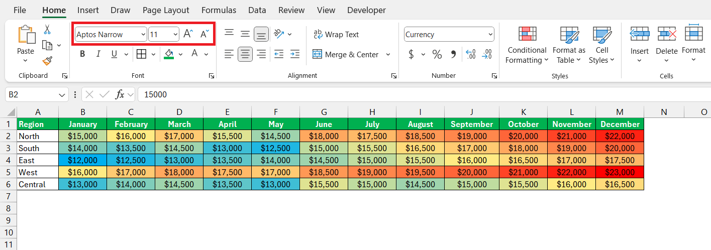
Microsoft Excel‘s heatmap creator serves as a powerful tool for swiftly extracting insights from extensive datasets. These color-coded maps illuminate patterns and outliers, making complex data easier to understand. Excel’s blend of simplicity and advanced features enables both novices and experts to create effective visualizations with ease.
Key Takeaways:
- Creating a heat map in Excel is easy with Conditional Formatting. Select your data range, apply a color scale, and transform your data into a colorful visual representation in just a few clicks.
- Excel allows detailed customization of heat maps, including adjusting color scales, adding borders, and using color-blind-friendly schemes, ensuring clarity and accessibility.
- Incorporating PivotTables adds interactivity to your heat maps, allowing dynamic filtering and sorting, which enhances their analytical power for presentations and data analysis.
- For effective heat maps, choose appropriate color scales, keep designs simple, use clear labels and legends, and test different formatting options to convey complex data intuitively.
Table of Contents
Introduction to HeatMap Creator in Excel
The Power of Visual Data Representation
In an age where information overload is a real challenge, visual data representation stands as a beacon of clarity. Heat maps in Excel bolster your ability to quickly glean insights from vast amounts of data by using colors. As your eyes scan these vibrant charts, patterns, and outliers pop out at you, making complex datasets much easier to digest.
Why Excel for Heat Maps?
Excel is a widespread tool that combines simplicity with powerful features, making it accessible for both novices and experts. Creating heat maps in Excel is a perfect example of this fine balance. It requires minimal setup, yet offers enough depth for more elaborate visualizations.
Whether you’re presenting to a team or analyzing data patterns, Excel’s heat map functionality lets you convert rows of numbers into meaningful insights with just a few clicks. And if you already have your data in a spreadsheet, why not take advantage of this built-in feature?
Step-by-Step Guide to Create a Heat Map Quickly
Step 1: Inputting Your Data
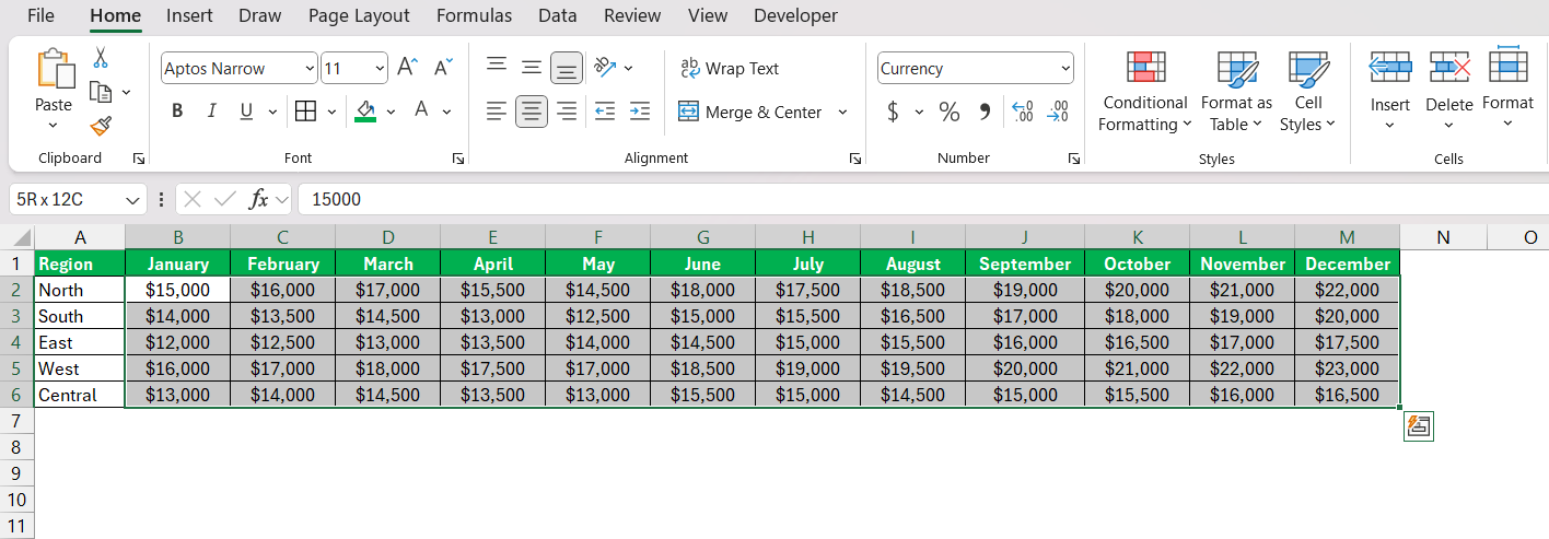
The first step towards a heat map masterpiece is to get your numbers in order. Open up your Excel worksheet and input the data that will be the base of your heat map. This data should be carefully arranged in rows and columns, ensuring that every label is in the right place.
Think of it as setting up the chess board before the game – each piece needs to be in its proper position. If you’ve collected your data elsewhere, make use of Excel’s handy import features to bring it directly into your worksheet without the hassle of manual entry.
Step 2: Applying Conditional Formatting
Now that your data is neatly inputted, the next step is bringing your heat map to life with colors. Follow the steps below to apply conditional formatting –
- Click on the first cell of your data range, then drag to select all the relevant cells.
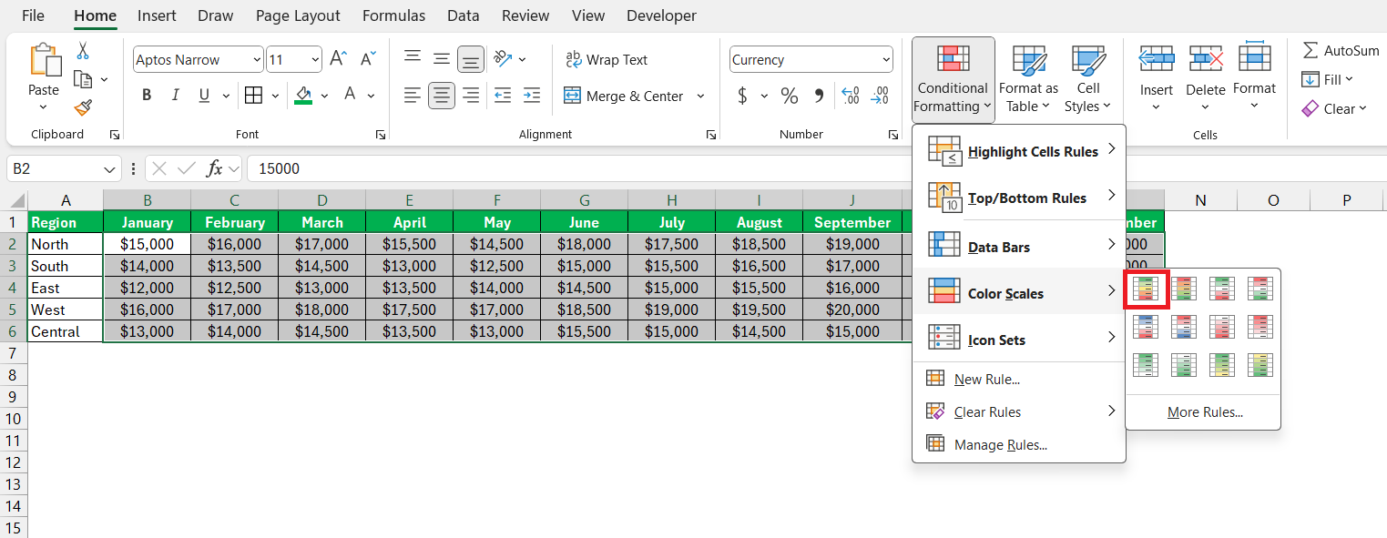
- Head over to the ‘Conditional Formatting‘ option under the Home tab. From the dropdown menu, select “Color Scales.” Excel provides several predefined color scales. Choose the one that best fits your needs.
For example, you might select a green-yellow-red scale where green represents high values, yellow represents mid-range values, and red represents low values.
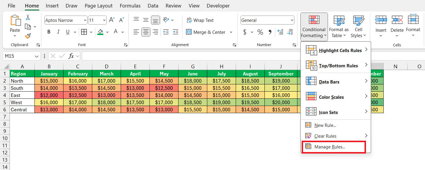
The heatmap will now be created!
Step 3: Adjusting Color Scales and Styles
After applying the initial colors, it’s time to adjust and refine. Go back to ‘Conditional Formatting’ and open ‘Manage Rules’ for more intricate control.
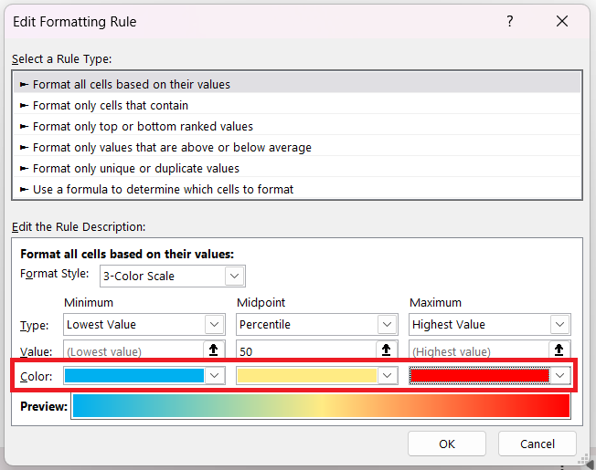
Here, you can tweak the minimum, midpoint, and maximum values and choose whether they’re determined by number, percentile, or a formula. Pick your desired colors for each threshold, ensuring they flow intuitively from one to the next.
For instance, you might designate a cool blue for the lowest values, a neutral yellow for the middle, and a hot red for the highest to create a visual thermometer effect.
Fine-tuning the intensity and shades of these colors can emphasize specific data trends or make your map more accessible to those with color vision deficiencies.
Step 4: Fine-Tuning and Customization Tips
Your heat map is taking shape, but like any good artwork, it requires some fine-tuning. First, consider the map’s borders. Adding lines can clearly define each cell, making the map easier to read. To do this, select your map range, then under the ‘Home’ tab, choose ‘Borders‘ and select ‘All Borders.’ This adds neat lines between your colored cells.
Next, think about personalizing your heat map’s appearance to match your presentation style or company branding. If you need more attention on a specific data point, using a contrasting color or adjusting the brightness can make it stand out.
Lastly, use the ‘Format Cells‘ options to add a professional touch with fonts, number formats, or alignment. While the colors communicate the main message, these minor adjustments ensure your heat map is not only informative but also visually appealing and consistent with your overall message.
Advanced Techniques for Dynamic Heat Maps
Incorporating PivotTables for Interactive Heat Maps
Isn’t it exciting to watch your data come alive? Now, take it a step further with PivotTables—Excel’s powerhouse feature for creating interactive heat maps. You’re not just painting by numbers anymore; you’re setting the stage for dynamic data exploration. By linking a PivotTable to your heat map, you can add an interactive component, allowing users to filter and sort data, watching as the heat map responds and updates in real-time.
To integrate a PivotTable into your heat map, select your dataset, go to the Insert tab, and click ‘PivotTable.’
Once you’ve created a Pivot Table, you can apply conditional formatting within it just as you would in a regular data range.
This way, the heat map will reflect the aggregated values or summary data in the PivotTable, which updates as you manipulate the table’s fields.
Best Practices for Creating Heat Maps
- Choose Appropriate Color Scales – Select color scales that provide a clear distinction between different values. Avoid using too many colors, as this can make the heat map confusing. Typically, a three-color scale (low, mid, high) is sufficient.
- Keep It Simple – Avoid adding too many details or decorations. A heat map’s strength lies in its simplicity and ability to convey complex data through colors.
- Use Labels Wisely – Ensure your rows and columns are clearly labeled to help viewers understand what the data represents. You can also add a legend to explain the color scale used.
- Be Mindful of Color Blindness – Approximately 8% of men and 0.5% of women worldwide are affected by color blindness. Consider using color scales that are color-blind friendly, such as blue-orange instead of red-green.
- Test Different Scales – Experiment with different color scales and formatting options to find the one that best highlights your data. Excel’s flexibility allows you to try out various styles before settling on the final design.
FAQs: Fast Heat Map Creation in Excel
What is the quickest way to create a heat map in Excel?
The quickest way to create a heat map in Excel is by using the Conditional Formatting feature. Just select your data, go to the Home tab, click on Conditional Formatting, select Color Scales, and choose a preset color scale option. This instant visual layer automatically applies a color gradient to your selected cells, creating a heat map aligned with the data’s values.
Can I create a heat map with non-numeric data in Excel?
You can create a heat map with non-numeric data in Excel by using Conditional Formatting with a workaround, like assigning values to categories and then applying color scales to those values. However, native Excel features are inherently designed to work with numerical data. For non-numeric data, consider creating a custom solution with VBA to assign specific colors to different text values.
How do I share my Excel heat map with people who don’t have Excel?
To share your Excel heat map with those without Excel, save it as a PDF or an image file. Click ‘File’, then ‘Save As’, and choose ‘PDF’ or ‘PNG/JPEG’ format from the dropdown menu. This way, anyone can view your heat map without needing Excel, ensuring broader accessibility. You can also use online platforms to create a shareable link or embedded visualization.
Are there limitations to heat maps created in Excel?
Yes, heat maps in Excel come with limitations. Excel can’t map specific cities or addresses, and customization options are basic, which means you might not get the visual precision or style that specialized mapping software offers. Editing them can involve complex conditional formatting, which is time-consuming for large datasets. Plus, Excel heat maps are static and may not support annotations directly on the map.
How to create a heat map by zip code in Excel?
To create a heat map by ZIP code in Excel, arrange your ZIP codes and corresponding data values in two columns. Go to the ‘Insert’ tab, click on ‘Maps’, and select ‘Filled Map’. Excel will then generate a map based on the geographical data, coloring the areas by the values you’ve provided, creating a ZIP code-based heat map.
John Michaloudis is a former accountant and finance analyst at General Electric, a Microsoft MVP since 2020, an Amazon #1 bestselling author of 4 Microsoft Excel books and teacher of Microsoft Excel & Office over at his flagship Academy Online Course.

