Table of Contents
What is A Histogram?
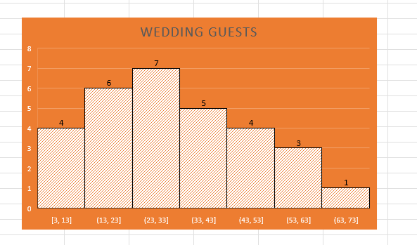
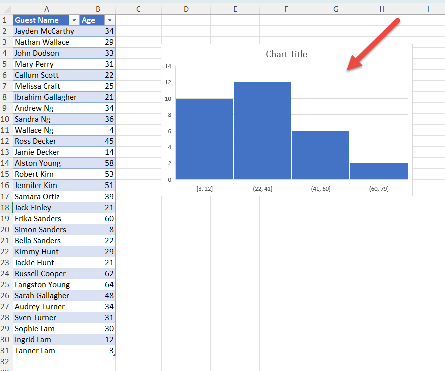
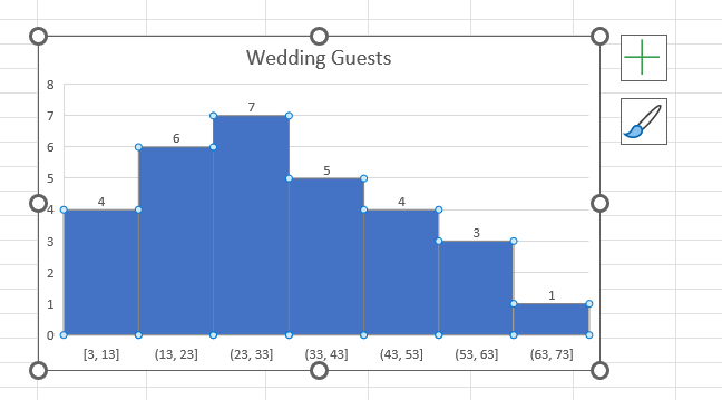
A histogram is a powerful tool for visualizing the distribution of data. Whether you’re analyzing sales figures, survey responses, or any other set of numerical data, creating a histogram in Excel can provide valuable insights. This is what a histogram in Excel looks like:
You will notice that each bar visually represents specific numerical data.
Excel refers to these visual segments as “bins.” Each bin signifies a particular range, such as 1-10, 11-20, and so forth.
On the vertical axis (y-axis), we depict the frequency or count of occurrences for each range in our dataset. The height of each bar reflects the number of data points falling within that specific range in our dataset.
In this article, we’ll walk you through the process of creating a histogram in Excel to help you understand and apply this useful feature:
Let’s look at these methods thoroughly!
Download the Excel Workbook below to follow along and understand How to Create a Histogram in Excel
download excel workbookHistogram-in-Excel.xlsx
STEP 1: Prepare Your Data
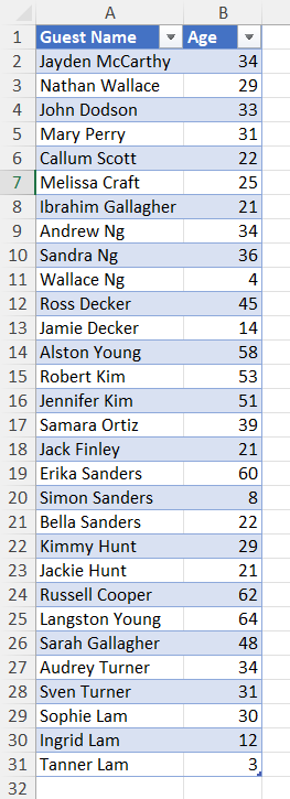
To begin creating a histogram, it’s important to make sure your data is properly arranged in either a single column or row within an Excel worksheet. For this example, let’s consider a dataset containing the ages of 30 people on a wedding guest list.
STEP 2: Selecting the Data Range
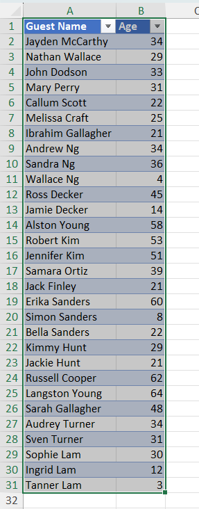
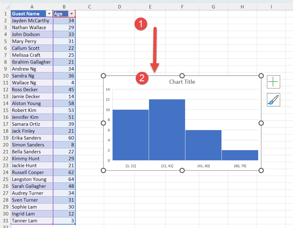
Begin by Selecting the data range that you want to use for the histogram. In our case, we will Select our data table, which contains the ages of the 30 wedding guests.
STEP 3: Inserting the Histogram
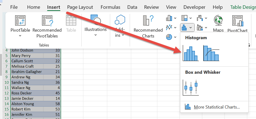
Go to the Insert > Charts > Histogram
Excel will automatically generate the histogram in the spreadsheet area.
STEP 4: Adjusting the Histogram
To customize the histogram, you can make adjustments to its location, size, and title.
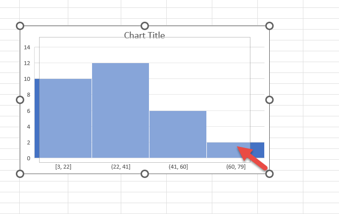
To change the location of the histogram within your spreadsheet, Click on a blank space within the graph area, hold the Left Mouse button, and Drag the graph to the desired position.
To Resize the graph, click on one of the corner circles and adjust the borders of the graph area as needed.
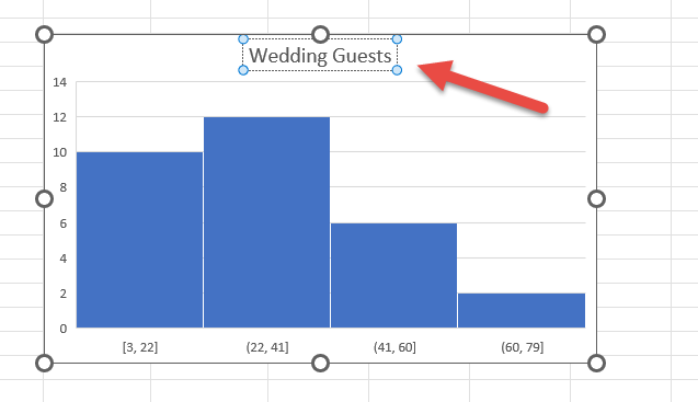
Double-click on the Chart Title and enter a new name to change the title of the histogram.
STEP 5: Modifying the Histogram
The histogram is divided into “bins,” which represent age ranges in our example. You can modify these bins to suit your preference.
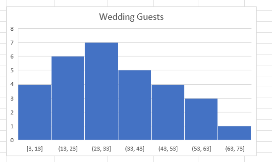
Each column, or bin represent an age group in the guest list.
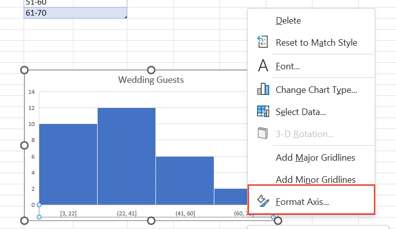
To change the age range, Right-click on the horizontal axis of the graph and select Format Axis. A pane will appear on the right side.
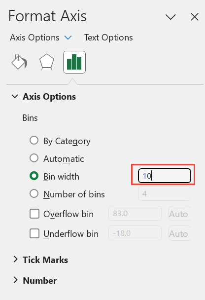
Adjust the Bin width to change the age range covered by each column in the histogram. If you want Excel to dynamically calculate the bin width for you, you can set the number of bins instead.
For our example, we will change the age range to 10 years. You will now see the bins ranging from 3-13, 13-23, and so on. It has started from 3 as that is the lowest age in the data table.
STEP 6: Adding Data Labels
To display the number of people in each age group directly on the histogram, follow these steps:
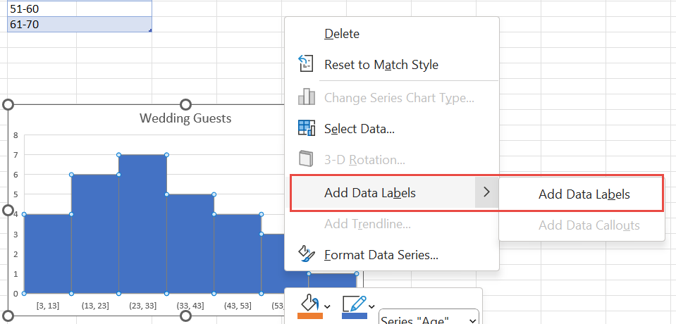
Right-click on the graph and select Add Data Labels.
Each bin will now show the exact number of people belonging to that age group.
STEP 7: Changing Style and Design
Excel provides options to modify the color scheme, style, and design of the histogram.
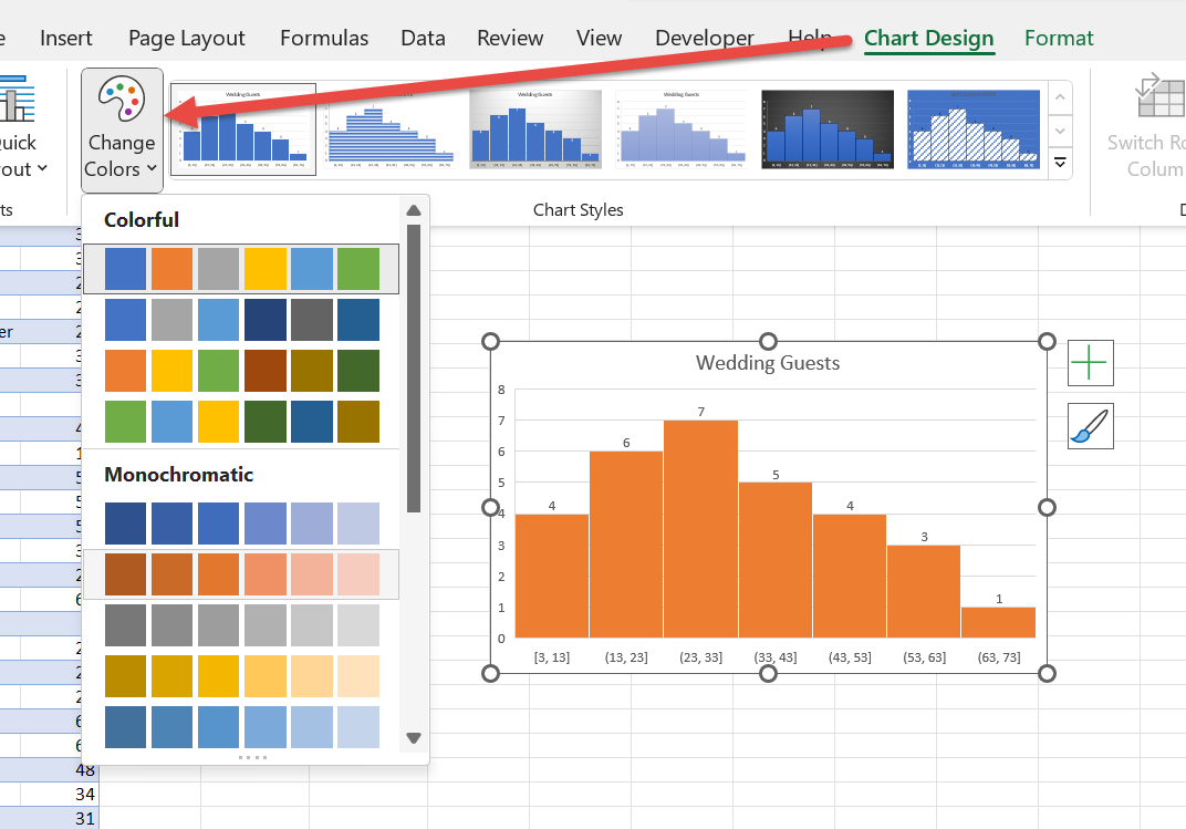
Click on a blank space within the graph area and go to the Chart Design tab. Use the Change Colors button to select a different color scheme for the histogram.
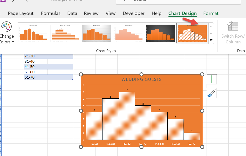
To change the style, click on the downward-pointing arrow in the Chart Styles section and pick a design.
There you have it! By knowing How to Create Histograms in Excel, you gain the ability to identify outliers and unearth valuable insights hidden within your data.
If you want to learn more about Excel charts, check out our Top 61 Excel Charts here.
John Michaloudis is a former accountant and finance analyst at General Electric, a Microsoft MVP since 2020, an Amazon #1 bestselling author of 4 Microsoft Excel books and teacher of Microsoft Excel & Office over at his flagship Academy Online Course.
