Grasping the fundamentals of X and Y axes in Microsoft Excel is essential for effective data visualization. The X-axis generally represents categories or time, while the Y-axis measures values, creating a clear structure for your data story. In this article, we will provide a comprehensive guide on How to Switch X and Y Axis in Excel.
Key Takeaways:
- Axis Orientation: Proper X and Y axis alignment is crucial for accurate data representation, helping viewers easily discern patterns and trends.
- Switching Axes: Use the “Select Data” function in Chart Tools to swap axes by selecting your chart and clicking “Switch Row/Column.”
- Customizing Axis Labels: Enhance clarity by adjusting axis labels and categories, ensuring a clear and uncluttered presentation.
- Adjusting Scale and Range: Fine-tune axis scales and ranges via the ‘Format Axis’ dialog box for optimal data display and trend visibility.
- Real-World Applications: Swapping axes can uncover hidden patterns and insights, benefiting fields like marketing and financial analysis.
Table of Contents
Unveiling the Axes in Excel
Understanding the Basics of X and Y Axes
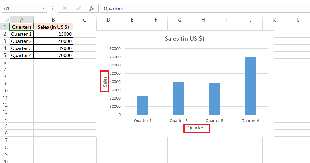
In Excel, getting to grips with the basics of X and Y axes is like setting the stage for a data storytelling adventure. The X-axis is your horizontal path, often hosting the painstakingly categorized data, where every step marks a clearly labeled point in time or category.
On the vertical climb of the Y-axis, you measure success, growth, decline, or any numerical values, each rung on the ladder a meaningful statistic. Together, these axes are crucial in framing your data’s narrative.
The Significance of Axis Orientation
The orientation of the axes in an Excel chart is not a trivial matter; it’s a strategic choice that greatly influences how your information comes across to your audience. When the X and Y axes are correctly aligned with your data sets, they serve as a clear guidepost, leading viewers’ eyes to the crux of your analysis.
Flipping the axes might cast a whole new light on your findings, revealing patterns or trends that could otherwise go unnoticed. It’s like turning the map around until you find the direction that makes the most sense; that’s the power of axis orientation in conveying the essence of your data story.
Step-by-Step Approach to Switching Axes
Accessing the Chart Tools for Modifications
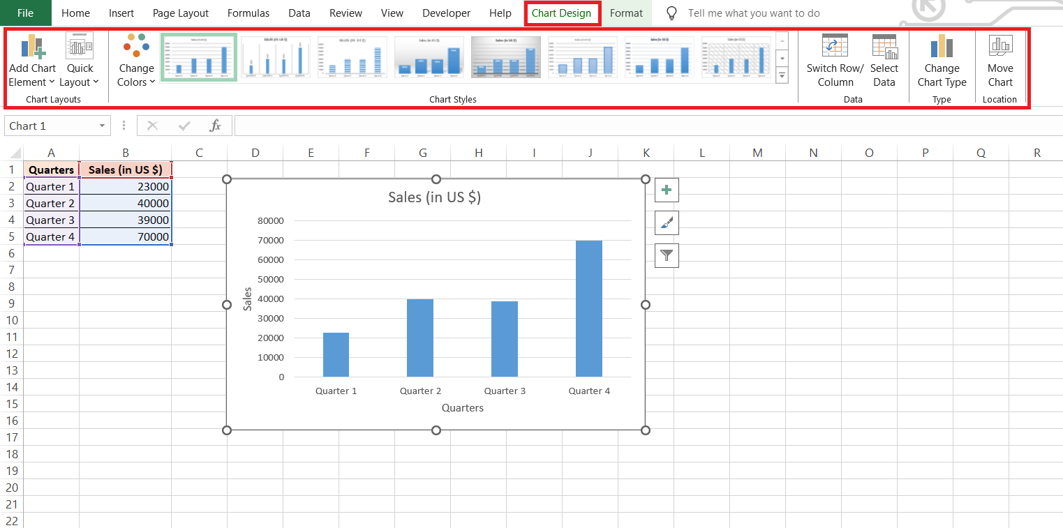
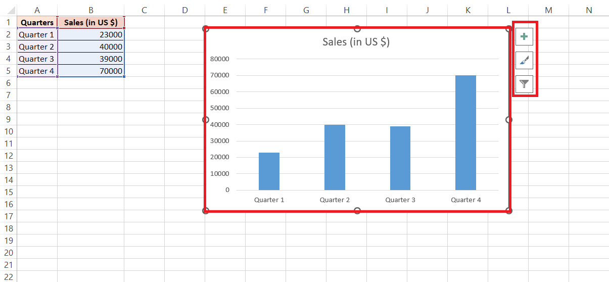
When the moment comes to tailor your chart, Excel’s Chart Tools swoop in like a trusty Swiss Army knife, equipped with everything you need. By clicking on your chart, the Design and Format tabs pop up, eager to assist. From here, you delve into a world of customization.
The Design tab is your starting point, where tweaks to the chart elements, such as axes, can be commenced with just a few clicks, and crucially, it’s your gateway to swapping those axes around.
Implementing the Switch with the “Select Data” Function
Once you’re cozied up with the Chart Tools, the “Select Data” function emerges as your wizardry wand. By clicking on it, a dialog box unfurls like a map, inviting you to chart a new course for your data.
Here’s where the magic happens:
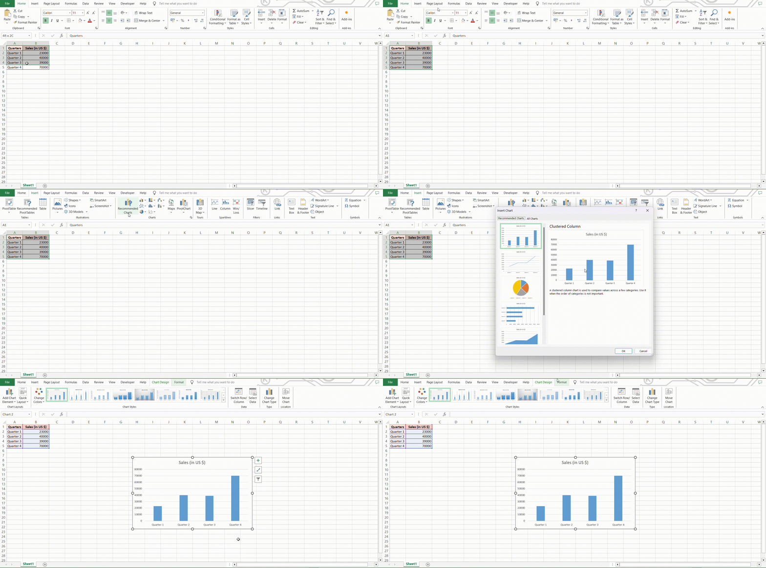
STEP 1: Create Chart: Select your data range and insert a chart using the “Insert” tab.
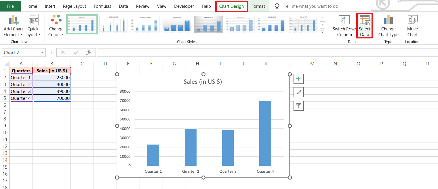
STEP 2: Select Chart: Click on the chart to activate the Chart Tools.
STEP 3: Select Data: Click “Select Data” from the Chart Tools Design tab.
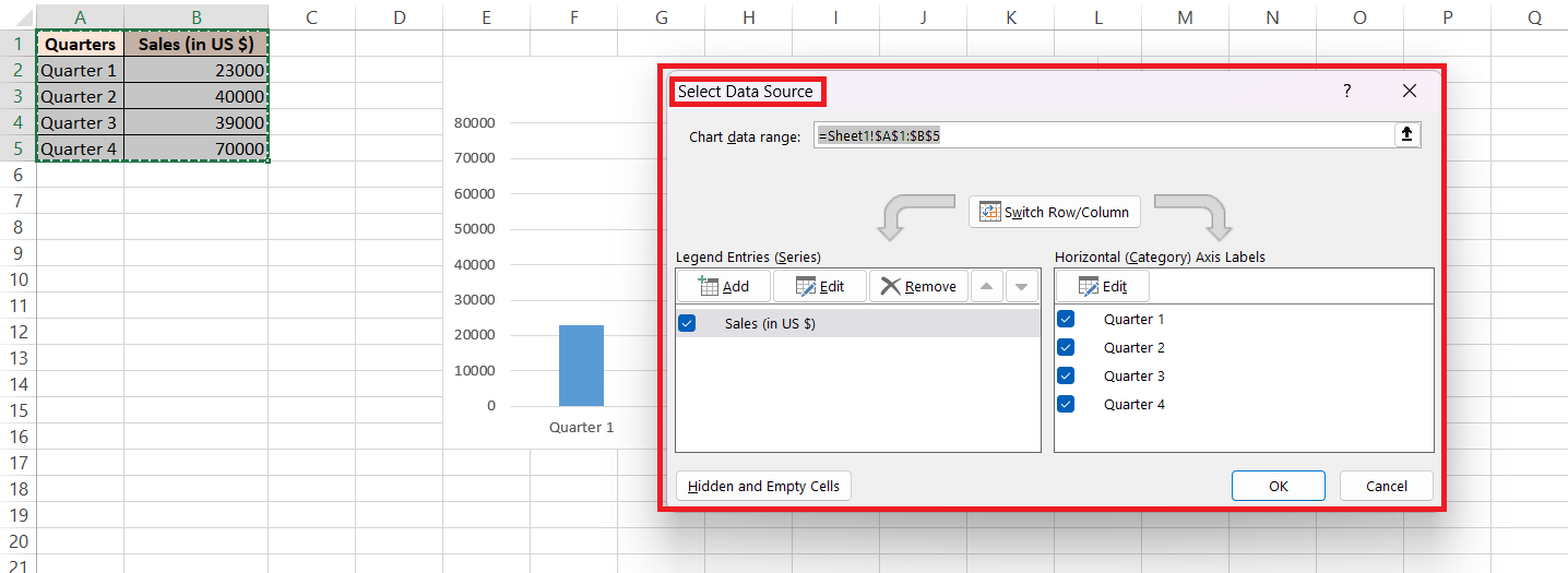
STEP 4: Open Dialog Box: The “Select Data Source” dialog box appears.
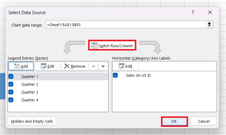
STEP 5: Switch Row/Column: Click the “Switch Row/Column” button to swap data orientation. Apply changes by clicking on “OK”.
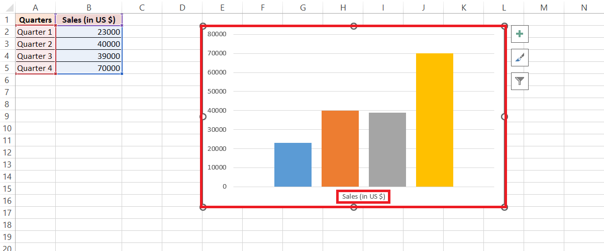
RESULT: Updated chart with the new data orientation.
Tailoring the Axes to Your Data Needs
Fine-Tuning Axis Labels and Categories
Diving even deeper into customization, and fine-tuning axis labels and categories is akin to choosing the perfect font for an invitation—it sets the mood and clarity for your guests. You can manipulate intervals between labels for just the right pacing, making sure each tick mark is a drumbeat in tune with your data’s rhythm.
Adjust the label distance from the axis to avoid a cluttered dance floor, offering each piece of data the space to make its presence felt. The harmony of your data presentation depends on these subtle tweaks.
Adjusting the Scale and Range for Optimal Display
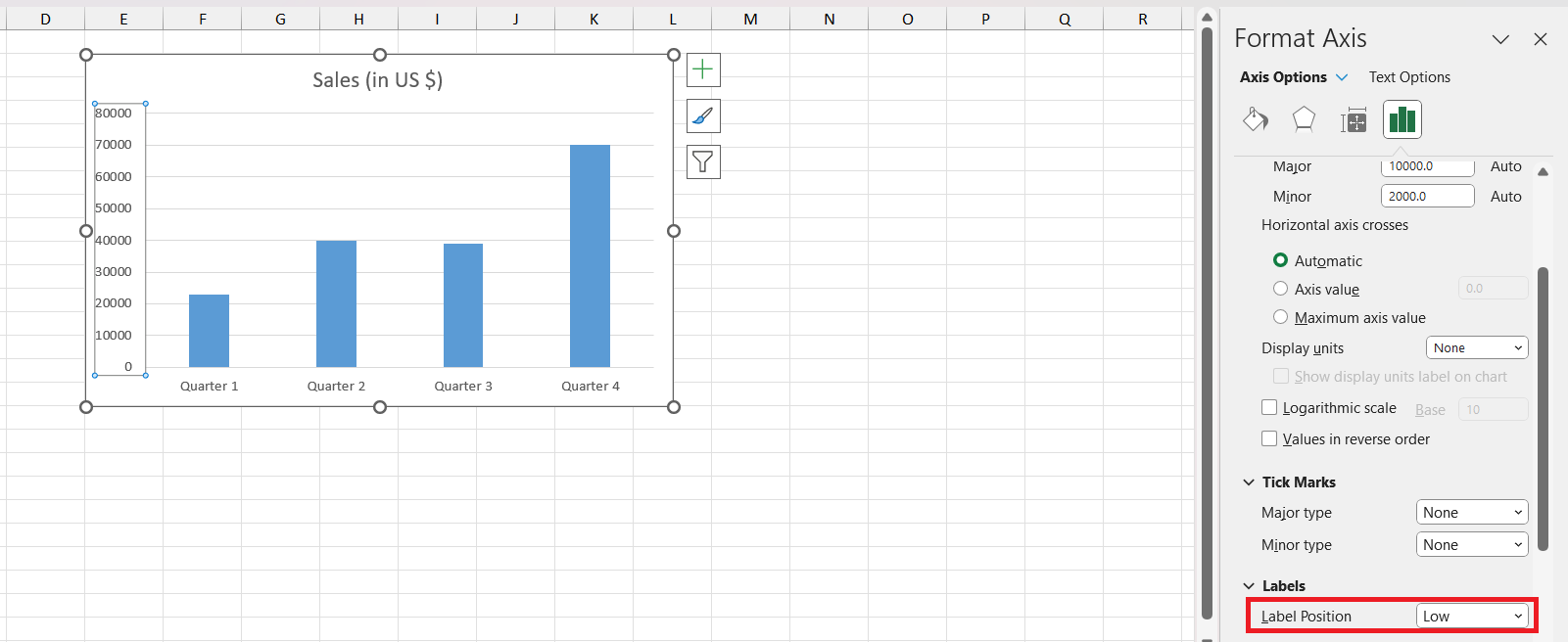
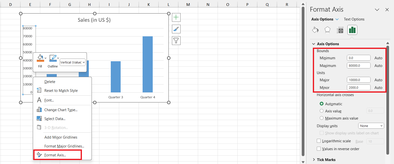
If the thought of viewers squinting at their screens or scratching their heads over your data keeps you up at night, then learning to adjust the scale and range on your Excel chart is your dream come true. Find comfort in the ‘Format Axis’ dialogue box, your trusty sidekick where scales can be stretched or shrunk as if you’re wielding a zoom lens for your viewers’ comprehension.
Optimal display is about getting the maximum and minimum values just right—a Goldilocks zone where trends leap to the forefront and anomalies don’t go hiding.
Real-World Applications of Swapping Axes in Excel
Case Examples of Axis Reorientation Benefits
Let’s zoom in on some real-world stories where axis reorientation turned the tide. Take a marketer analyzing customer trends—by flipping the axis, they highlighted product preferences over time, uncovering a seasonal pattern that was obscured before.
Another case: a financial analyst found that switching axes better displayed the correlation between two economic indicators, clearing the fog on a complex fiscal landscape. These cases illustrate the transformational power of a simple axis swap, converting confusion into clarity, one chart at a time.
Industry-Specific Scenarios and Solutions
In healthcare, swapping axes might distill patient data trends, shedding light on the efficacy of treatments across demographics. Meanwhile, in retail, it could juxtapose sales data with seasonal events, crafting a vivid narrative of consumer behavior.
In finance, aligning investment returns against time periods may reveal insights crucial for future strategies. The scenarios are as varied as the industries themselves, but the common thread is how a fresh perspective on axes can unlock strategic solutions and drive informed decision-making.
Frequently Asked Questions (FAQs)
What is the x-axis in Excel?
In Excel, the x-axis is the horizontal plane on your chart, showcasing categories of data such as time intervals, names, or unique identifiers. Think of it as the groundwork for plotting your data points, the stage where your story’s characters—whether they’re sales figures or survey responses—come to life.
Why add a second axis to the Excel chart?
Adding a second axis to an Excel chart lets you clearly present two different data sets that may have varying units or scales. It’s perfect for comparing distinct variables, like combining absolute numbers and percentages, without one overshadowing the other—ensuring both stories are told harmoniously.
Why Would You Need to Swap the X and Y Axes in Excel?
Swapping the X and Y axes in Excel might come in handy when your current chart doesn’t quite serve the story you want to tell. Perhaps you’re aiming to emphasize a trend over time, or it’s simply clearer when the data series are transposed. This switch can resurface hidden insights and deliver a more intuitive visualization for your audience.
Can You Switch Axes on All Types of Excel Charts?
Most Excel charts, like bar, line, and scatter plots, allow you to switch the axes. However, certain chart types, such as pie or doughnut, don’t have axes in the traditional sense as they represent parts of a whole. So, it’s a yes for many, but not all chart types.
Which data labels to display in Excel charts?
Choose data labels in Excel charts that directly emphasize your key points. This could be displaying value labels on a bar chart for immediate impact or using percentage labels on a pie chart for clarity. Always aim for labels that enhance comprehension without cluttering your visualization.
John Michaloudis is a former accountant and finance analyst at General Electric, a Microsoft MVP since 2020, an Amazon #1 bestselling author of 4 Microsoft Excel books and teacher of Microsoft Excel & Office over at his flagship Academy Online Course.
