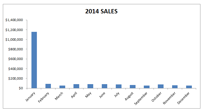
When you have a large numerical range of data and you want to plot a graph, you will most probably end up with a skewed looking chart like the one below:
You want to create an Excel Chart Logarithmic Scale!
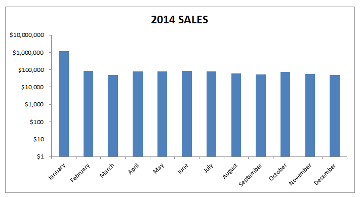
You can use the logarithmic scale Excel (Excel log scale) in the Format Axis dialogue box to scale your chart by a base of 10.
What this does is it multiplies the vertical axis units by 10, so it starts at 1, 10, 100, 1000, 10000, 100000, 1000000 etc. This scales the chart to show a more even spread, like the image below:
Want to know how to use a Excel Chart Logarithmic Scale?
*** Watch our video and step by step guide below with a free downloadable Excel workbook to practice ***
John Michaloudis is a former accountant and finance analyst at General Electric, a Microsoft MVP since 2020, an Amazon #1 bestselling author of 4 Microsoft Excel books and teacher of Microsoft Excel & Office over at his flagship Academy Online Course.


