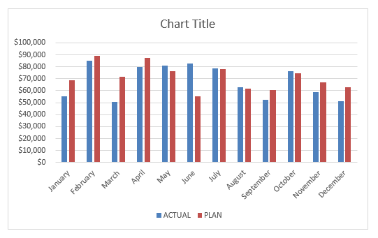
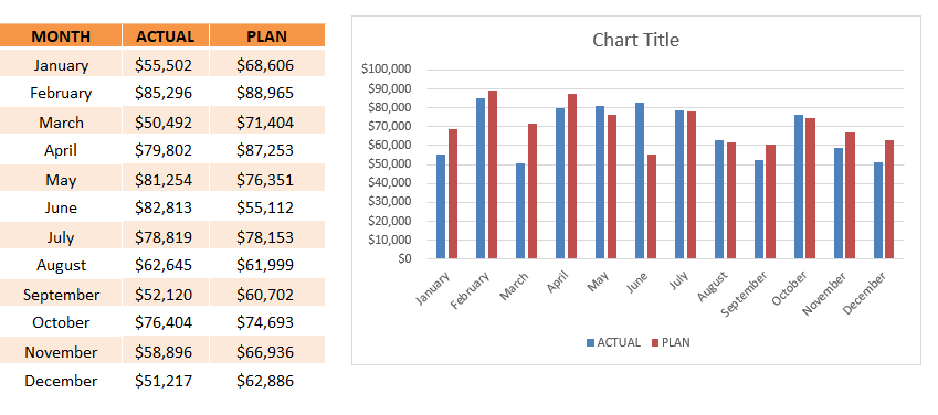
If you try to plot Actual vs Target values in form of a Clustered Column in Excel, it will look like this:
Even though, it will get the job done it will be slow to read and difficult to interpret by the users. Comparing the right of each bar will take time and may be prone to errors.
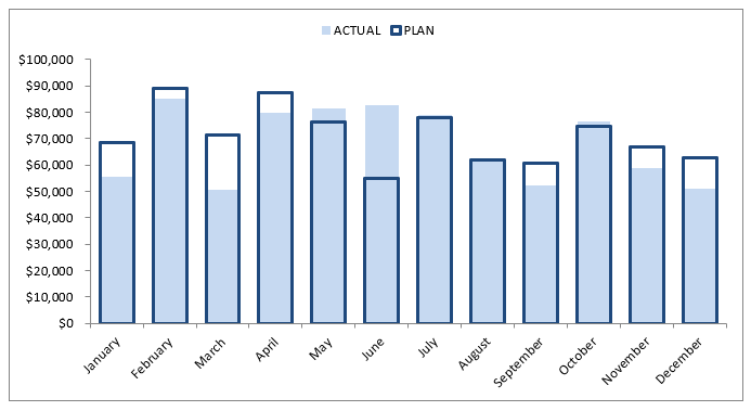
Whereas, by just changing the format of the Clustered column we can convert it to overlay chart. Overlay Chart will help you to interpret the data at a glance.
This overlay of graphs may seem like a difficult exercise but it is a very easy process.
Keep reading to learn how to overlay charts in Excel!
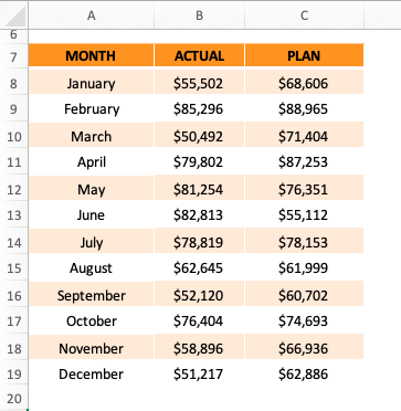
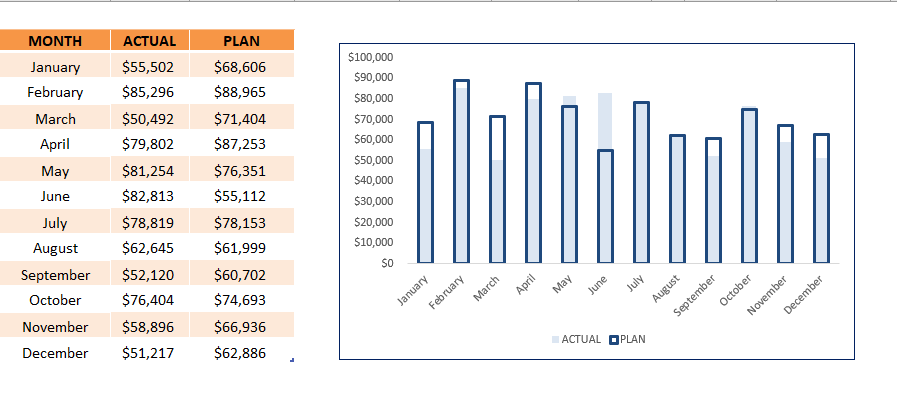
In the example below, we have both actual and planned sales amount for each month and you need to plot it on a graph for easy comparison.
Follow the step-by-step tutorial on how to overlay graphs in Excel and download this Excel workbook to practice along:
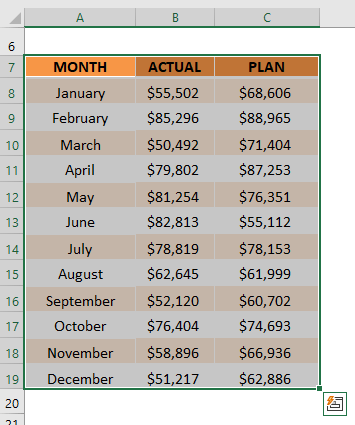
STEP 1: Select all the cells in the table.
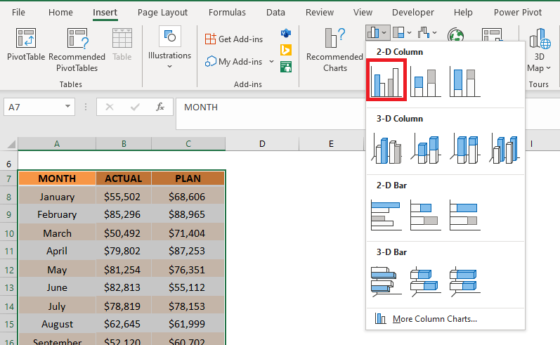
STEP 2: Go to Insert Tab > In the Charts Group, click on the Clustered Column Chart icon.
A clustered column chart will appear next to the data table.
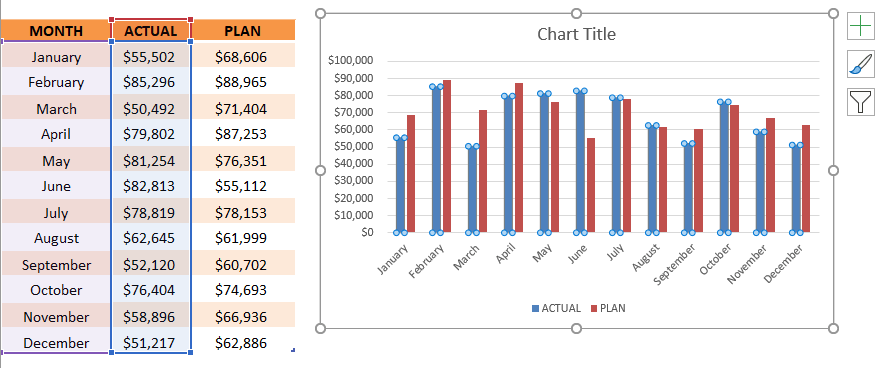
STEP 3: Click on the Plan Value Bars.
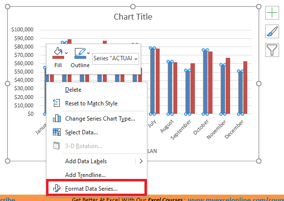
STEP 4: Right-click on the bar and select Format Data Series.
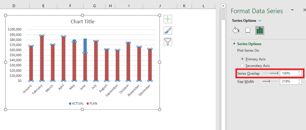
STEP 5: In the Format Data Series dialog box, select Series Overlap as 100%.
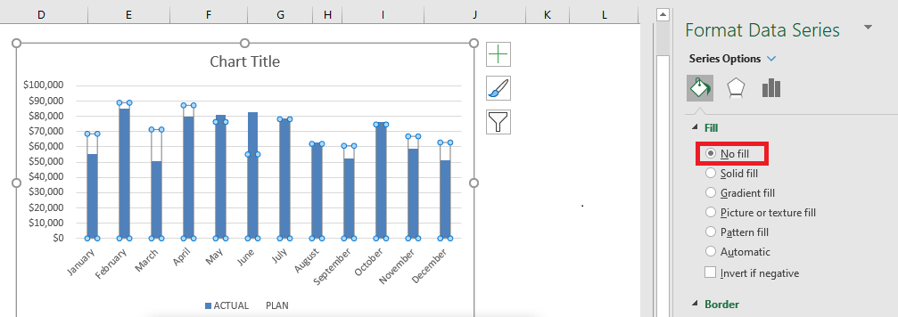
STEP 5: Under Fill Tab, Select No Fill.
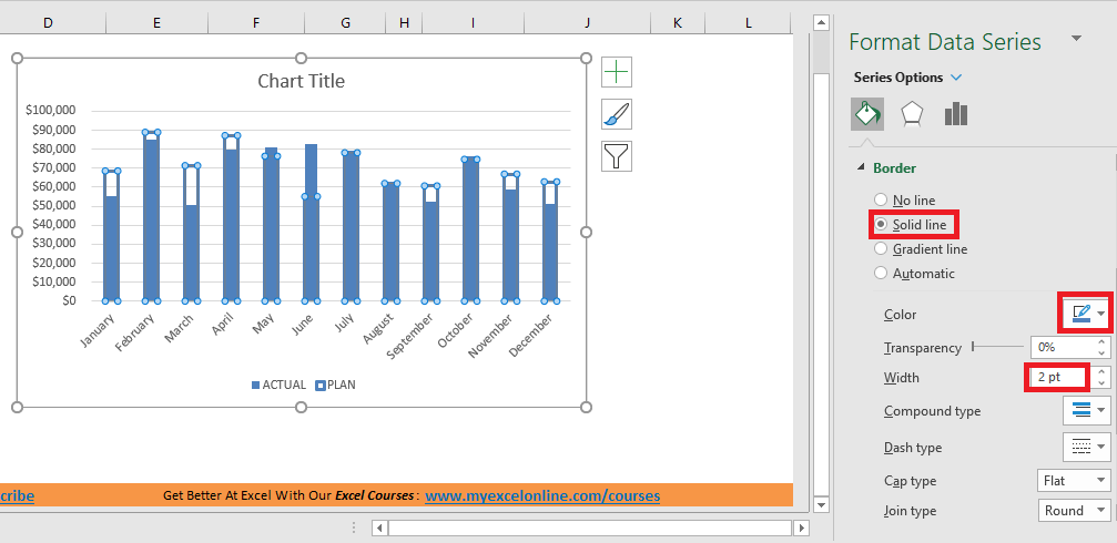
STEP 6: Select Solid Line as Border, Dark Blue as Color, and 2pt as Width.
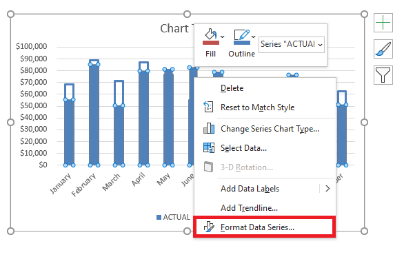
STEP 7: Right Click Actual Value Bar and Select Format Data Series.
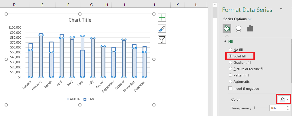
STEP 8: Select Solid Fill and Light Blue as color.
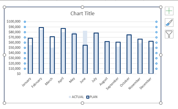
STEP 9: Select Gridlines and Press Delete.
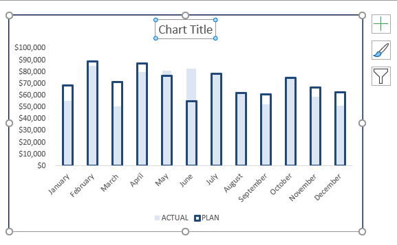
STEP 10: Select Chart Title and Press Delete.
Your Overlay Chart is now ready!
Conclusion
In summary, this is how to superimpose graphs in Excel:
First, you need to edit your “Plan” graph by clicking on its series and pressing the CTRL+1 shortcut. Then within the Format box, you need to choose:
FILL: NO FILL
BORDER COLOR: SOLID LINE & DARK
BORDER STYLE: 2pt WIDTH
Then you need to edit your “Actual” graph by clicking on its series and pressing the CTRL+1 shortcut. Then within the Format box, you need to choose:
FILL: SOLID FILL & LIGHT COLOR
SERIES OPTIONS: 100% OVERLAPPED
GAP WIDTH: 60%
So, just by changing the format of the chart you can interpret the data easily.
Further Learning:
HELPFUL RESOURCE:
Make sure to download our FREE PDF on the 333 Excel keyboard Shortcuts here:
John Michaloudis is a former accountant and finance analyst at General Electric, a Microsoft MVP since 2020, an Amazon #1 bestselling author of 4 Microsoft Excel books and teacher of Microsoft Excel & Office over at his flagship Academy Online Course.
