How to Set Your Picture as Slide Background in PowerPoint
Capturing Attention with Custom Backgrounds.
The Power of a Personal Touch in Presentations.
Adding a personal touch to your presentations could be just the secret ingredient you've been missing! Imagine your audience being greeted with a visually stunning slide that resonates with your unique style.It's not just about the aesthetics; it's the emotional connection that ensues when your personal photo becomes a visual storyteller.
Capturing Attention with Custom Backgrounds
The Power of a Personal Touch in Presentations
Adding a personal touch to your presentations could be just the secret ingredient you’ve been missing! Imagine your audience being greeted with a visually stunning slide that resonates with your unique style. It’s not just about the aesthetics; it’s the emotional connection that ensues when your personal photo becomes a visual storyteller.
Download our 141 Free Excel Templates and Spreadsheets!
Key Takeaways
- To set a picture as slide background in PowerPoint, access the “Insert” tab in the toolbar, select the “Pictures” option from the “Images” group, and insert your chosen image onto the desired slide.
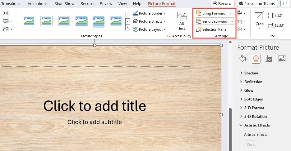
- Once the picture is on the slide, resize and position it as needed, then right-click and select “Send to Back,” or use the “Arrange” button to move the image behind the slide content.
- Before finalizing the picture as a background, enhance its quality by adjusting settings like brightness, contrast, and transparency, and consider applying artistic effects to create a visually appealing slide.
Selecting the Perfect Image for Your Slides
You’ll want to ensure that the picture you choose sets the tone for your presentation. Look for high-resolution images that complement your message without overwhelming it. Consider the colors, style, and make sure you have the right to use it. Sometimes, less is more – simpler images with space for text often work best.
Getting Started with Backgrounds in PowerPoint
Step-by-Step Instructions to Open Format Background Options
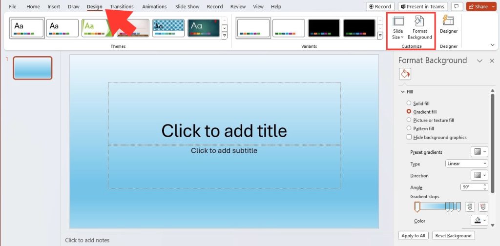
Feeling ready to give your slides a makeover? Let’s dive right in. First things first, click on the Design tab in your PowerPoint ribbon > Customize group > click on Format Background.
Essential Tips Before You Begin Customizing
Before diving into customization, here are some nuggets of advice: Double-check the permissions for any images you plan to use to avoid copyright issues. Remember, image quality is paramount; a low-res picture can cheapen the look of your presentation. And most importantly, test your background with a few overlaying text colors to ensure readability. The last thing you need is a beautiful background that swallows your content whole!
Adding Your Picture to the Slide
Uploading and Adjusting Your Chosen Image
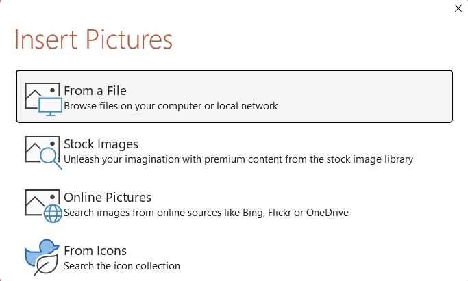
STEP 1: To upload your chosen image, click “Insert” on the top menu > “Pictures,” and pick your image source.
STEP 2: Once the image is in your slide, you’ll likely need to make some adjustments. Play around with sizing by dragging the corners, and if necessary, right-click to access ‘Format Picture’ for more intricate tweaks like brightness, contrast, and color saturation. Remember, the goal is harmony between imagery and content.
Apply Changes to Individual Slides or Entire Presentation
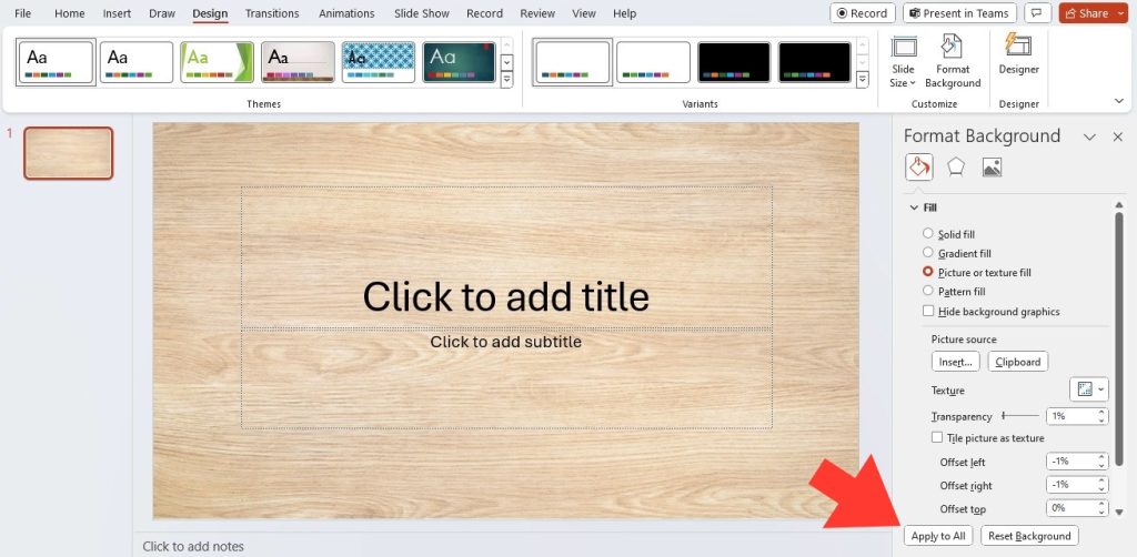
When you’re satisfied with your new background, you have a choice to make: Apply to just this one or shower all your slides. If you opt for uniformity, simply hit “Apply to All” after making your adjustments and voilà, every slide will dress up in your chosen image. If you’re looking to maintain variety, just click outside the background pane to apply your changes to the current slide. Save your work to preserve these changes, ensuring your presentation’s visual flow remains uninterrupted.
Fine-Tuning Your Slide’s Aesthetic
Exploring Opacity and Other Image Effects
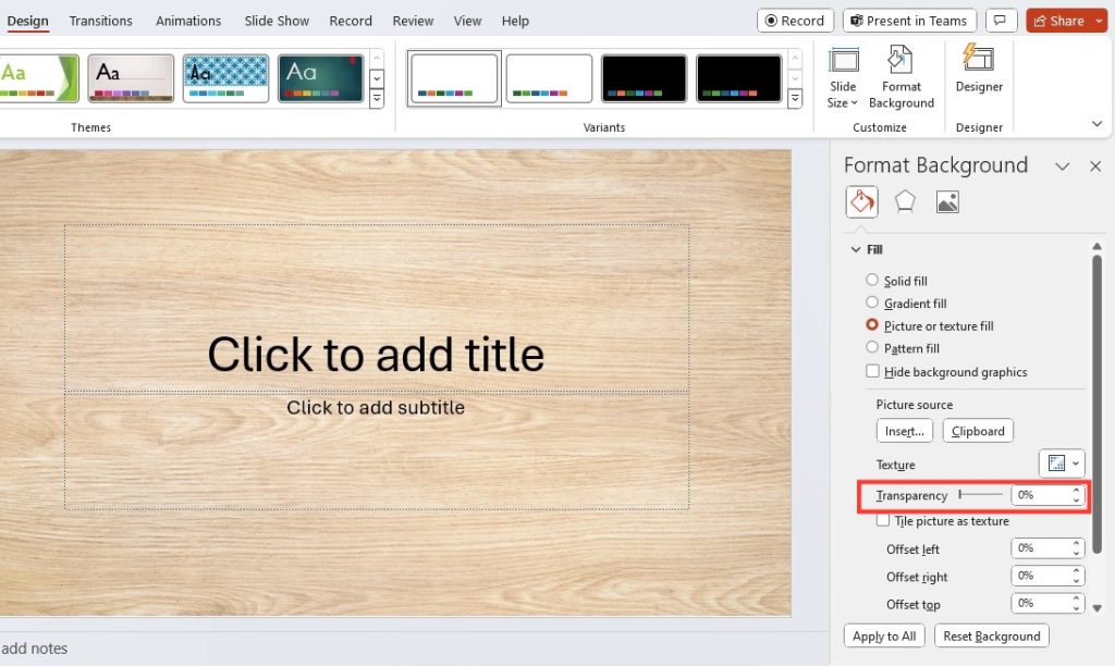
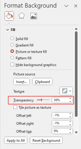
Now let’s have some fun experimenting with opacity to layer your content over the image without losing either’s charm. Adjusting transparency is key to making sure your words pop while your image gently supports the narrative. You can find this setting in the ‘Format Background’ options, under ‘Picture’ or ‘Texture Fill.’
Don’t stop there – PowerPoint has a treasure trove of artistic effects at your disposal. Tinker with these to give your image a sketch-like appearance, or perhaps a watercolor vibe. These effects can add subtle flair to your presentation, making your slides memorable and engaging.
Beyond Single Slides: Consistency Across Your Presentation
Leveraging Slide Master for Uniform Backdrops
Say goodbye to the tedious task of editing individual slides. Enter the Slide Master: PowerPoint’s clever way of helping you streamline design consistency across your presentation. By adding an image to the Slide Master, you automatically set it as the background for all slides that use that particular layout.
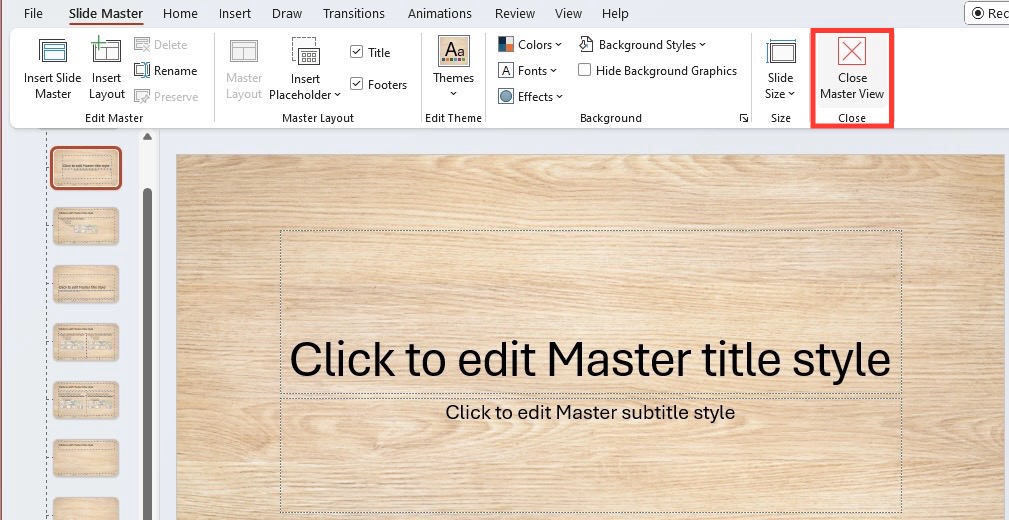
To leverage this feature, head to ‘View’ on the ribbon and select ‘Slide Master.’ Choose which layout to modify or create a new one, then insert your picture. Once you’re happy with the look, click ‘Close Master View,’ and like magic, every slide reflects the change. This not only ensures uniformity but also saves you valuable time.
When to Use Different Images on Different Slides
There are times when varying images across slides can tell a more dynamic story. When each part of your presentation explores different themes, switching up backgrounds can signal these transitions to your audience. Say, for example, your slides progress through various topics — different backdrops can work as visual cues, helping your audience to mentally categorize the information.
However, it’s important to maintain a coherent overall style. Pick images with similar color schemes or artistic touches to create a seamless yet varied narrative. Choose wisely — each picture should support the slide content, not outshine it.
Common Pitfalls and How to Avoid Them
Compatibility Issues and Resolution Warnings
To keep a smooth sailing presentation, steer clear of compatibility problems and resolution red flags. Keep in mind, a picture-perfect background on your computer might not look the same on another device. Different aspect ratios and resolutions can warp your well-crafted slides. This is why using high-resolution images is crucial; they’re more likely to preserve clarity across various screens.
Before finalizing your presentation, check the size and format of your images. PowerPoint prefers JPEG or PNG files for a balance of quality and compatibility. Test your presentation on different devices and projectors to ensure everything looks as intended.
Balancing Visual Appeal with Content Readability
An eye-catching background is great, but not if it turns your content into a visual puzzle for your audience. To maintain balance, ensure your text contrasts well against the background, making it easy to read. If your image is busy, consider adding a semi-transparent overlay or a blur effect to tone it down where the text sits. Keep fonts simple and sizable; fancy fonts might clash or become unreadable.
Content really is king, so while your background should captivate, it mustn’t overthrow the message. Careful planning of color schemes and text placement will lead to slides that are both informative and visually pleasing. Remember: if your audience is struggling to read the slides, they’re not absorbing your message.
FAQ: Mastering Your PowerPoint Backgrounds
How do I make sure my picture fits well as a slide background?
Select a high-resolution image that matches your slide’s aspect ratio to avoid stretching. Use the ‘Format Background’ feature to scale and crop your image for a perfect fit, ensuring it complements your content without overpowering it.
Can I use different pictures as backgrounds for each slide?
Absolutely, you can use different pictures for each slide to keep your presentation dynamic. Just ensure they maintain a cohesive look and support your presentation’s theme.
How do I put a picture behind text in PowerPoint?
Right-click on the picture, choose ‘Send to Back,’ or use the ‘Arrange’ button from the ribbon to layer the image behind your text in PowerPoint.
What can I do if my background image is distracting from the content?
Adjust the image’s transparency, apply a blur effect, or add a dark or light overlay to reduce distraction, ensuring the focus remains on your content.
John Michaloudis is a former accountant and finance analyst at General Electric, a Microsoft MVP since 2020, an Amazon #1 bestselling author of 4 Microsoft Excel books and teacher of Microsoft Excel & Office over at his flagship Academy Online Course.
