Pie chart in Excel are a quintessential tool in data visualization, offering a straightforward method to display complex data as easily digestible visuals. Microsoft Excel‘s capabilities enhance this simplicity, allowing for quick insights into data proportions and relationships. They serve as an essential medium for data presentation, transforming dense information into accessible and immediate visual formats.
Key Takeaways
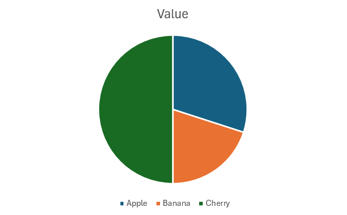
- A Pie Chart is a circular statistical graphic divided into slices to illustrate numerical proportions.
- Each slice of the pie chart represents a category’s part of the whole, making it easy to compare parts against the whole and each other.
- Pie charts are crucial for visualizing the composition of something as a whole. They simplify complex data into easily understandable visual pieces, helping viewers grasp significant patterns and trends at a glance.
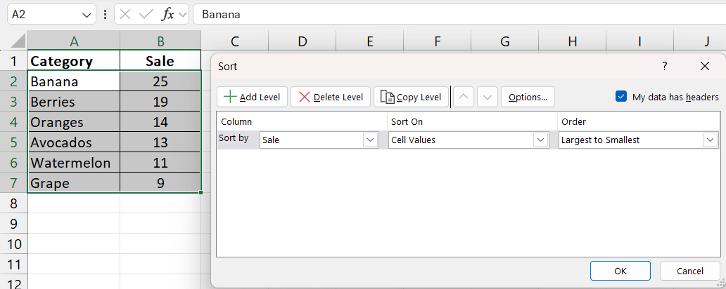
- Organize your dataset from largest to smallest to align slices in an orderly, aiding in clearer comprehension.
Table of Contents
Introduction to Crafting Pie Charts
Unlocking the Power of Visual Data
Visualization tools like pie charts transform sprawling sheets of data into comprehensible visuals, making it easier for you to analyze and convey information. Through Excel’s robust features, you can showcase relationships and proportions among data categories at a glance.
Why Pie Charts are Essential for Presentation
Pie charts are the visual shorthand for presenting complex data. They’re essential because they communicate substantial information quickly and efficiently, condensing what would otherwise be dense tables into an accessible visual format. This aids your audience in grasping the story behind your numbers without unnecessary complexity.
Preparing Your Data for a Pie Chart
Simplifying Data for Clarity
To ensure that your pie chart is a clear window into your data, start by simplifying it. Pare down your dataset to the most crucial elements. Consider using fewer than 10 categories to keep your chart from becoming a tangle of indistinguishable slices. The goal is to make your data impactful at a glance, so focus on the essential parts that tell the clearest story.
Sorting and Structuring Your Dataset
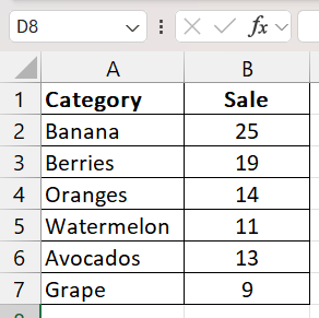
Before diving into chart creation, it’s key to meticulously sort and structure your dataset. A well-organized dataset not only streamlines the process but ensures accuracy in your final pie chart. Arrange your categories from largest to smallest to automatically align slices in an orderly fashion. This order simplifies understanding for your audience and makes your data’s story clearer.
Detailed Guide to Create a Basic Pie Chart
Selecting the Right Data Range
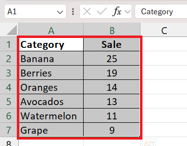
Choosing the right data range is fundamental in pie chart creation. In Excel, highlight the section of your worksheet that includes both the categories and their corresponding values—this should be your chart’s foundation. Remember to include only the most relevant data to maintain clarity and avoid overcrowding your visual.
Using the Chart Wizard for Quick Results
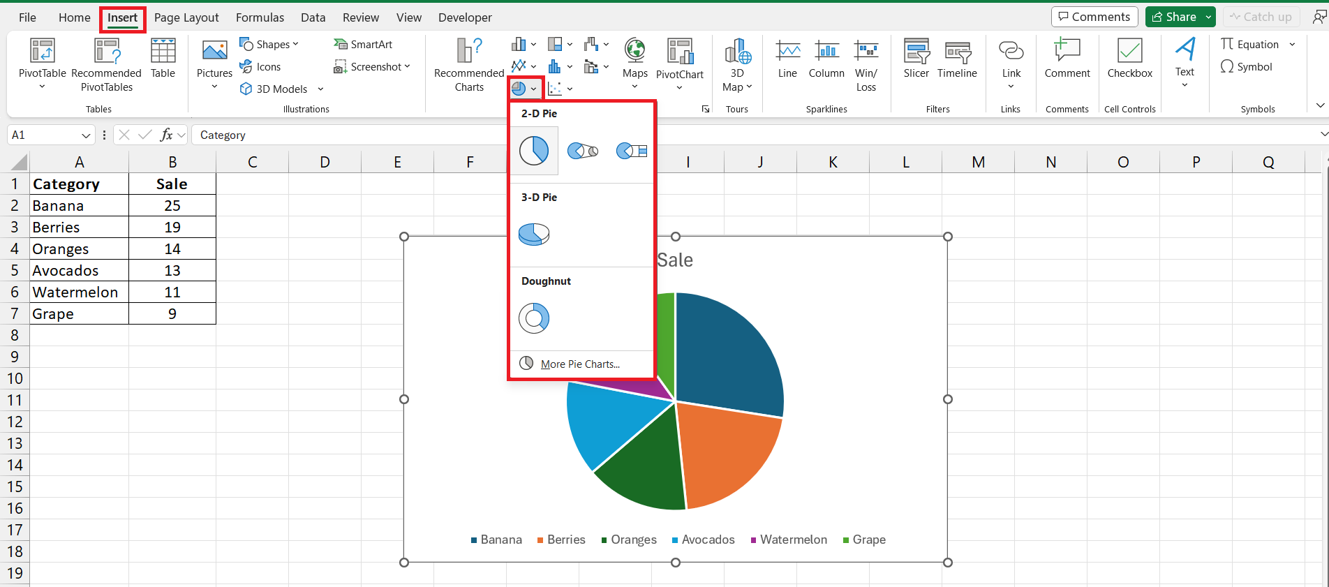
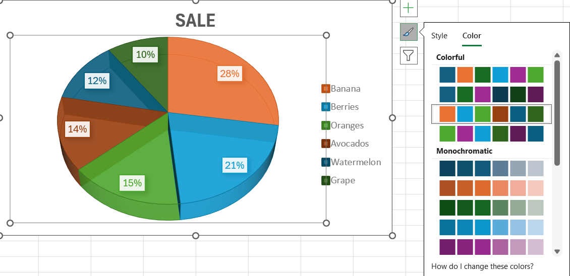
Excel makes charting straightforward with its Chart Wizard feature. Once your data is highlighted, simply click the ‘Insert’ tab on Excel’s ribbon and select the pie chart icon. From there, choose your preferred style—be it a classic 2-D or a more dramatic 3-D pie. This tool guides you through the process, providing instant visual feedback as you go.
Advanced Pie Chart Techniques
Optimizing Pie Slice Aesthetics
For a pie chart that’s both visually striking and easy to understand, optimize the aesthetics of your slices. Use contrasting colors to differentiate between categories, applying brighter hues to emphasize larger portions or key data points. Ensure text is legible by selecting appropriate fonts and sizes. If needed, use the ‘Format Data Point’ feature to individually highlight a slice, making it ‘explode’ slightly for added focus.
Implementing Pie of Pie and Bar of Pie Charts
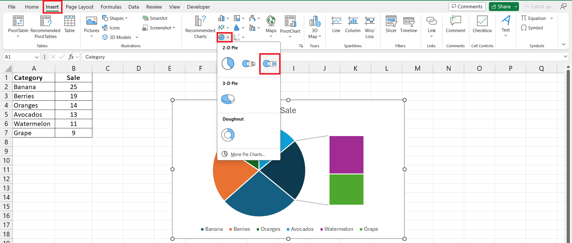
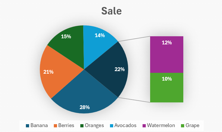
For data with smaller values that can get lost in a traditional pie chart, Excel’s ‘Pie of Pie’ and ‘Bar of Pie’ chart types come to the rescue. They allow you to highlight and expand on these smaller categories. For a ‘Bar of Pie’ chart, simply follow these steps:
STEP 1: Select your entire data set.
STEP 2: Click the ‘Insert’ tab.
STEP 3: In the ‘Charts’ group, click on the ‘Insert Pie or Doughnut Chart’ icon.
STEP 4: Choose the ‘Bar of Pie’ chart icon (found within 2-D Pie icons). Excel automatically divides some of the smaller slices into a bar chart for better visibility.
This chart type can be customized to show any number of slices in a more detailed manner, giving you flexibility in how you present your data.
Customizing the Look and Feel
Fine-Tuning Colors and Fonts
Craft a pie chart that’s not just informative but also pleasing to the eye by fine-tuning the colors and fonts. To change a pie slice’s appearance, click on it to bring up the ‘Format Data Point’ window, where you can adjust the fill color or add texture. For fonts, right-click on the data label or any chart text to open the ‘Format Text’ menu, enabling you to alter the font style, size, and color for better readability.
Adding and Formatting Data Labels
Customizing your chart with data labels can greatly enhance its readability. After creating your chart:
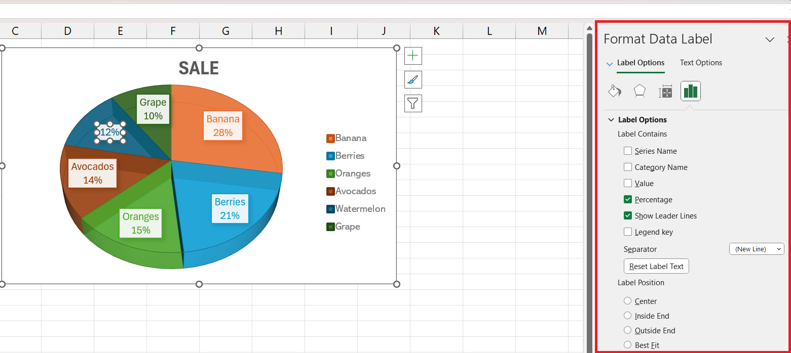
STEP 1: Right-click on a slice and select “Format Data Labels”—instantly, each slice will be tagged with its value.
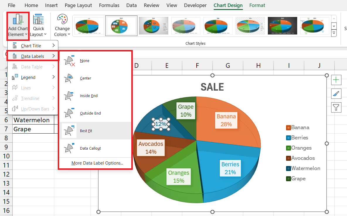
STEP 2: For quick customization, head to the Design tab and click “Add Chart Element,” then hover over “Data Labels” for various formatting options. “Data Callout” is one standout choice, turning labels into engaging callouts.
This personal touch can give your pie chart a professional flair that aligns with your presentation style.
Interactivity and Functionality
Rotating and Exploding Pie Slices for Emphasis
Add emphatic flair to your pie chart by rotating and exploding slices.
Integrating Interactive Features for Enhanced Analysis
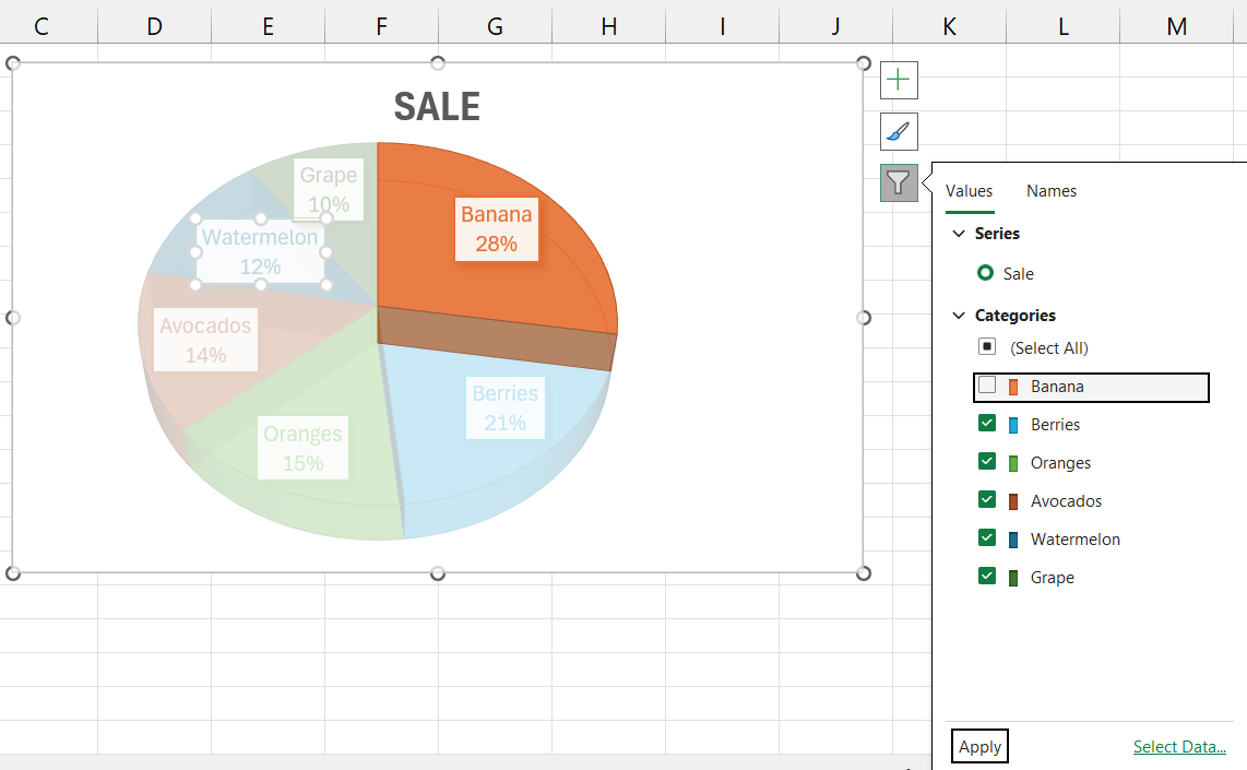
Go beyond static charts by adding interactive features that allow your readers to engage with the data more deeply. Utilize Excel’s built-in filters to create a dynamic pie chart that updates when you adjust data ranges or apply filters. Additionally, consider embedding your Excel chart into a PowerPoint slide for an interactive presentation, where viewers can click on pie slices to see more details or summary data.
Troubleshooting Common Pie Chart Issues
Resolving Data Representation Challenges
Pie charts in Excel can sometimes struggle with clarity when data labels overlap or are too numerous. To resolve this, you might need to manually adjust the labels. Decrease font size, shorten text, or even use leader lines to prevent overlap. Excel also offers the option to display labels best fit—select ‘Label Options’ followed by ‘Best Fit’ from the ‘Format Data Labels’ pane. This minimizes clutter and increases readability but may require additional tweaking to perfect.
Adjusting Layouts for Concise Interpretation
When fine-tuning your chart layout for concise interpretation, exploit Excel’s Quick Layout tool for a variety of pre-set arrangements that enhance readability. This could be as simple as repositioning the legend or changing the chart’s aspect ratio. For complete control, manually adjust pie slices’ positions and angles, ensuring that the layout aids in emphasizing the most relevant data points without sacrificing clarity.
Expert Tips for Professional Pie Charts
Design Best Practices to Improve Readability
When crafting a professional pie chart, following design best practices is crucial:
- Embrace Whitespace: Ensure your chart isn’t cramped—allow for ample space between elements.
- Color Wisely: Utilize a color palette that’s coherent and accessible, with distinct shades for differentiation.
- Limit Categories: Aim for no more than six slices; too many can overwhelm and confuse.
- Consistent Fonts: Choose legible, consistent fonts across all data labels to maintain a clean look.
- Leverage Legends: A clear, well-placed legend can supplement your chart without cluttering the visual.
Utilizing Shortcuts and Tools for Faster Creation
Streamline your pie chart creation in Excel with these keyboard shortcuts and tools:
- Quick Access Toolbar Customization: Add Chart Elements and the Format Painter to your Quick Access Toolbar for one-click operations.
- Keyboard Shortcuts: Use
Alt + N + Qto jump to the Insert Pie Chart button in newer versions of Excel, saving a few clicks. - Templates and Styles: Begin with Excel’s pre-designed templates to save time; then tweak to suit your data.
- Automated Tools: Explore Excel’s add-ins, like the Analysis Toolpak, which can automate data analysis, laying the groundwork for your pie chart.
Remember that mastering these shortcuts will significantly speed up your workflow and free up time for data analysis and presentation refinement.
FAQ: Perfecting Your Pie Chart Skills
How do you plot a pie chart in Excel?
To plot a Pie Chart in Excel, select your data, go to the ‘Insert’ tab, click on the ‘Pie Chart’ button, and choose your preferred pie chart style. A chart will appear on your sheet, which you can then customize and format as needed.
What is the use of pie of pie chart in Excel?
A ‘Pie of Pie’ chart in Excel separates out smaller slices from the main pie chart into a secondary pie or stacked bar, making them more visible and easier to analyze. It’s used when your data contains smaller value categories that are hard to read in the standard pie chart.
How do you make a pie chart with percentages?
To make a pie chart with percentages in Excel, highlight the dataset you want to visualize, click ‘Insert’ > ‘Pie Chart’ and select the style you prefer. Right-click the chart, choose ‘Add Data Labels’, and then select ‘Format Data Labels’ to display percentages. Ensure ‘Percentage’ is checked under ‘Label Options’.
How Can I Customize the Legend of My Pie Chart?
Customize your pie chart’s legend by clicking on it to select it, then right-click and choose “Format Legend.” Here, you can alter its position and tweak design options such as color, gradients, and opacity to match your chart’s aesthetic and improve readability.
What Are the Alternatives if a Pie Chart Isn’t Suitable?
If a pie chart isn’t suitable, you can opt for bar or column charts for comparing individual categories, line charts to display trends over time, or a stacked bar/column chart for part-to-whole relationships across multiple variables. These alternatives can offer clearer insights, especially for complex datasets.
John Michaloudis is a former accountant and finance analyst at General Electric, a Microsoft MVP since 2020, an Amazon #1 bestselling author of 4 Microsoft Excel books and teacher of Microsoft Excel & Office over at his flagship Academy Online Course.
