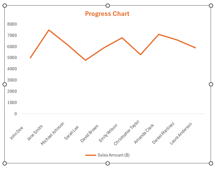
A Progress Bar Chart in Microsoft Excel serves as a dynamic visual tool, designed to showcase the completion status or advancement of a project relative to its expected goals. It is a visual representation of progress toward a specific goal, task, or milestone. It typically consists of a horizontal bar, divided into segments or sections, where each segment represents a portion of the total progress.
Key Takeaways
- Excel’s progress charts transform complex data into clear visuals, aiding in understanding trends and patterns without overwhelming users with numbers.
- With Excel’s dynamic capabilities, progress charts can reflect real-time updates, providing an interactive tool for tracking performance against goals.
- Progress bar charts are commonly used in project management, task tracking, and goal setting to provide stakeholders with a clear and intuitive visualization of progress.
- It serves as an effective tool for monitoring and communicating progress, facilitating better decision-making and accountability within teams and organizations.
Download the spreadsheet and follow along with the blog on how to create a progress chart in Excel – Download excel workbookProgress-Chart-in-Excel.xlsx
Table of Contents
Introduction to Progress Charts in Excel
Understanding the Basics of Progress Charts
Progress Charts in Excel are powerful tools used to track and display the progression of tasks, goals, or projects. They convert data into visual representations that highlight the degree of completion or growth of an objective.
By translating complex information into a more digestible format, progress charts help users quickly grasp the status and momentum of their efforts.
The Significance of Visualizing Growth in Excel
Visualizing growth and progress in Excel through charts and graphs is not just a matter of aesthetics; it plays a significant role in data analysis, communication, and strategic planning. Here are some key reasons why visual growth representation is essential:
- Clarity and Comprehension: Progress charts translate complex datasets into clear visuals, making it easier for everyone involved to understand trends and patterns without being overwhelmed by numbers.
- Performance Tracking: Excel allows for real-time data updates, meaning that progress charts can reflect current status immediately, providing a dynamic tool for tracking performance against goals or benchmarks.
- Motivation and Engagement: Visual representations of progress can boost motivation by providing tangible evidence of advancement, which can encourage continued effort toward achieving goals.
- Decision Support: By illustrating progress, decision-makers can more easily identify areas of success or concern, facilitating informed decision-making and strategic adjustments where necessary.
- Communicative Power: Charts provide a universal language for conveying information. They can be shared across teams and departments, ensuring that everyone is aligned with the current status and future directions of the project or task.
By harnessing the power of Excel to visualize growth, users can enjoy these benefits and more, ultimately driving efficiency and effectiveness in their work or projects.
Hans Rosling, the acclaimed statistician and public health expert, once said, ‘The goal is to turn data into information, and information into insight.’ Excel provides the platform to achieve this goal, allowing users to unlock the true potential of their data through effective visualization.
Crafting Your First Progress Chart: Preliminary Steps
Create Excel Progress Bar
STEP 1: Organizing Your Data for Chart Creation
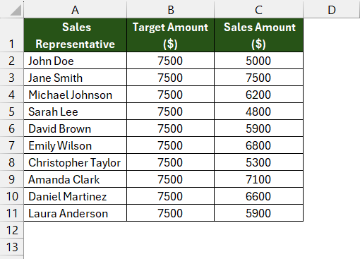
Before creating the chart, organize your data in Excel. Arrange your data in a table format, with categories listed in one column and corresponding values for each category in separate columns. Ensure that each row represents a unique category, and each column represents a different series or segment within that category.
STEP 2: Select Data
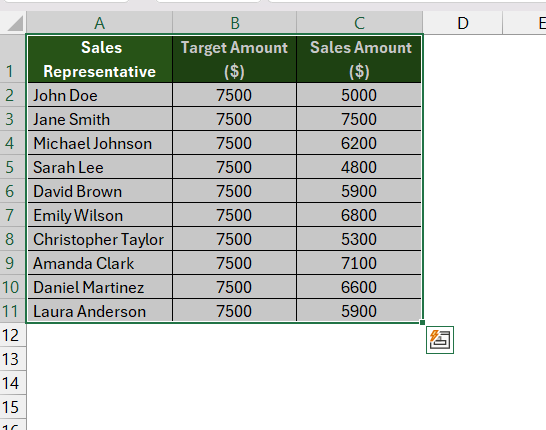
Highlight the data range you want to include in the chart. This includes both the category labels and the corresponding values for each segment. Make sure to include all relevant data in your selection.
STEP 3: Insert Chart
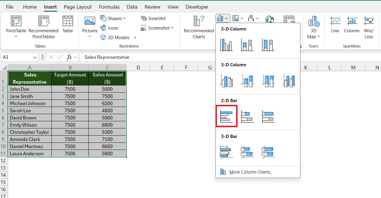
Navigate to the “Insert” tab on the Excel ribbon. In the “Charts” group, click on the “Bar Chart” icon and select the “Clustered Bar Chart” chart type.
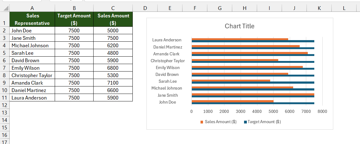
Excel will insert the clustered bar chart into your worksheet. You can now customize the chart to enhance its appearance and readability.
Customizing Chart Elements to Reflect Progress
Once you have your basic Bar Chart in place, customization is key to making your progress chart both visually appealing and informative. Customizing chart elements can enhance clarity, align with branding, or emphasize certain aspects of the data. Follow these steps to tailor your chart to your needs:
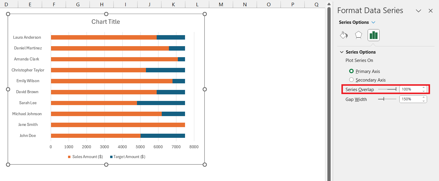
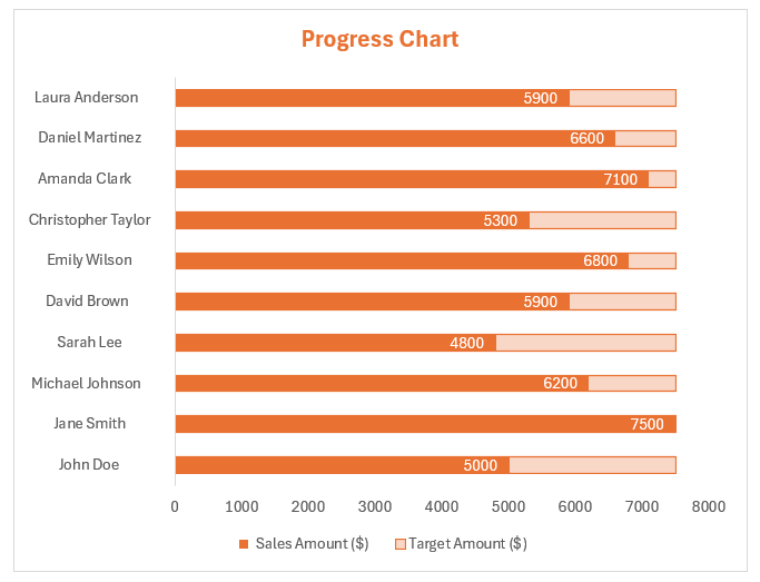
- Series Overlap: Right-click on the chart and select ‘Format Data Series’. In the Format Data Series panel, set ‘Series Overlap’ to 100%.
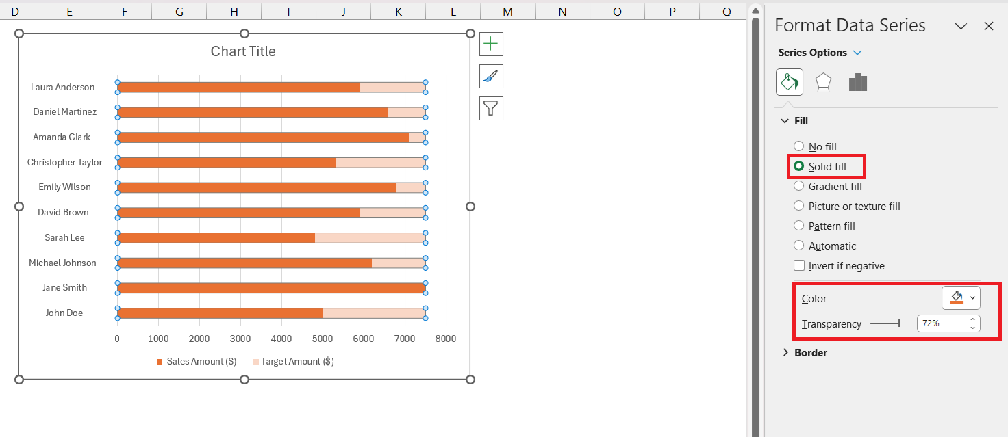
- Adjust Color: In the Format Data Series panel, select Fill > Solid Fill and then select the orange color and set “Transparency’ to 100%.
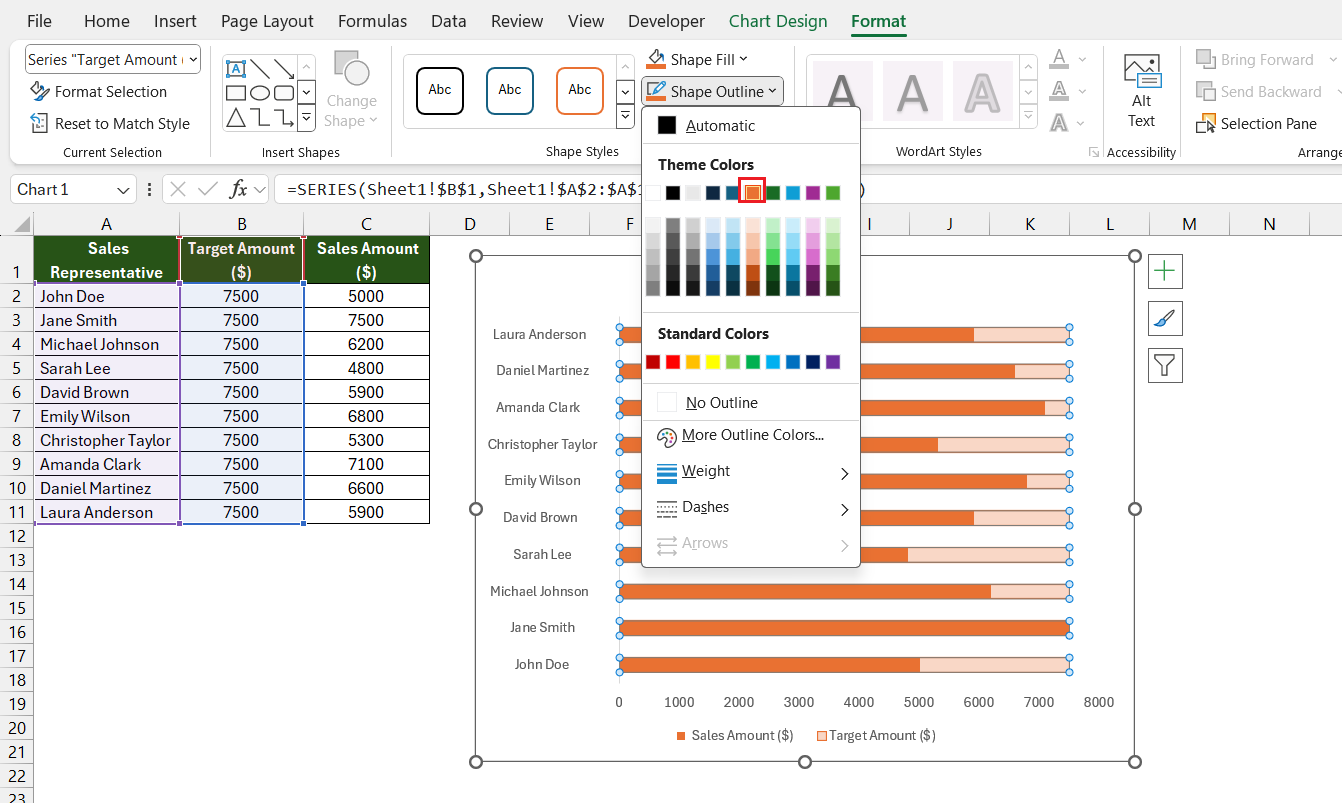
- Add Outline: Go to the ‘Chart Design’ tab and select ‘Shape Outline’. Select the orange color.
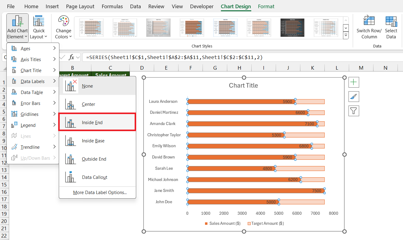
- Add Data Labels: Click on chart and go to Chart Design > Add Chart Element > Data Label. Here you can set the position to ‘Inside End’ or ‘Inside Base’ for better visibility and readability. Customize font size and color to make the data point stand out against the chart elements.
- Customize Fonts: Under the Home tab, you can change the font type, size, and color of your chart title, data labels, and axes to improve readability.
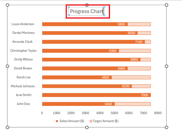
- Modify Chart Title: Click on the chart title to edit the text. Make sure it reflects what the chart is representing.
These customizations not only make your progress chart more professional and intuitive but also tailor it to the specific communicative needs of your audience. The goal is to make the chart not just a representation of data but a storytelling tool for your project’s progress or growth.
The progress chart is now ready.
Choosing the Right Progress Chart Type for Your Data
Selecting the appropriate progress chart type is imperative for accurate and effective data visualization. Excel offers a variety of chart types that cater to different datasets and visualization goals. Here’s how to choose the right one for your data:
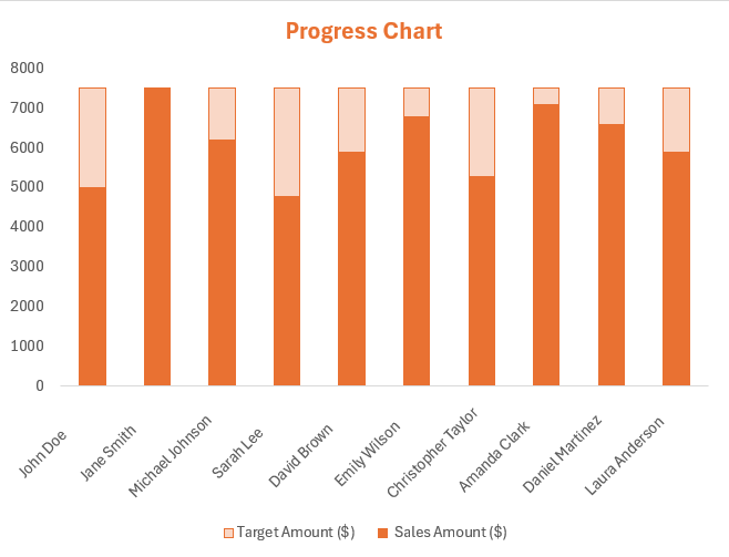
- Clustered Bar Chart: If your data is best represented as a series of completion stages or comparisons among categories, opt for a progress bar chart. It uses horizontal or vertical progress bars and is ideal for showing completed versus remaining work.
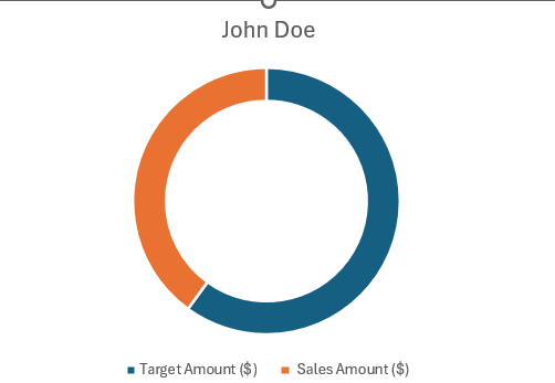
- Doughnut or Pie Chart: For a snapshot of the part-to-whole relationship, a doughnut or pie chart can show progress in a circular form, where each slice represents a component of the whole.
- Clustered Column Chart: When dealing with multiple data series and wishing to show a comparison across categories, a clustered column chart might be your best choice.
- Line Chart: If you want to represent continuous progress over time, a line chart might be appropriate, allowing for trend analysis and pattern recognition.
Each type of progress chart has its strengths, and the right choice will depend on the nature of your data and what you want to emphasize or convey. It’s also important to consider your audience and their ability to interpret the information presented in the chart you choose.
Real-world Applications and Benefits of Progress Charts
Case Study Examples: How Progress Charts Drive Decision-Making
Progress charts play a pivotal role in guiding decision-making processes within various business contexts. The following case study examples demonstrate the impact of these charts on strategic planning and operations.
- In one well-documented case, a project management team used progress bar charts to oversee a large-scale software development project. The charts enabled them to track milestones and individual team contributions visually. By closely monitoring progress, they could identify bottlenecks early on and reallocate resources to maintain project timelines effectively, ultimately leading to successful on-time project completion.
- A retail company incorporated progress doughnut charts to visualize sales targets and actual performance. The clear representation helped the sales team promptly recognize areas behind targets, prompting strategic discount campaigns and product promotions. This led to an increase in sales to meet quarterly goals and allowed for improved forecasting for future inventory and marketing initiatives.
- An HR department used a stacked bar chart format to track employee attrition rates over time. By segmenting the data into various departments, they could pinpoint departments with unusual turnover patterns and implement targeted retention strategies. As a result, this not only improved overall employee satisfaction but also reduced recruitment costs and efforts.
These examples exhibit how progress charts can serve as potent instruments that translate complex data into actionable intelligence, optimizing resource distribution and informing strategic decision-making, ultimately contributing to achieving the overarching goals of an organization.
Comparing Progress Charts with Other Visualization Techniques
When it comes to data representation, progress charts offer unique advantages that set them apart from other visualization techniques. Let’s compare progress charts to alternative methods:
- While tables present raw numbers clearly, progress charts translate these figures into visual forms, making it easier to comprehend progress at a glance. Whereas tables may require deeper analysis to discern trends or completion levels, progress charts offer instant visual cues—for example, how full a bar is—indicating the degree of progress towards a goal.
- Line graphs are excellent for displaying changes and trends over time but might not convey the completion aspect of a project or goal as effectively as progress charts. Progress bars or doughnut charts show the proportion of work completed against the work remaining, providing a more immediate management tool for tracking project milestones.
- Pie charts break down a whole into constituent parts, great for showing distribution but not always for progress, especially if there are multiple ongoing variables. Progress charts, particularly stacked bars, can show multiple elements contributing to a goal, making them more dynamic in showing development toward a target.
- Gantt charts shine in project management by showing the duration of tasks along a timeline. However, they may become cluttered in complex projects. Progress charts offer a simpler view of completion status without necessarily detailing the time aspect, which can be more digestible in regular reporting.
- Heat maps are ideal for comparing intensities, such as high-volume areas in data sets, using color gradation. In contrast, progress charts are specifically designed to illustrate the advancement toward meeting objectives, which is not a strong point for heat maps.
In conclusion, while each data visualization technique has its merits, progress charts are uniquely equipped to present completion levels in a digestible and straightforward manner. They’re particularly effective when the primary requirement is to showcase advancement or setbacks in achieving specific targets, making them useful tools for project managers, team leaders, and anyone responsible for delivering results.
FAQs: Essential Questions Answered
What Are the Key Advantages of Using Progress Charts in Excel?
Progress charts in Excel offer a clear graphical representation to monitor targets and track progress over time.. They enable project management professionals to visualize milestones and growth patterns, ensuring resources are allocated efficiently and projects are completed within set timeframes. It provides advanced visualization designs without the need for programming skills, thus enhancing insights for strategic decision-making.
How do I create a progress line chart in Excel?
To create a progress line chart in Excel, firstly, input your data with the relevant dates and progress values. Then, select your data and go to the Insert tab, and choose the “Line Chart” option to insert a basic line chart. Customize the chart by formatting the line style, adding data labels, and adjusting the axis to represent your progress over time.
What does a progress bar do?
A progress bar visually represents the completion level of a task, project, or specified activity, using filled bars to indicate how much progress has been made toward a goal or milestone. It provides a quick and clear way to track advancement and measure performance, facilitating strategic decision-making by highlighting areas of growth or decline. Progress bars are particularly useful in dashboards where comparing progress across different categories or regions is necessary.
Why is a progress bar chart more effective than other graphs?
A progress bar chart is more effective than other graphs due to its ability to convey complex data succinctly and clearly, showcasing progress against multiple categories without cluttering the dashboard space. The visual comparison of red and blue bars allows for quick interpretation of decline and growth, enabling faster relational insights and facilitating continuous monitoring and strategic decision-making. Moreover, the aesthetic and shareability attributes of the visualization tool used for progress bar charts enhance its effectiveness in collaborative environments.
John Michaloudis is a former accountant and finance analyst at General Electric, a Microsoft MVP since 2020, an Amazon #1 bestselling author of 4 Microsoft Excel books and teacher of Microsoft Excel & Office over at his flagship Academy Online Course.
