How to Create Excel Radar Chart – Step by Step Guide
Unveiling the Radar Chart.
Defining a Radar Chart in Excel.
A Radar Chart in Excel is a unique graphical tool that displays multivariate data on a two-dimensional chart.Picture a spider web, and you're getting close! Each point on the chart is plotted on a separate axis that starts from the center and goes outwards, allowing for a neat comparative overview of different data sets.
Unveiling the Radar Chart
Defining a Radar Chart in Excel
A Radar Chart in Excel is a unique graphical tool that displays multivariate data on a two-dimensional chart. Picture a spider web, and you’re getting close! Each point on the chart is plotted on a separate axis that starts from the center and goes outwards, allowing for a neat comparative overview of different data sets.
These charts can include several quantitative axes, which are typically organized radially, with equal distances between each axis to ensure consistency in interpretation.
The Ideal Scenarios for Utilizing Radar Charts
Radar charts shine in scenarios where the comparison of various attributes is key. They’re fantastic for highlighting the profile of different items or subjects across a uniform set of variables. For instance, when you’re evaluating employee performance across a range of competencies like communication, leadership, and innovation, a radar chart can clearly show who excels.
Another ideal use is in product comparisons, laying out features such as battery life, weight, and camera quality for a side-by-side analysis of smartphones. In risk analysis, radar charts can visualize varying risk factors, emphasizing which areas might need more attention. Marketers often use radar charts to gauge the impact of diverse strategies on overall campaign success.
In each of these situations, the radar chart’s ability to demonstrate how one subject or item measures up against another across multiple axes makes it a compelling choice. It’s especially potent when the goal is to capture the big picture at a glance rather than getting bogged down in the weeds of data comparison.
Preparing Your Data for Visualization
Tips for Organizing Data Effectively
Before you can dazzle with your radar chart, the groundwork lies in organizing your data. A well-structured dataset is the backbone of any insightful radar chart. Here’s how to get your data radar-ready:
- List down your variables: These will form the axes of your radar chart. For instance, if you’re comparing smartphones, variables could include battery life, camera quality, screen size, etc.
- Ensure consistency: Make sure each variable is measured on the same scale for a fair comparison.
- Arrange your data: Organize your data in a table format with each row representing a different item or category and each column a variable.
This preparation step makes the actual chart creation in Excel a breeze, paving the way for more accurate and visually compelling comparisons.
Step-by-Step Guide to Radar Chart
Creating a radar chart in Excel is a straightforward process. Follow these detailed steps to create a radar chart:
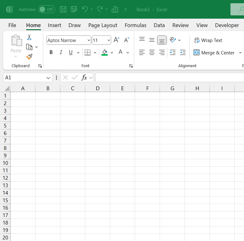
STEP 1: Start by opening Excel and creating a new workbook or opening an existing one.
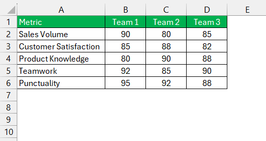
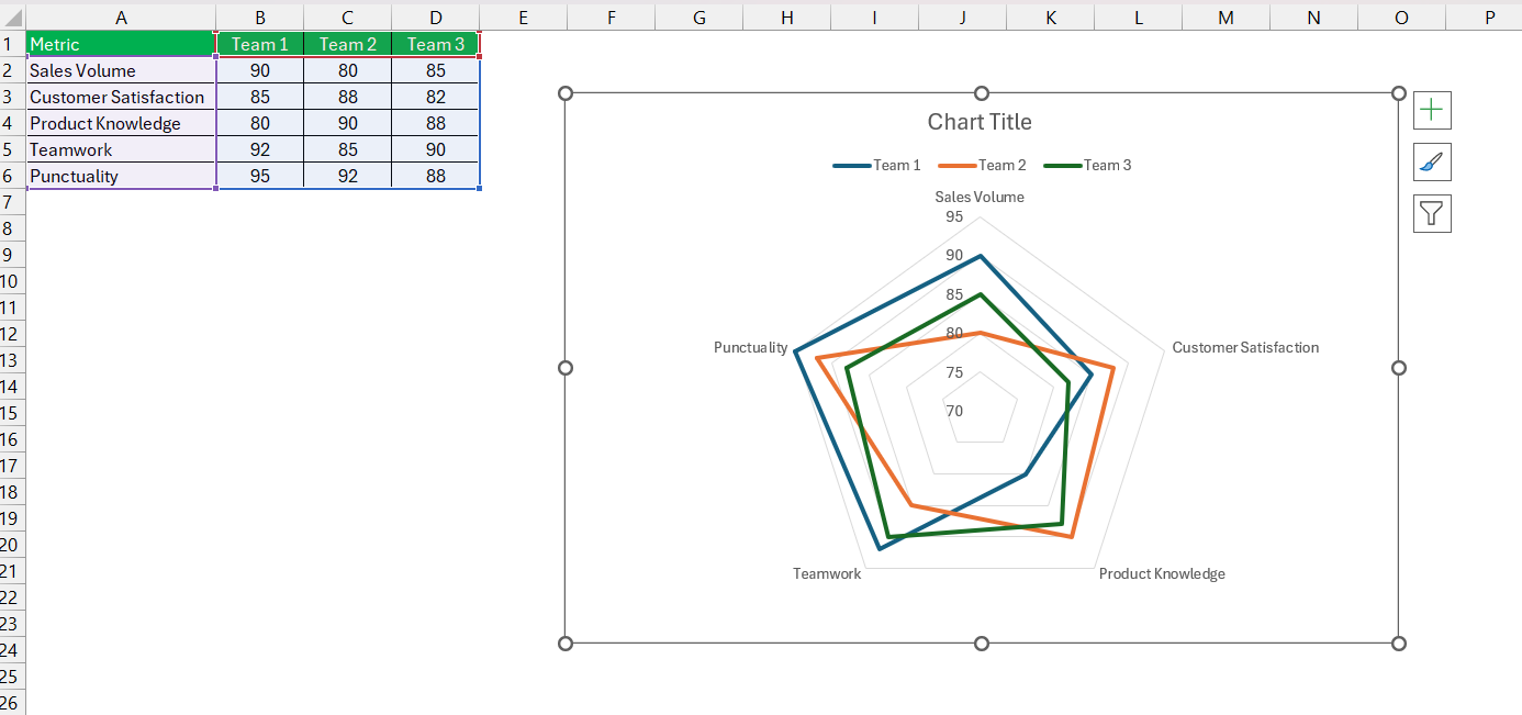
STEP 2: Ensure your data is arranged in a tabular format. Each row should represent a different category, and each column should represent different items or variables. Include headers for each column.
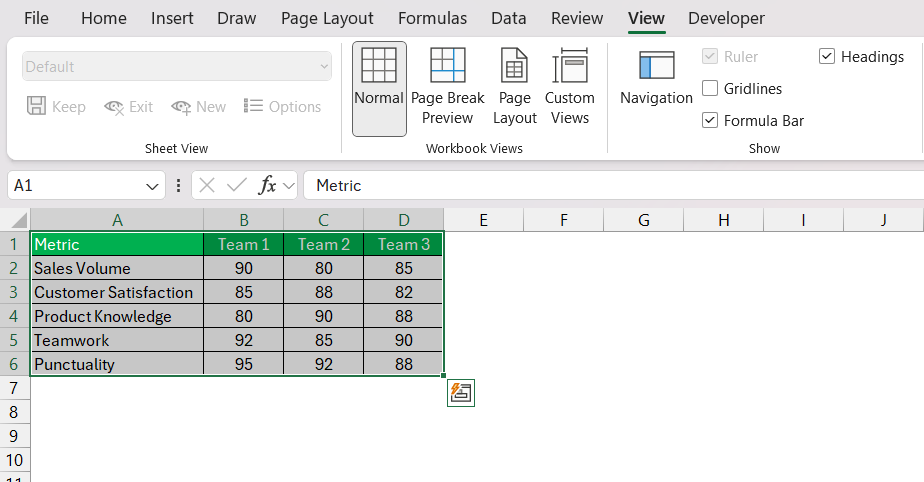
STEP 3: Click and drag to select the data range you want to include in your radar chart, including headers.
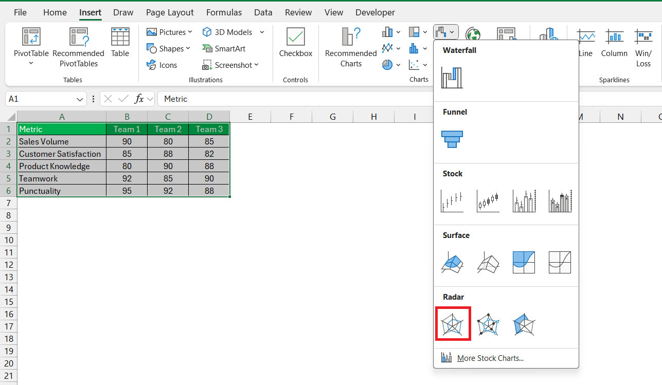
STEP 4: Navigate to the Insert tab on the Excel ribbon. In the Charts group, look for the Radar Chart icon. It might be under a sub-menu such as Other Charts depending on your Excel version.
STEP 5: Click on the Radar Chart icon and select the type of radar chart you prefer:
- Radar: Basic radar chart without markers.
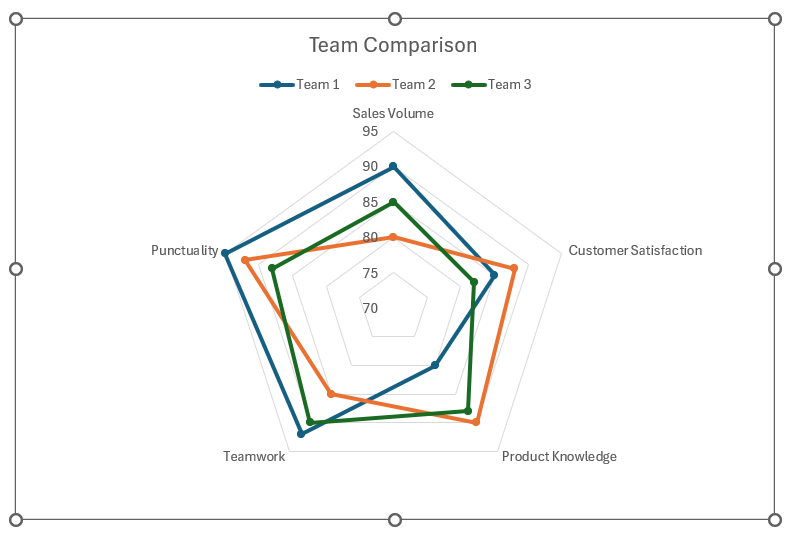
- Radar with Markers: Radar chart with data point markers.
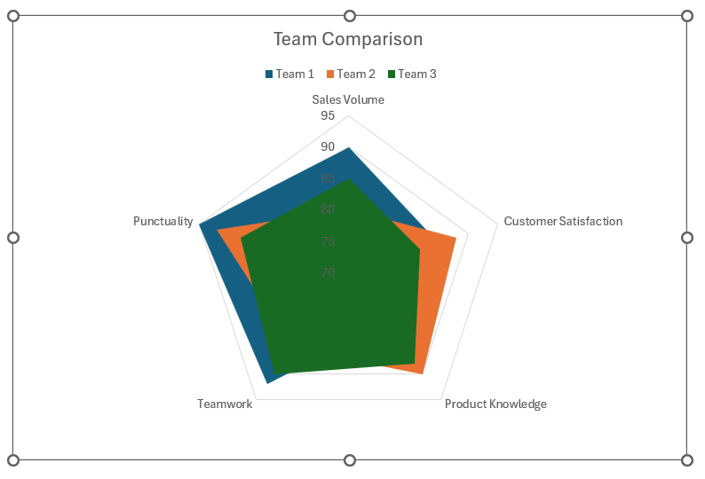
- Filled Radar: Radar chart with filled areas.
The radar chart is ready now!
Advancing Your Radar Chart Skills
Customize the Radar Chart
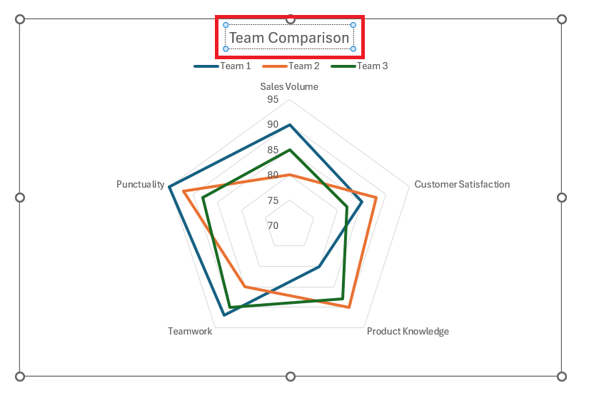
- Click on the default chart title to edit it. Type in a descriptive title for your chart.
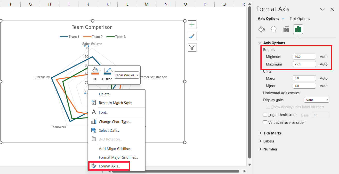
- Right-click on any axis and select Format Axis. Adjust the minimum and maximum values if needed for better visualization.
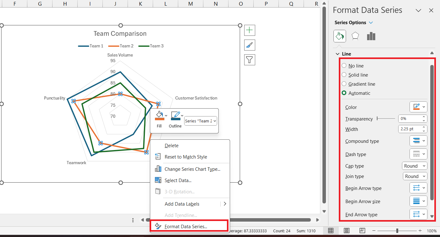
- Right-click on any data series (the lines in the radar chart) and select Format Data Series. Customize the colors, line styles, and markers to distinguish between different items clearly.
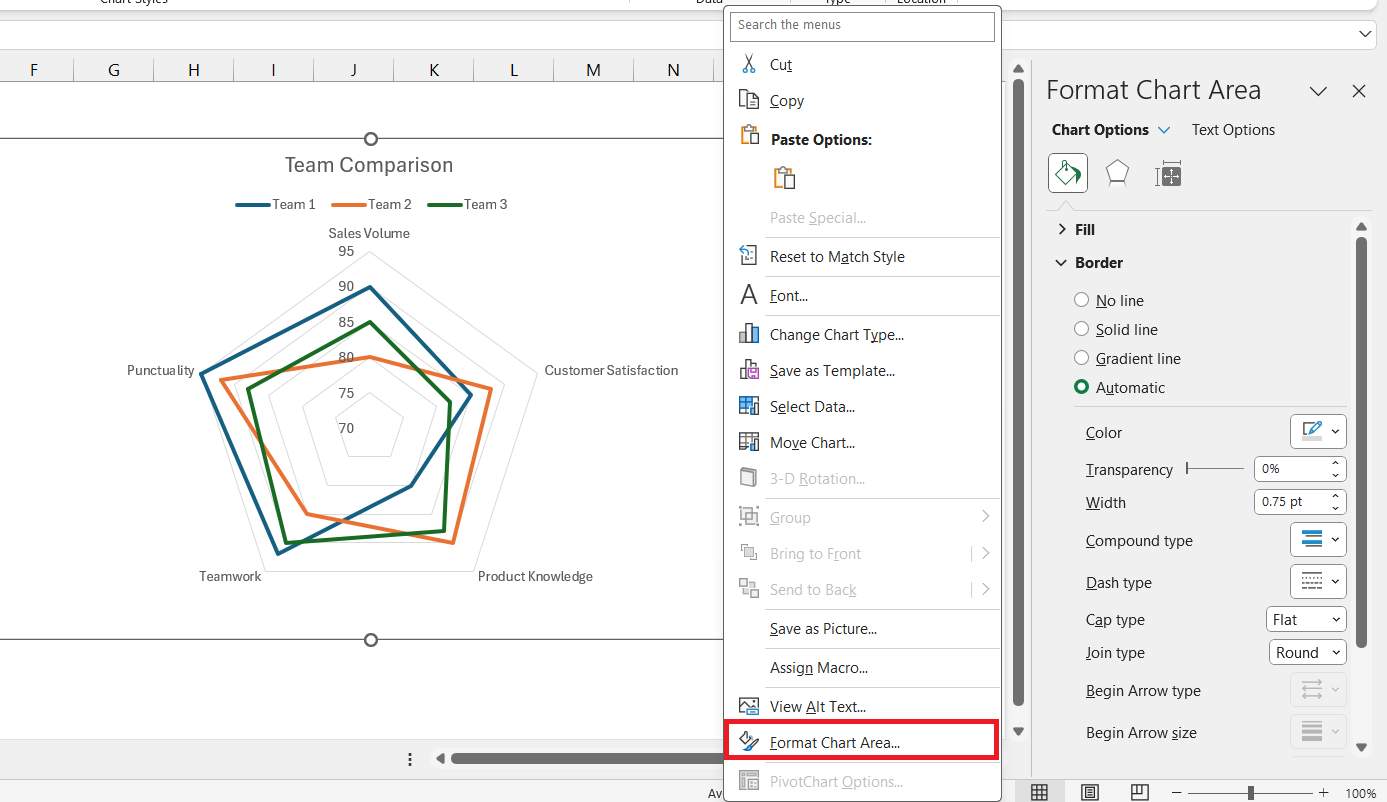
- Right-click on the chart background and select Format Chart Area. Adjust the gridlines, background color, and border styles to improve the chart’s appearance.
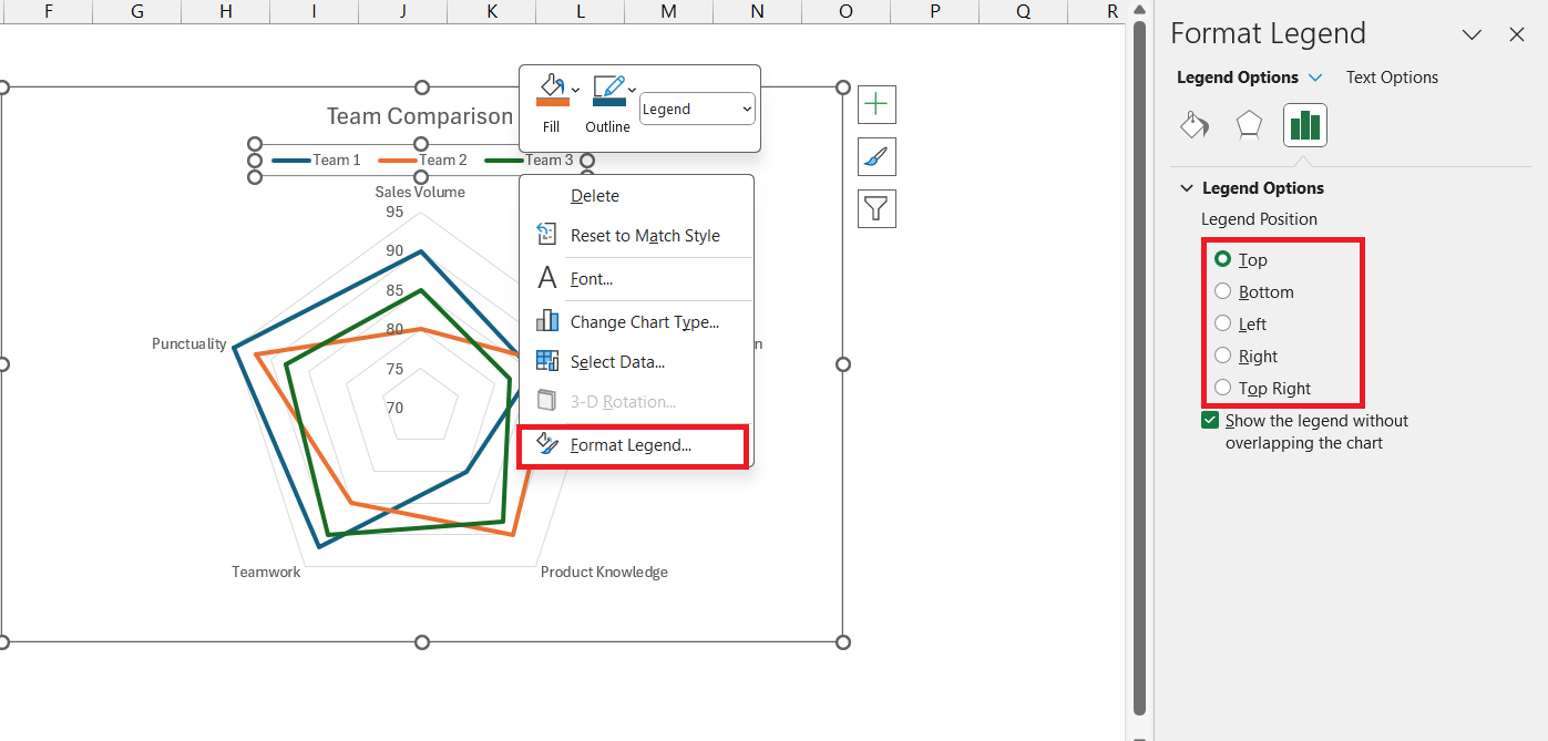
- Click on the legend to select it. Move it to your preferred location (top, bottom, left, or right of the chart).
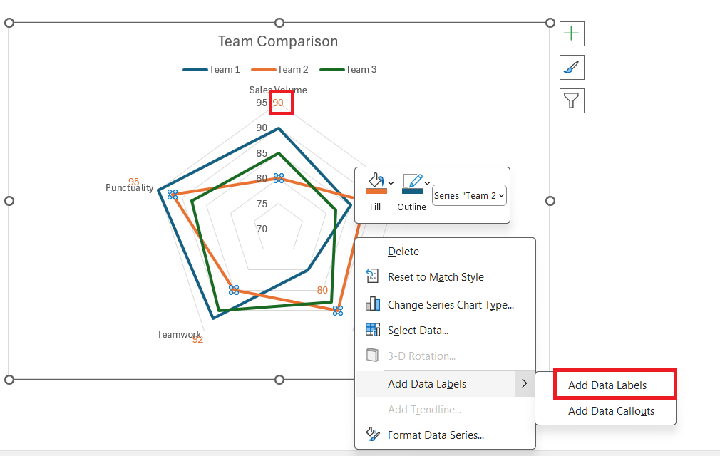
- Right-click on any data series and select Add Data Labels. Position and format the data labels as needed to enhance readability.
Save Your Chart
Go to File > Save As to save your workbook with the radar chart.
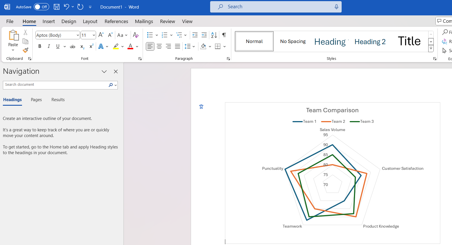
If you want to use the chart in a presentation or document, right-click on the chart and select Copy. You can then paste it into another application such as PowerPoint or Word.
Exploring Variations: Filled vs. Markered Radar Charts
Dive into the variations of radar charts by comparing filled and markered versions to select which best suits your data storytelling needs:
- Filled Radar Charts: These are visually impactful, filling the space between the axes and the data line. The use of color highlights the magnitude of each value and allows for an immediate visual comparison between different sets of data or categories. Filled radar charts are often used when the overall shape formed by the data points is as important as the individual points themselves.
- Markered Radar Charts: These keep the focus on the precise data points through the use of markers. Each value is clearly indicated, making it ideal for emphasizing individual data points or when you want to draw attention to specific values within the dataset. It’s particularly effective when the dataset is not as dense, and the clarity of individual points is paramount.
Both chart styles come with their own benefits. Filled radar charts are better for capturing overall trends and patterns at a glance, whereas markered radar charts excel in presenting granular details.
Further Enhancements and Expert Tricks
Alternatives to the Radar Chart When Suitable
While radar charts are compelling, there are instances where other charts might better communicate your data. Here’s when to consider alternatives, and some options to explore:
- Bar Charts: Ideal when you want to compare individual categories or variables side by side, especially if you’re dealing with a large data set.
- Line Charts: Great for tracking changes over time or continuous data, and for making high-level trends easily identifiable.
- Pie Charts: Useful when you need to show proportions within a whole, particularly for a single set of categorical data.
When choosing an alternative to the radar chart, consider your data’s nature, the story you need to tell, and your audience’s familiarity with different chart types.
FAQs
How do I create a radar chart?
To create a radar chart in Excel, follow these steps:
- Input your data in a table format.
- Select the data range you want to chart.
- Go to the ‘Insert’ tab and click on ‘Other Charts’, then select ‘Radar’.
- Choose your preferred radar chart type and press ‘OK’ to insert it into your sheet.
What is a radar chart in Excel used for?
A radar chart in Excel is used for displaying multivariate data as a two-dimensional chart with three or more quantitative variables represented on axes starting from the same point. It’s ideal for comparing performance, attributes, or different entities.
How do I create a filled radar chart in Excel?
To create a filled radar representation in Excel, select your data, go to the ‘Insert’ tab, choose ‘Radar’ from the chart options, and click ‘Filled Radar’. Excel will generate a chart with shaded areas representing values.
When Should I Choose a Radar Chart Over Other Charts?
Opt for radar representations when comparing multiple qualitative attributes or specific data points across several categories or entities, especially when the relational balance between variables is the focus, rather than their individual values. They work well for comprehensive profiles or holistic views of data sets.
How Can I Make My Radar Chart Stand Out in Presentations?
To make your radar chart stand out, use a consistent and appealing color scheme that matches your branding, apply subtle gridlines, and include clear, legible data labels. Also, consider simplifying by focusing on key data points and storytelling for impactful presentations.
John Michaloudis is a former accountant and finance analyst at General Electric, a Microsoft MVP since 2020, an Amazon #1 bestselling author of 4 Microsoft Excel books and teacher of Microsoft Excel & Office over at his flagship Academy Online Course.
