A Tornado Chart in Microsoft Excel is a specialized bar chart used primarily for sensitivity analysis to visually compare the impact of different variables on a particular outcome. With bars arranged horizontally and in decreasing order, it effectively showcases data comparisons and evaluates the relative importance of variables.
Key Takeaways
- Tornado Charts are used for comparing different items or the same item across various periods.
- These charts serve as a valuable tool for decision-making by illustrating the effect of variable changes on outcomes.
- To create a tornado chart in Excel, you can follow a straightforward process. It’s like a storm of data, revealing the most influential factors at a glance.
- Adding data labels, adjusting bar width, improving readability, and harmonizing style enhance the visual appeal and effectiveness of the chart as a graphical asset.
Download the Excel Workbook and follow along with the tutorial on how to create a tornado chart in Excel – Download excel workbookTornado-Chart-in-Excel.xlsx
Table of Contents
Introduction to Tornado Charts
Understanding the Basics of Tornado Charts
A Tornado Chart is essentially a graphical representation designed to illustrate how different variables can affect a particular outcome. Think of these charts as a snapshot of a storm of data, providing a clear visual hierarchy of factors based on their impact on the results.
The Significance of Tornado Charts in Data Analysis
In data analysis, Tornado Charts are particularly valuable because they quickly highlight the relative importance of input variables to a study. They are pivotal in:
- Sensitivity Analysis: This allows analysts to assess how changes in input variables influence the output.
- Decision-Making: Helping decision-makers to understand which factors have the most significant impact, and therefore prioritize these issues in strategic planning.
- Comparative Studies: Facilitating a straightforward comparison between different populations or scenarios.
By using a Tornado Chart, you can transparently communicate complex data, ensuring that stakeholders grasp the critical elements without getting lost in the details.
Step-by-Step Guide to Creating Tornado Charts in Excel
Preparing Your Data for a Tornado Chart
Before creating a Tornado Chart, it is crucial to curate your data effectively. Here’s how you can get started:
- Define Your Variables: Identify the variables you will examine and their potential range of values.
- Collect Data: Ensure you have accurate and relevant data for each variable.
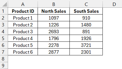
- Organize Your Data: Arrange your data in a table format in Excel, typically with categories in one column and the corresponding values in another.
- Sort Your Data: Organize your table by the impact of variables, usually with the most significant variable at the bottom.
Once your data is ready, you’re set to move forward with crafting your Tornado Chart to visualize the data in a way that’s both informative and easy to understand.
Crafting the Chart – A Visual Walkthrough
Creating a Tornado Chart in Excel involves a series of steps:
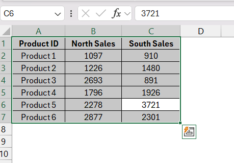
STEP 1: Highlight the table columns that contain your categories and corresponding values.
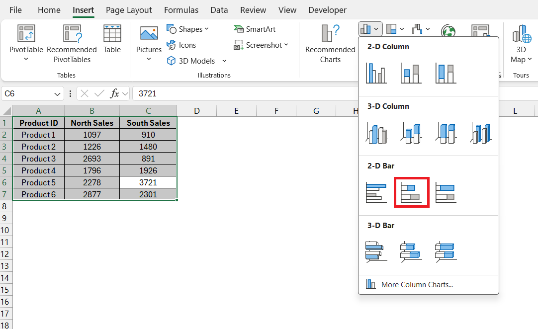
STEP 2: Go to Excel’s Insert tab, choose ‘2-D Bar,’ and select the ‘Stacked Bar’ option.
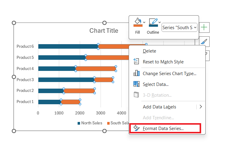
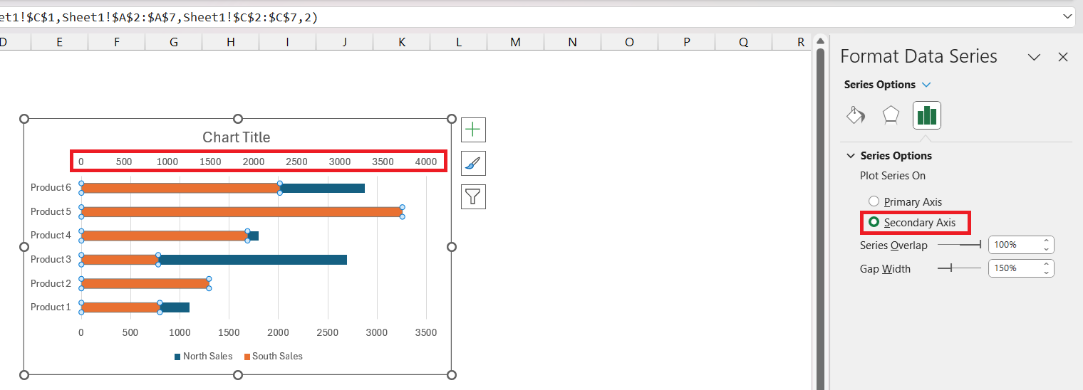
STEP 3: Right-click on the second variable chart and select ‘Format Data Series’.
STEP 4: In the Format Data Series dialog box, select ‘Secondary Axis’.
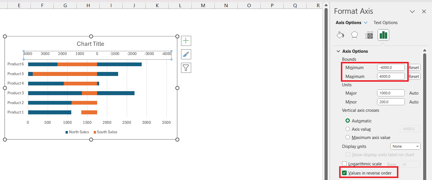
STEP 5: Right-click on the secondary axis and select ‘Format Axis’. Adjust the bounds to reflect –
- Maximum – The maximum value of your data.
- Minimum – To be the negative of the maximum value.
Also, check ‘Values in reverse order’.
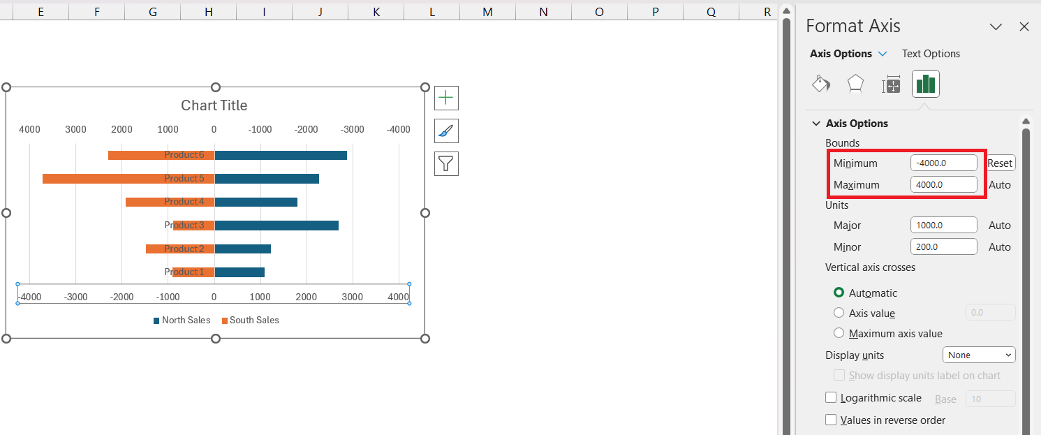
STEP 6: Right-click on the Primary Axis and select ‘Format Axis’. In the Format Axis dialog box, set the bounds the same as the secondary axis.
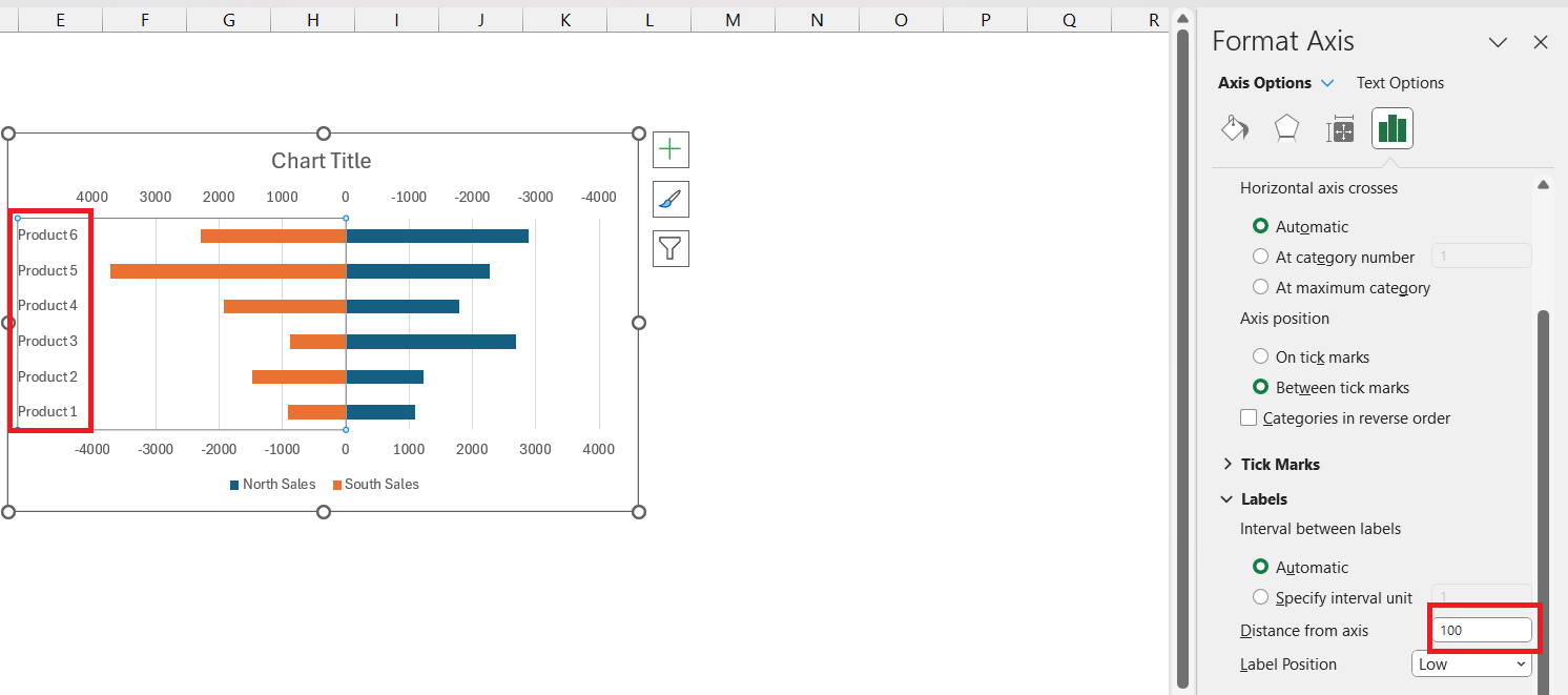
STEP 7: Right-click on the Vertical Axis and select ‘Format Axis’. Set ‘Label Position’ to ‘Low’.
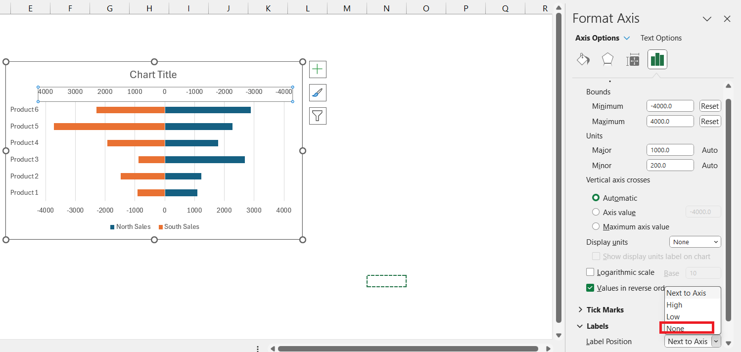
STEP 8: Right-click on the ‘Primary Axis’ and select ‘Format Axis’. Now, select Label Position as ‘None’. Repeat the same step for the Secondary Axis.
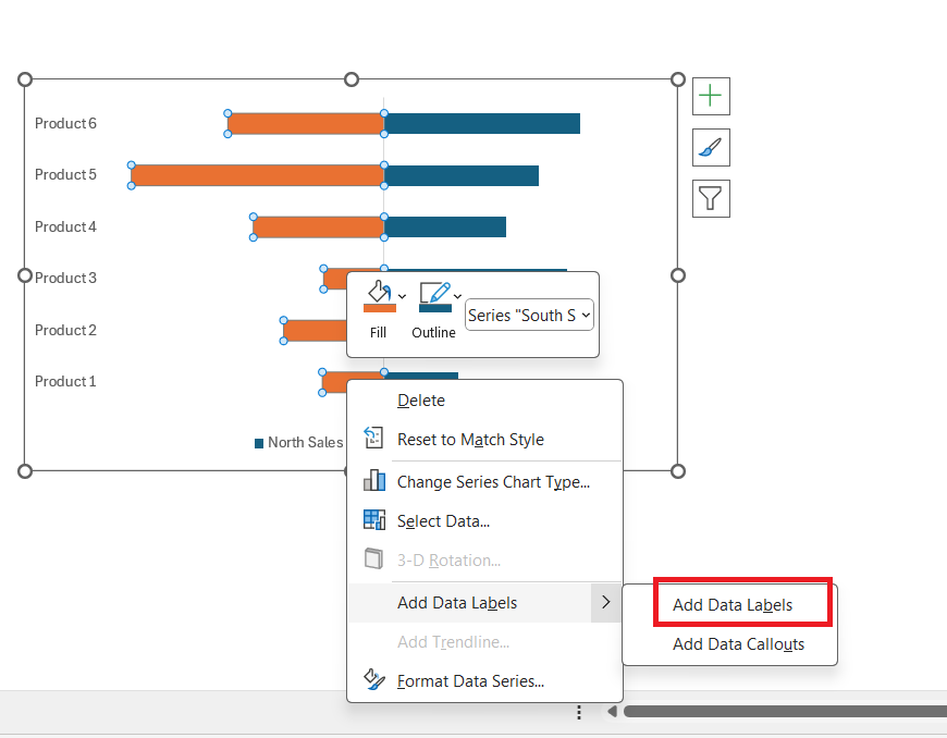
STEP 9: Right-click on the bar and select ‘Add Data Labels’.
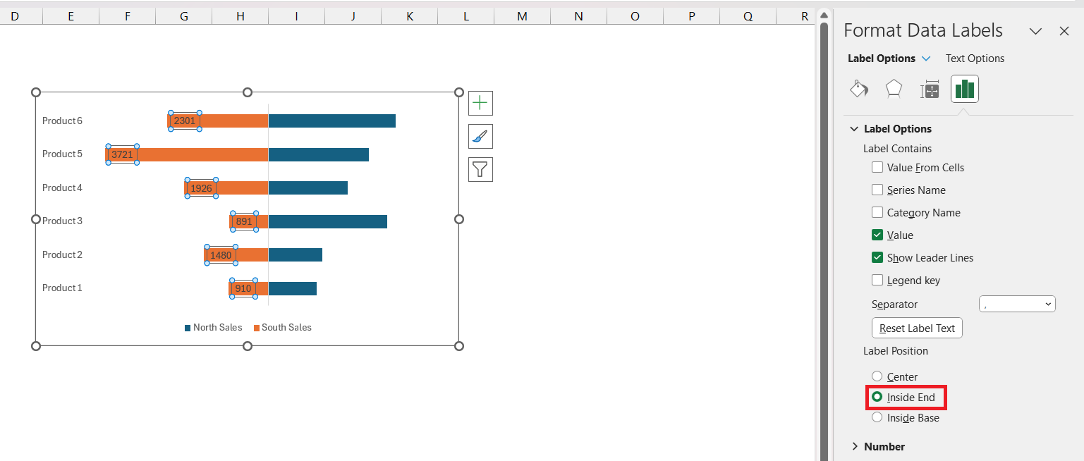
STEP 10: Right-click and select ‘Format Data Label’ and select Inside End as Label Position.
Repeat the same steps for the second variable as well to add data labels.
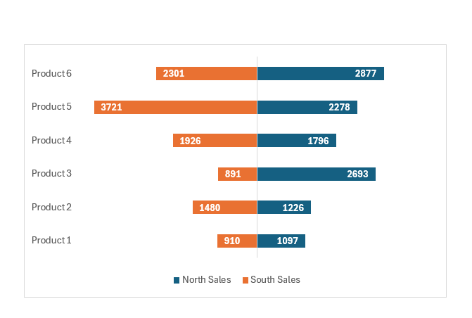
STEP 11: Format the data labels if necessary and format your chart accurately.
By following these steps, you’ll transform a simple data table into an insightful Tornado Chart, suitable for a vast array of analytical purposes.
Tips and Tricks for Effective Tornado Charts
Customizing Tornado Chart Appearance for Better Clarity
Enhancing the clarity of your Tornado Chart in Excel can be achieved with a few customization tweaks:
- Add Data Labels: For precise value reading, right-click on a bar and select “Add Data Labels.” This puts the exact figures at the tips of each bar for immediate comprehension.
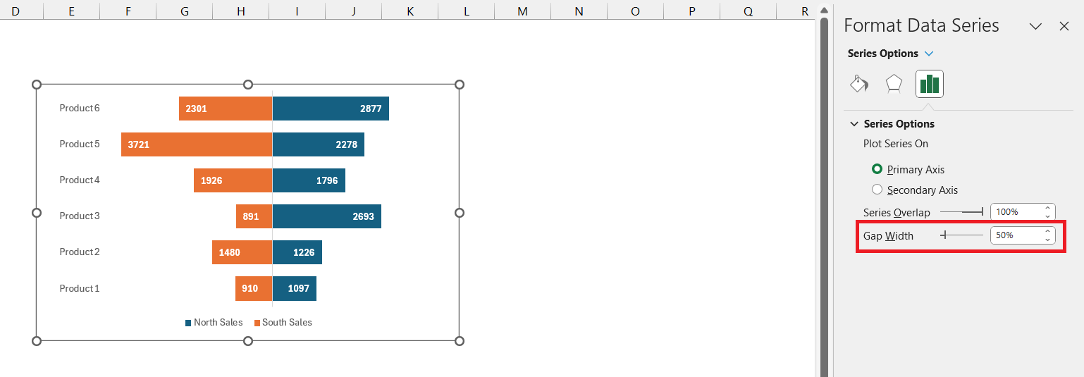
- Adjust Bar Width: To make the chart bolder and the values stand out, decrease the “Gap Width” under “Format Data Series” to 50%, giving the bars a fuller appearance.
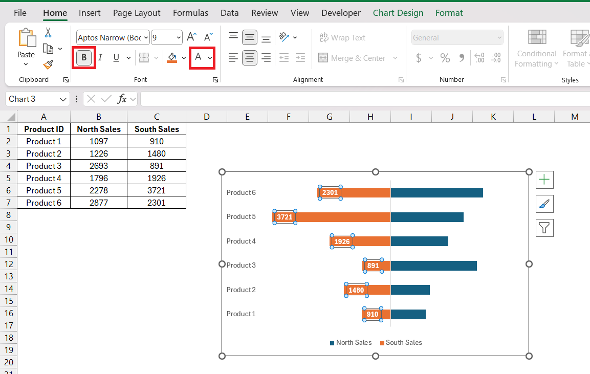
- Improve Readability: Consider changing the text color to white if the bars are dark and making it bold.
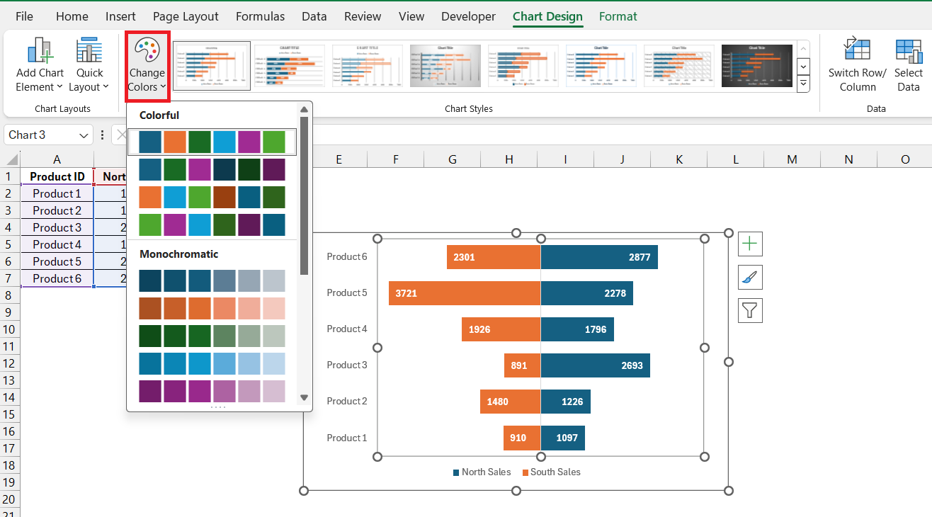
- Harmonize Style: Match the chart to your branding or report theme by customizing the chart color scheme. Consistent chart styling can significantly enhance the presentation’s look and feel.
With these few steps, your chart comes to life, becoming not just a data visualization tool but a clear and sleek graphical asset.
Common Uses and Applications of Tornado Charts
Risk Analysis and Decision-Making with Tornado Charts
Tornado Charts are powerful tools in risk analysis and decision-making as they allow stakeholders to weigh different risks based on their potential impact. In scenarios where multiple factors contribute to the outcome, Tornado Charts:
- Pinpoint Critical Factors: They highlight which inputs have the largest influence on the bottom line, thus identifying where risk mitigation strategies could be most effective.
- Aid in Resource Allocation: By visualizing the effect of various uncertainties, decision-makers can allocate resources strategically, targeting areas with the greatest potential for return or risk reduction.
Using Tornado Charts can facilitate a more nuanced and focused approach to business strategy, helping you to prioritize efforts where they count the most.
Comparing Variables – Where Tornado Charts Excel
When you need to compare variables, Tornado Charts excel in picturing how different factors stack against each other in terms of influence and magnitude. For example:
- Scenario Analysis: Comparing how changes in inputs affect outputs across various scenarios.
- Budget Allocation: Identifying which budget items have the greatest scope for reduction or increase.
- Performance Metrics: Evaluating competing products, services, or investments based on a set of variables.
In contrast to other data visualization tools, Tornado Charts give a focused lens on comparative analysis, making them excellent for side-by-side evaluation of competing factors.
Troubleshooting Common Issues
Resolving Problems When Building Tornado Charts
Troubles with Tornado Charts can arise, but with some know-how, you can resolve them:
- Misaligned Bars: Ensure all bars are correctly formatted to center on the axis by adjusting the ‘Format Data Series’ settings.
- Data Not Updating: Double-check data connections and ensure Excel hasn’t cached old values. Refresh data ranges if necessary.
- Confusing Layout: Redesign the chart’s layout for clarity. Simplify by removing unnecessary elements and ensuring axis labels are legible.
- Incorrect Sorting: Verify that your data is sorted correctly before creating the chart, with the most significant factors at the top.
- Formatting Issues: Tweak color schemes, fonts, and bar widths for better readability and professional appearance.
Addressing these common issues not only sharpens the look of your Tornado Chart but also strengthens its effectiveness as an analytical tool.
Ensuring Accuracy in Your Tornado Chart’s Data Display
Accuracy in a Tornado Chart is crucial. To make sure your chart reflects your data correctly, follow these tips:
- Verify Source Data: Double-check that your data is correct at the source before it’s imported or entered into Excel.
- Regular Audits: Periodically review the chart to confirm that it updates properly as source data changes.
- Validation: Run validation checks on the data input ranges within Excel to limit the possibility of incorrect data entry.
- Cross-Check: Have a second set of eyes examine the chart and data for discrepancies.
- Data Labels: Use data labels to provide an immediate reference point for verifying the numbers represented visually on the chart.
By taking these precautionary measures, you can foster trust in the data’s accuracy and thus, in the decisions derived from it.
Integrating Tornado Charts into Reports and Presentations
From Excel to PowerPoint – Sharing Tornado Charts Effectively
Transferring your Tornado Chart from Excel to PowerPoint for sharing is straightforward:
- Copy-Paste Method: Simply copy the chart in Excel and paste it into PowerPoint. For consistent scaling, use the ‘Paste Special‘ as ‘Picture’.
- Embed Excel: Embed your Excel file within PowerPoint for a dynamic chart that can be updated in real-time during your presentation.
- Focus on Clarity: Make sure the chart is sized appropriately for visibility. Larger presentations may require adjusting text size and chart elements for readability.
These sharing methods allow for seamless integration of your detailed analysis into presentations, making it easier for you to convey complex data in a comprehensible way using Charts in Excel.
Frequently Asked Questions (FAQs)
What Exactly is a Tornado Chart and When is it Used?
A Tornado Chart is a type of bar chart that enables sensitivity analysis, often used in risk management to compare the impact of variables. It lays out variables side by side in descending order, like a tornado. It’s especially helpful in decision-making where understanding the relative importance of variables is crucial.
Can Tornado Charts Be Created Automatically in Excel?
While Excel doesn’t have a built-in feature for Tornado Charts, they can be created using a Stacked Bar Chart and customizing it accordingly.
How Do You Interpret Results from a Tornado Chart?
To interpret results from a Tornado Chart, look at the length and position of bars, which indicate the variable’s impact. Longer bars mean greater impact, and their order helps understand which variables are most important. This allows you to assess risks or make decisions based on their potential effect on the outcome.
What type of chart did we use to build a tornado chart?
To build a Tornado Chart, you typically start with a Stacked Bar Chart in Excel. Then, by customizing and formatting it, you convert the standard bar chart into a Tornado Chart, which displays variables in descending order to analyze their sensitivity or impact.
John Michaloudis is a former accountant and finance analyst at General Electric, a Microsoft MVP since 2020, an Amazon #1 bestselling author of 4 Microsoft Excel books and teacher of Microsoft Excel & Office over at his flagship Academy Online Course.
